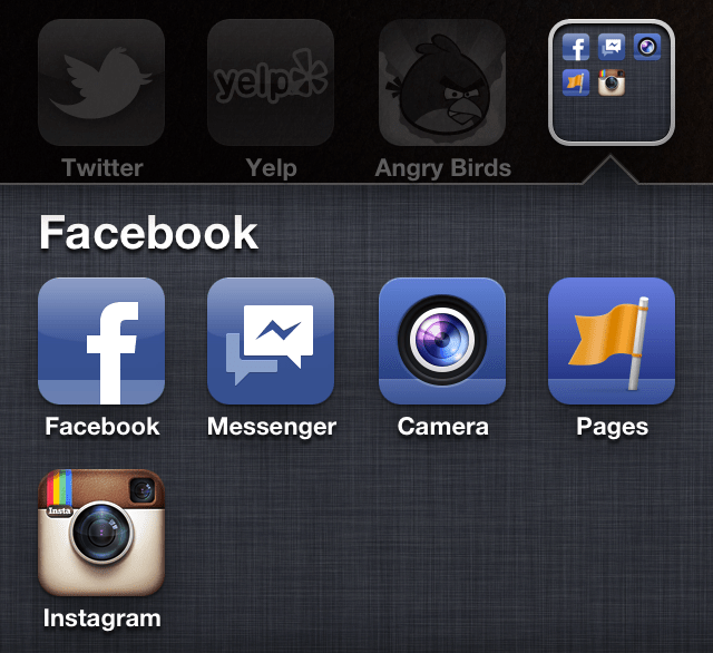
Not everyone loves Facebook enough to give it three, four, or five spots on their homescreen. So yesterday's launch of Facebook's third consumer iOS app Facebook Camera, could actually end up reducing usage of Facebook's main app, Messenger, and others by compelling people to consolidate them into a folder. Facebook Camera has shot to the top of the iOS free charts, so lots of people are making the decision of where to put it right now.
This issue isn't one just for Facebook but for any developer looking to break out specific features of a cluttered omni-app into streamlined standalone apps. Is a lightweight feel worth the risk of app overload?
Facebook's attempt to cram its entire full-featured web-based social network into a single mobile app hasn't quite worked out. Many people complain the app feels slow and requires too many clicks to get to core services. Honestly, I think the click friction concerns are blown out of proportion. It takes one click to start uploading a photo and two to reach your messages. It is slow, though, as it has to load a ton of extra features you don't always use.
Standalone apps don't have to load anything unnecessary, so at first it makes sense that Facebook would release Messenger and now Camera, its new Instagram-style photo filtering and sharing app.
But where are you going to put them? If you're not willing to give Facebook three home screen spots, some of them are going to get relegated to your back pages. There could be another terrible fate in store for the apps, though. You might drag their icons on top of each other and create a Facebook app folder.
Suddenly it takes an extra click to get to any of them. Without that big blue F icon reminding me to check my news feed and notifications, I could become a lot less likely to open my main Facebook app so often.

Facebook for iOS app had around 57.5 million daily users growing at 2.5 million per month when Facebook stopped reporting these numbers at the start of 2012, at that rate it would have around 70 million DAU now. Being banished to a folder could stunt this growth.
And what if Facebook doesn't stop? What if it releases another standalone app for accessing third-party apps on its mobile platform? Or apps for Events or its location service Places? Not to mention Facebook Camera is already competing with Instagram which Facebook has acquired (though the deal still has to close), and it recently launched a separate app for admins to manage their Pages. They could all get buried in the folder too.
[Update: Some like Google's director of product management Hunter Walk think opening a folder and then a standalone app might still be easier than digging through a clutter omni-app for certain features. But there's still the problem of Apple's questionably designed folders. With no featured image, just a grid of teeny tiny icons within the icon, they don't really sing "click me" the way a full-size app icon does. I once put all my photo and camera apps in a folder and found myself clicking on all of them less. People navigate their iPhones visually, and folders don't have the same visual prominence.]
Facebook is reaching standalone app overload — a growing pain of the move to mobile, a medium it wasn't originally built for. The root of the problem is the sluggish main app. Facebook can't keep cutting off limbs to make it more lightweight, and it can't just trim the fat of lesser-used features. It needs to convert fat to muscle so its main app stays the same size, but feels better, faster, stronger.
No hay comentarios:
Publicar un comentario