viernes, 31 de mayo de 2013

The Register examines the Nokia 808's place in the 2013 smartphone world

From Andrew's article (which is lengthy, you may wish to grab a coffee or similar!):

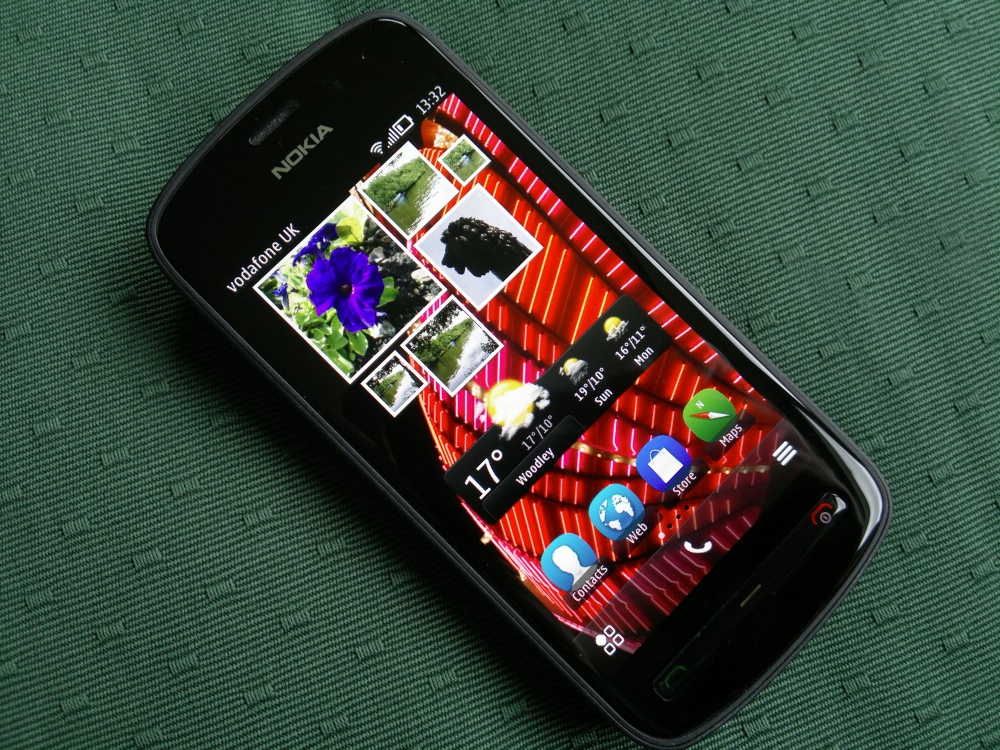
Last year Nokia released to the world a mobile phone that is still unique. It's a smartphone with a 41-megapixel camera sensor, scooping up more detail than some professional DSLRs: it's the PureView 808.

When I say "released", that's a little misleading. This showpiece won the Best New Phone gong at last year's Mobile World Congress, but it was hard to buy. Since the phone ran Symbian OS, it was considered toxic by carriers, and it was not distributed in the UK.

So for the past year the 808 has had a crepuscular presence. It's lived on, in a spooky afterlife: Nokia wanted you to know about it, and prominently placed the thing on the front page of its main website – but it did not want you to actually buy it. Nokia had already transferred some 3,000 Symbian engineers to Accenture, and last February cancelled all Symbian devices on its phone road map bar the 808.

Yet, something unexpected has happened. The 808 as been quietly receiving lots of loving care and attention. Regular updates and tweaks have continued from the Other Side, including a major overhaul of the OS late last year. Every update is expected to be the last. But still they keep coming, and if anything, the pace is accelerating.

Over the past few weeks I've attempted to live with a PureView 808. And it's been an interesting and surprising experience. This is the first Symbian phone I've used regularly in four years and it isn't quite how I remembered Symbian.

Which strikes a chord with me, I suspect that a great many journalists had written Symbian off after trying the Nokia 5800 and then N97. The 808 (and 701 and 700, to be fair) with Belle Feature Pack 2, offers a dramatically different experience in terms of speed and slickness.

Andrew elaborates further:

The old warhorse, updated

Many of the old complaints against Symbian, such as its reliance on an archaic menu-driven interface, are no longer valid. The Belle update, when it finally and belatedly emerged last year, removed many of these gripes. The 808 was equipped with a decent processor and memory – rather than the constrained resources and cheap CPUs that were depressing features of many late-period Symbian devices.

The basics of communicating, and general housekeeping, are now handled very slickly. Calling and texting is as good, or better, than any of the more modern phone interfaces - although previewing an SMS requires a third-party app.

One single addition alone - instant Spotlight-style search available from the home screen - goes a huge way to making the device very usable. Finding the settings in Symbian had become a nightmare, but now finding a contact or a setting is fairly instant.

Andrew then goes into detail on the 808's imaging, plus the back history of the OS, before starting to conclude with his thoughts on the 808 in every day use:

The main draw has to be the call quality and battery life, which comfortably lasts into a second day. Just as designed, this is a deterministic system with no surprises. Overnight it will drain one or two per cent of the battery. Even with push email switched on I get well into a second day of use; if I throttle back email I often get a third day – all on a now modest 1350mAh battery. The phone will keep dozens of applications open at any one time, and if they need to run in the background – for example, syncing with Evernote - they'll do so without draining the battery.

The phone stack is a very well debugged – as it should be after a decade of running 3G. And it's now bang up to date with HD voice. As a bonus, the version of Skype is probably the most parsimonious out there, in terms of power consumption.

He summarises the device like this, putting it into context and very much valuing the 'converged' aspect of the 808:

I found myself using the 808 at weekends and in 'downtime' when I don't need to check email or social media feeds, and was positively surprised by the ease of use.

So what's the value proposition for the 808? Good, dedicated cameras can be found for under £200, and good, modern phones for under £99. You'll pay a little more for a new 808 or less if you take a risk on eBay. You have to really value not carrying two devices around, and charging two at night, and having the integrated communications available (Facebook, Flickr, MMS, email). But as the cliché goes, the best camera in the world is the one at your fingertips – and I did take terrific pictures I wouldn't have otherwise taken – because I simply wouldn't have had a dedicated camera with me, merely an ordinary smartphone. The PureView is no ordinary smartphone.

If this whets the appetite for the original PureView tech coming to a modern phone, then hopefully we don't have too long to wait. This discussion of camera shortcomings in Windows Phone 8 show how far ahead the 808 is today.

Alas, I found the 808 couldn't hack it for me as the sole "work phone", largely because of the slow browsing and lack of calendar sync. But then I have a work BlackBerry and can call on a tablet for the fancy stuff. The market looks very different now to 2007 when the iPhone was launched, and affordable small tablets do this "fancy stuff" (email, browsing, social media) better than a phone – that could be a justification alone for choosing a device that specialises in one or two things, and is a very dependable everyday companion.

Apart from a few small items of errata, a very decent summary of the Nokia 808 PureView in today's world. It's clear that web browsing performance, email restrictions (only one Mail for Exchange mailbox) and cloud syncing generally are something of a weak point and, one day, may force even die hard Symbian users off the platform. But, as Andrew proves to himself, that day is not - quite - upon us yet. And in the meantime, there's a lot of media to capture on the 808, 'the smartphone that refuses to die'....

You can read the whole Nokia 808 piece here.

Nokia 808 PureView

Does tech really improve integrated marketing? 1,000+ marketers help us look at the connection

We're two weeks away from Integrated Marketing Week in New York (June 10-13th), and are looking at a few of the topline findings from the report we'll be premiering at the event. 

Today: is there a connection between the technology and success at integrated marketing?

In the last post, we examined the essential elements of integrated marketing, and saw how internal politics undercut organizations' ability to field fully integrated campaigns. Today we'll look at supporting integration with technology.

We asked respondents to the Integrated Marketing Survey what technologies they use to manage and implement their cross-channel campaigns.

The chart below breaks down their responses. 

Naturally, most organizations use multiple technologies, and the most common are general and point web analytics solutions. One small surprise was the uniformity of usage across spending levels - we expected to see bigger spenders skewing toward technologies designed for integrated marketing.

Complex tech and the promise of simplicity

Integrated marketing is challenging for a number of reasons. Any truly integrated campaign has a number of moving parts, each with its own metrics, processes and format and often a variety of internal and external participants.

That being the case, we theorized that there would be a correlation between technologies that reduce complexity and integrated marketing success.

We defined these technologies narrowly as those which specifically aim to assist with the significant challenge of control and analysis of far flung marketing activities – the integrated marketing platforms, aka the "marketing clouds."

The chart below compares organizations that have integrated platforms with those that don't, and compensates for annual spending. The percentage of organizations that describe themselves as "very effective" or "very sophisticated" in each area varies significantly, showing at least a correlation between tech and success. 

Although the differences vary, there's a consistent lift among the integrated marketing technology users. With the exception of attribution, these respondents are between 60% and 285% more likely to describe their integrated capabilities as "very effective" or "very sophisticated" than their peers who are using other means of managing integrated marketing.

Cloud systems promise the ability to tie together multiple systems for the management and measurement of disparate channels, and the largest differences between the groups support the claim.

For most products, the customer journey is complex and getting more so. The data above suggests that a significant benefit of having an integrated system is the ability to get a meaningful view into how customers are interacting with brand assets and how they are buying.

Likewise, integrated capabilities that are process-based appear to benefit from having a single dashboard; successful campaign timing and brand experience have a great deal to do with having assets readily available and easy to field across multiple platforms on a schedule.

It's important to note that isn't possible to tease out all of the variables that contribute to the success highlighted in the chart above.  Some of the difference we see in particular activities is likely to have to do with the nature of the marketing organization and its existing capabilities. 

For example, having a unified data structure is a precursor to moving to a marketing integration platform for many companies, which then increases their self-evaluation of "data" as a capability.

­­

Having the right tools is only part of the solution to the tougher problems of integration. Even among companies with integrated platforms, only 11% give top grades to their ability to deliver "user experience" across channels and platforms.

That's better than the 6% of those using other techs but a long way from where the industry needs to be.

Getting the intended benefits from technology

The emphasis on technology in digital marketing is extreme, and its promise in theory can sometimes outpace the specific reality for companies. It's quite common for organizations to invest in technology and be disappointed. That can happen for any number of reasons, but in our experience, it's usually not terrible tech or tech support, it's a question of priorities; 

In 2006 Avinash Kaushik famously advised that a successful web analytics implementation depended on an investment ratio of 90% "intelligent resources" (people) to 10% technology.

Although this rule was intended for web analytics, our experience is that there are few exceptions in marketing technology. But it's a lot easier to pull the trigger on a piece of technology than on new employees. Likewise it's not easy to casually reorient existing staff to become experts in a new technology. 

The most frequent example we come across is in marketing automation. Whether it's an automation specific solution or an email service provider with that capability, the story is often the same; the technology is brought on, but results don't change significantly. The issue is not usually with the premise (automation can and does work) or with the technology itself, but with the organization's insufficient strategy and support.

Whatever the technology, the best way to take advantage of its most powerful capabilities is to turn them into specific goals for specific people. This might mean giving the email team a collective bonus around automation, or tying the evaluation of the mobile team to KPIs accessible through a new mobile analytics capability.

Integrated marketing platforms are the same. They bring an array of features and processes to the table, and the challenge is to use them. 

One place to begin might be to incent marketing teams to use the workflow and communication tools available in most of the cloud/integrated solutions. Integration is all about process, so if the first step draws internal and external communications into one place, you'll be well on your way.

Has technology helped your integrated marketing efforts? Whether it has or hasn't, we want to hear all about it.

In the final post before the report's launch, we'll look at the surprising challenge that stymies the most sophisticated integrated marketers. To get the entire report hot off the press, join Econsultancy and the DMA at Integrated Marketing Week, June 11th-13th in New York.

Tumblr Brings More Ads To Users' Dashboards, Rearranges Buttons & Teens Freak Out

A month after Tumblr introduced sponsored posts into its native mobile applications, the company is today bringing those same brand advertisements to its web dashboard. Launch partners for these new "Sponsored Web Posts," as they're called, include Viacom, Ford Motor Company, Universal Pictures, Capital One, AT&T, Denny's and Purina.

Tumblr users will be able to reblog, like, follow and share these ads and the brands themselves directly from their web dashboard, which of course, is what we know all the Tumblr-lovin' teens are just dying to do. Like Tumblr's sidebar "Radar" ads, the new sponsored posts will be marked with an animated dollar sign icon to indicate that they are paid placements.

Also like Tumblr's mobile advertising, users will only see up to four sponsored posts per day. The company notes in a brief announcement on the new ads that sponsored posts have already seen over 10 million likes and reblogs since their debut.

Sponsored Web Posts in the dashboard will continue to roll during a beta period that ends in June 2013. During the first week, premiere spots belong to Viacom, Ford Motor Company and Universal Pictures, and then they'll become available to Capital One, AT&T, Denny's and Purina.

"The engagement rates on the Tumblr Radar and Sponsored Mobile Posts have been spectacular and we have taken this same carefully architected approach to this new web in-dash opportunity," said Lee Brown, Global Head of Sales at Tumblr, in a release. "The Tumblr post is a flexible, dynamic and expressive medium, and we are delighted to give marketers yet another opportunity to promote their content and connnect with this vibrant and engaged community."

dennys-post

As Tumblr founder David Karp has previously explained time and again, Tumblr wants to offer advertisers canvas and space for "creative brand advertising" – something he feels hasn't really had anywhere to live on the web. "We want to give them the space to do anything, a four-second loop, an hour and a half video, a high-res panorama, whatever they need to help them build amazing, interactive ads," he said onstage during the TechCrunch Disrupt NY event in early May, ahead of the $1.1 billion Yahoo acquisition.

The expansion of brand advertising in Tumblr was expected, whether or not Yahoo bought the company. (Yahoo's bigger plans involve search ads and ads that bloggers run themselves, for instance, and it doesn't expect to see significant revenue from ads until next year.) But Tumblr's younger user base is sensitive to change, and likely they'll see these ads a disturbance, then blame Yahoo.

Already the user base was distressed over the impending acquisition, some leaving in droves for WordPress after the fact, and today a minor change to the Tumblr dashboard involving the relocation of the Reblog and Notes buttons has them hand-wringing again. Those changes rolled out yesterday, and today have reached 100 percent of Tumblr's user base. The company says the buttons were moved for consistency between mobile and web.

These buttons used to be at the top of posts on the web dashboard, and now they're on the bottom – I know, right? The horror! And if you think that's bad, just wait until the kids see these new ads.

Tumblr's teenaged audience has led to explosive growth for the company, but those users are also known to be fickle (and dramatic), which makes every change that Yahoo/Tumblr enacts going forward risky. It still remains to be seen whether or not the audience will stick around as the site becomes less of an online hideout, and more ad-driven in the future.

(13) yahoo | Tumblr-3

(13) yahoo | Tumblr-2

(13) yahoo | Tumblr-1

(13) yahoo | Tumblr


Tumblr is a re-envisioning of tumblelogging, a subset of blogging that uses quick, mixed-media posts. The service hopes to do for the tumblelog what services like LiveJournal and Blogger did for the blog. The difference is that its extreme simplicity will make luring users a far easier task than acquiring users for traditional weblogging. Anytime a user sees something interesting online, they can click a quick "Share on Tumblr" bookmarklet that then tumbles the snippet directly. The result is...

? Learn more

Yahoo was founded in 1994 by Stanford Ph.D. students David Filo and Jerry Yang. It has since evolved into a major internet brand with search, content verticals, and other web services. Yahoo! Inc. (Yahoo!), incorporated in 1995, is a global Internet brand. To users, the Company provides owned and operated online properties and services (Yahoo! Properties, Offerings, or Owned and Operated sites). Yahoo! also extends its marketing platform and access to Internet users beyond Yahoo! Properties through its distribution network...

? Learn more

SuperCalendar Aims To Fix Your Scheduling Woes With A Mix Of Tech And ‘Superhuman' Power

"I completely forgot that we were supposed to meet today, I'm sorry."
"I swore that I put it on the calendar."
"My dog got sick."
"My dog ate my calendar. Then he got sick."
"Ugh. I blew it."

These are excuses that I you may have given recently for missing meetings with people, either for work or for personal outings. Even though every major tech company in the world, including Apple, Google and Microsoft, has tried to tackle scheduling, the reality is that the options suck. Even upstarts like Sunrise, while beautifully designed, aren't getting the job done. If we can't afford a real personal assistant to bug us about every step we're supposed to take on a given day, we're not doing a great job of keeping our schedules straight.

Even the most regimented planners aren't thrilled with the options out there, with one close friend telling me that the "color coding" on Google Calendar is the only thing keeping her on time and employed. So what's the fix if we can't afford our own personal assistant and tech is letting us down?

How about a hybrid of both?

That's what Aviary co-founder Michael Galpert has been working on in stealth mode under the company title of "Superhuman.io" for the past year or so. Not much has been known about what Galpert was up to, other than what was found on his trademark application for Superhuman:

downloadable software that allows users to obtain personal assistant and concierge services comprising making requested personal arrangements and reservations, running errands and providing customer specific information to meet individual needs, including assistance provided on demand via email

Screenshot_5_30_13_2_26_PMIt sounds a bit like Exec, TaskRabbit and Fancy Hands, but in hindsight, it sounds exactly like SuperCalendar to me, which is Galpert's first Superhuman product. So far, Galpert tells me that Superhuman has raised some seed capital to get things running, and the rollout will be gradual, with new invites going out every Monday. The service will cost you $89 a month, with unlimited scheduling.

The best part about how Galpert has gone about doing research for SuperCalendar is that he used Superhuman to collect information and feedback about what the product would end up offering, when you signed up for an invite. Even though you had no idea what you were signing up for. Genius.

I spoke with Galpert about the progress that he's made on SuperCalendar, and asked him what he felt was missing with current offerings:

TechCrunch: What was it about calendaring that just wasn't working for people?

Galpert: For busy people, managing their calendars was close to a full time job. The biggest annoyance that comes up when scheduling meetings is finding a time to meet, picking a location that is convenient for both parties etc. Not to mention you end up having to always be on high alert with your inbox and make sure to enter all the necessary info to keep your calendar up to date. We basically built a solution that makes it easier than doing it yourself.

We have some customers who choose to schedule meetings on their own and just fwd the email to their SuperCalendar assistant to add to their calendar. When something comes up and they need to cancel all their meetings that day. Customers just send over a note that says something like "reschedule all my meetings today for some time next week" and we take care of the hassle of rescheduling so they dont have to.

TechCrunch: Were your own experiences with scheduling things the reason for starting Superhuman?

Galpert: The reason we started Superhuman was to remove the bullshit in peoples lives that prevent them from being present and living their life. If you ask anyone that has a full time personal assistant they say they couldnt do what they do if it wasnt for their personal assistant. Richard Branson even mentioned this recently. The biggest distraction to your workflow is coordination and scheduling so we are starting with that.

Screenshot_5_30_13_2_19_PMTechCrunch: Some people have tried to re-mix calendaring but failed because it required too much work from users, how is SuperCalendar handling that?

Galpert: We dont think the solution is to give people a new interface to deal with. Ala tungle.me which was a service I loved but anyone that I asked to coordinate using it loathed. Our approach is not to create a service that takes more time to learn than to complete the task at hand. We make it simple and easy to share your preferences with your Super Assistant (a team of scheduling assistants) via email.

TechCrunch: Are you worried about scaling the service, since it relies on real people in the background?

Galpert: Over the next couple of weeks we will be rolling out invitations to the service to make sure that our system can handle the demand. We are constantly building out automated processes that will allow us to scale without needing to rely on real people in the background. That's how we can offer the service for way cheaper than hiring someone full time in the first place.

———

For those of you who don't have more than a few things going on every week that you have to be on time for, you might not get value out of paying $89 a month. This is aimed at professionals that either don't want to handle their own scheduling, or just plain stink at it.

If you'd like to get priority access to SuperCalendar, you can use this code: SuperTC. Be sure to sign up now so that you can get your invite next Monday.

[Unnecessary Disclosure: I'll be moving on to Yahoo! soon]


Seven tips for designing an effective ecommerce call-to-action

In ecommerce much of the focus is on the best ways to attract traffic and visitors, meaning that tactics for conversion rate optimisation are often neglected.

In fact our new Adobe Digital Marketing Optimisation Survey found that a majority of companies (53%) spend less than 5% of their total marketing budgets on optimisation activities, despite the fact that a small uplift in conversion rates can translate into thousands of dollars of extra revenue.

One relatively easy way of improving conversions is by making sure you have the best possible call-to-action (CTA). 

There's no exact formula for the perfect ecommerce CTA, but there are some aspects that web designers should focus on tweaking and testing to make sure they're maximising their conversion rate.

Some of them are obvious while others are more obscure, but each of them has the potential to add to your bottom line...

Wording

Getting the correct wording for your CTA should be a relatively easy task as you just need to boil the desired action down to the simplest phrase possible.

However it also needs to inject a sense of urgency and entice the user into taking a particular course of action.

On ecommerce product pages the standard wording is 'Buy now' or 'Add to basket', and in truth these are so widely accepted now that I'm unsure whether trying a different angle wouldn't just confuse the customer.

Spotify is a good example of a different business case and it could have been featured in any number of these categories, as it also ticks the boxes for placement, size and colour, however the wording is also spot on.

It leaves the user in no doubt about what they're getting and how much they're paying for it in just four words. It's an almost perfect sales pitch.

Colour

Ideally the CTA needs to be the most obvious feature, so it should be an eye-catching colour that doesn't blend in with the rest of the page.

It's definitely worth testing different colours to find which one is most appealing to your users and drives the most clicks, and it's worth noting that both ASOS and Amazon have opted for orange buttons on a white background.

Skype hits the nail on the head with its unmissable 'Join' CTA, though personally I'm a fan of square rather than circular buttons.

On the other hand, Hubspot's CTAs get lost in a sea of orange and grey.

John Lewis could also do with turning up the brightness on its 'Add to basket' CTA as it's a bit flat when you first arrive on the page. 

Placement

The debate over the ideal place to put your CTA is worthy of its own blog post as there are a number of factors to consider.

James Gurd whittled it down to three important points in an excellent post on landing page optimisation:

  • The goal of the landing page.
  • Audience intent.
  • Complexity of the offer.

If you just want to generate leads or grab a sale then the CTA should be prominently placed near the top of the page.

However placing your CTA above the fold is no longer considered to be an absolute must because user behaviours have changed over time and people are used to scrolling.

Therefore if you have a complex product offer or need time to convince the customer to make a purchase then there's no harm in putting the CTA lower down the page.

In general though, on most ecommerce product pages people expect to see the CTA at the top near a product image, like in this ASOS example...

Size

People don't want to have to search around the page looking for what to do next so the CTA should be big enough that your customers can spot it straight away.

Not On The High Street's CTA is almost bigger than the product thumbnail images and only the most shortsighted user will fail to spot it. 

Similarly, Mozilla has designed an unmissable CTA that jumps out at you the moment you land on the page.

Allow some white space

Allowing plenty of white space around your CTA serves two purposes – it makes it both easier to spot and easier to click.

If a page is too cluttered then it will increase the amount of erroneous clicks and slow down navigation, which leads to a frustrating user experience.

Victoria's Secret uses an extremely simple design for its product pages which allows the CTA room to breathe.

In contrast, though Staples has excellent product pages I feel it could do a much better job of removing some of the clutter from around its buttons.

Have more than one

While it's not a good idea to fill your page with CTAs in the hope that the more there are the more sales you'll make, there is scope to include more than one if you have a large or complex page layout.

This makes it more convenient for the user where the page contains sub-sections or different features that might draw their attention from the original CTA.

Test it

The only way to find out the best combination of factors for your CTA is to test each one to see the impact versus a control.

Running A/B tests is relatively simple and is a great way of validating or disproving your hunches.

In this example from Unbounce the site owner managed to increase CTR by 35.81% by changing the colour and shape of the CTA. That's definitely a change worth making.

Transformation in digital marketing: five ways to work

It is not so much a revolution but a rapid evolution and transformation.

The growth of digital media, the convergence of paid, owned and earned media practices and the rapid growth and adoption of mobile and video have fueled change in the way we work in 2013. 

If you add to this equation the technological changes and innovation and the catalyst that is social media and content marketing it becomes apparent that dealing and adapting to change is a digital marketing necessity rather than the option that it used to be. 

Adapt

Search marketing is the core component of any digital marketing campaign. However, search has changed, Google has changed, the SERPs have changed and marketers must adapt.

Since Google introduced its Panda and Penguin algorithmic updates we've seen a seismic shift in the way that we work 'with' search engines.

Pair this alongside a renewed interest and focus on content marketing and the convergence of paid, owned, and earned media and we have challenges, yes, but also great opportunity that marketers need to adapt to. 

Penguin 1.0 and now 2.0 has transformed the way that people work with regard to link building, content creation and outreach and relevancy. Dark art tactics aimed at gaming the search engines have shifted towards dark art content and social media practices.

Organisations have adapted by changing their working processes, strategies and in some cases branding (content marketing agencies of the future).

Align

Many of the technological changes that affect search are reflected by the changes in the SERPs. Aligning and optimising campaigns across search, social, local and mobile means that aligning talent across multiple departments and disciplines must follow. 

What's more, as paid and owned media converge with earned media, aligning PPC, display, RTB, content and creative teams gives organisations the best chance of delivering highly targeted, relevant, and efficient digital campaigns.

It is no coincidence that in 2013 we see more change and structural innovation as companies attempt to accelerate digital transformation with the rise of Chief Digital Officer, Chief Content Officers, and Chief Revenue Officers as search and social media practices are integrated into the wider digital mix.

Create

Since John Deere published "The Furrow" in 1895, content marketing has been right in front of the consumer eye.

The growth of social media and the links between content and social and search engine results has changed and the ability of content to attract, retain, and convert customers naturally draws parallels with conversion and purchasing funnels. However content marketing tactics and strategies overlap in numerous areas.

This has meant that customers don't always follow a traditional funnel system.

Producing mature content that is thoughtful, unique, insightful, and perfectly placed is the way that real content marketers approach their campaigns. Content is distributed and recycled and reproduced and aligned line with quality editorial, seasonal, and consumer based timelines.

Quality content marketing really has to be produced by individuals and not technology. Technology only distributes and helps you create and curate some of that content. Individuals are the content agents of the future and AuthorRank encourages content creators and bloggers to publish insightful, relevant, and regular content.

Many dark art practices of content distribution and outreach have been highlighted recently. This relates to dodgy backlinks, spam campaigns and irrelevant outreach campaigns for guest blogging posts. It is important not to confuse this with real content marketing that it not primarily focused on link building.

Creating unique and insightful content and distributing it across multiple digital channels is in many ways transforming the future of digital marketing.

Structure

Digital channels and markets have change and converge and so should your marketing organisation. Search, social and digital growth has redefined the role of the CMO.

For some organisations it is a process of reorganisation to adapt to change and move from traditional structures, based on pre-defined departmental structures, to build new and innovative ways of working and matrix management that are more flexible, less political, and are built by optimising talent first.

As I mentioned earlier - the rise of digital CMOs and forward thinking CMO place this marketing talent at the center of all activity and across all areas of the organisation.

Mastering 'big data' AND building a successful marketing organisation based around how talent powers the adoption of data and technology is going to be a key CMO challenge in 2013.

Accountability is key to success and this comes from the talent in your organisation. Who creates the content, authors thought leadership, works with the brands?

Who drives digital strategy, who creates product and brand messaging, and who is responsible for content and digital collaboration are just some of many questions the CMO and CEO need to address.

Attribute

Attribution has many meanings and is a phrase that is often over used in some areas. As I have mentioned in previous posts attribution is not just an apt term to describe digital marketing interaction, it also relates to psychology, copyright and content, organisational performance and behavior and talent.

All are relevant in today's integrated marketing ecosystem. For the purpose of this post attribution relates to:

  • Attributing, measuring and optimising cross channel digital marketing strategies in line with the convergence of paid, owned and earned media as described in the early sections of this post.
  • Attributing and optimising talent within your organisation as you structure and build teams, multi-function departments, and matrix management process.

Optimise

Technology change is a constant but people don't change at the same pace, and when they do they do differently. It is essential that all your digital marketers campaigns are optimised for the user. Every campaign, every strategy, every tactic should be built with the end user in mind. 

When we talk about organisations and structure let's, for a second, forget the technology, changes, and economy and think about how you organise talent and make the most out of whole brained, left brained, or right brained marketers and talent. 

It's all about balance and at the moment many individuals, organisations, agencies, and brands are struggling to make the most out their left and right brain marketers and cope with change and transform their digital organisations accordingly.

Conclusion

The real, and largest, change in digital marketing has ultimately been the growth and rise of tools, technology, and platforms that have allowed us to build and engage with brands and clients using 'pull' marketing compared to traditional content techniques that were focused on 'push'.

For example, the rise of social media is all about content and engagement driven through new technology.

Expect more technological change, innovation, and more investment. Be prepared to adapt, align, structure and optimise if you really want to transform the way you work.

Eight brilliant mobile product pages

There is no exact template for designing mobile product pages as the small screen size means its up to each retailer to work out which features are most important for their customers.

On an ecommerce site you can afford to squeeze in almost any feature you want but on a smartphone you need to be more selective.

Even so there are a number of tools and functions that nearly all mobile sites should include, mainly because users expect to see them so leaving them out will damage the UX.

So with this in mind, here are eight examples of great mobile commerce product pages. All of them have flaws but also have features that are worth considering for your own mobile site.

The criteria

These are the main features I was looking out for:

Walmart

Walmart's product pages are excellent and tick many of the boxes for best practice without appearing cluttered.

They include product images, reviews, an unmissable CTA and product recommendations.


I also like the way that the product description is housed in a collapsible menu so it's easy to access but doesn't always take up a huge amount of the screen.

Target

Target has a lot of neat features on it product pages including swipeable images, customer reviews and concise details on its shipping and returns policy.


It also has a tool that allows customers to find the item in a Target store in case they don't want to buy it online.

There are a few points that I feel could be improved though. For example the CTA is a bit small, as is the font size for product details.

Home Depot

Home Depot has made great use of collapsible menus to create pages that include a huge amount of information without appearing cluttered.

The lists house the product descriptions, specifications and shipping options.


However the coolest feature is the in-store information, which tells you not only the location of your nearest outlet but exactly how many items it has in stock and even the aisle number.

This is a terrific way of tying up your online and offline channels and taking advantage of 'showrooming' customers.

The pages also include reviews, recommendations and swipeable images.

Macy's

Though far from perfect, Macy's has several decent features on its pages that help it to stand out above many of its competitors.

It is another retailer that makes good use of dropdown menus to make sure it has a clean design without forgoing any relevant information.

Similarly, I like the buttons that it uses to select the product dimensions, while the images and CTAs are also a good size.


On the downside, the product reviews menu is slightly clunky and personally I think it's a strange decision to put the social sharing buttons above the reviews and returns information.

Victoria's Secret

As with its desktop site, Victoria's Secret has designed simple mobile product pages that are very simple to navigate.

It includes large, swipeable images and there's a decent amount of white space around the CTAs to make them easy to press.


Furthermore, product information is housed in a dropdown menu which helps to maintain the clean, simple design.

However on the downside the pages do not include returns information or customer reviews.

Dick's Sporting Goods

The font size on the Dick's site is quite small which is an obvious flaw, however the navigation is well designed and worth flagging up.

The pages include swipeable images and recommendations, plus big CTAs that are easy to click. The site also scores points for having full stock and shipping information.


Finally, Dick's has an excellent product description though it's undermined by the tiny font size.

Under Armour

Under Armour is another site that ticks most of the boxes for best practice, but with a few areas for improvement.

It has decent images, stock information, good product descriptions and a prominent CTA. It also has reviews and makes good use of collapsible menus.


However on the downside the font is quite small, plus the shipping information should be more prominent as it's currently located at the very bottom of the screen.

Juicy Couture

I'm not a huge fan of Juicy Couture's colour scheme as the white and light pink strikes me as a bit flat, however it does at least mean the CTA sticks out.

As with most of the other brands it makes good use of collapsible menus and has an excellent array of product recommendations and imagery.


However another downside is the small font, which makes it very difficult to spot the price.

Four ways to improve the customer experience through mobile loyalty

From increasing brand awareness to accelerating conversions and transaction volume, mobile has become an integral way for brands to guide consumers along the path to purchase.

The rise of mobile is a key factor in the shift from what used to be a linear path to purchase. The days of "here's our ad, see you at the register" are long gone and have been replaced by a broad, multi-faceted discovery and engagement process.

With this evolution, marketers must make effective investments that use mobile as a connective tissue in the increasingly non-linear purchase cycle.

The end goal with connecting digital and in-store touch points is to inspire a desired action from the customer, be it enrolling in a loyalty program, sharing a brand interaction socially or buying an item.

Smart organizations have recognized this and are pouring resources into mobile strategies to increase loyalty and guide the customer along their path to purchase. The stakes are high because getting mobile right will only increase your competitive advantage.

The mobile loyalty opportunity

New data released as part of the 2013 Maritz Loyalty Report demonstrates the urgency for brands to strategically use mobile to build loyalty among customers.

In fact, the study found that 91% of consumers are likely to download a mobile loyalty program app and 73% of smartphone users are interested in interacting with loyalty programs through their mobile devices.

Because mobile enhances the overall loyalty experience for consumers, it's critical that marketers focus on leveraging mobile to create incremental touch points and added value opportunities for loyalty members.

By doing so, a brand can also help guide consumers along the path to purchase, driving communication streams that add value to the customer experience, and offering compelling reasons for customers to engage. And the more a customer engages, the more likely they are to make a purchase.

Here are four ways to drive more effective customer engagement through mobile loyalty: 

1. Get customers enrolled

Thanks to the ubiquity of SMS-enabled phones and growth in smart phone adoption, it has never been easier for shoppers to join a loyalty program.

Loyalty enrollment through both apps and SMS offers marketers an immediate entry point for consumers to opt in to engage with your brand – so show them how easy it is! In the retail environment, for example, brands can use mobile to convert the customer into a member immediately when they're in store.

Don't wait until the customer gets home, as this generates lower conversation rates.

To get customers excited about joining your mobile loyalty program in store, utilize displays and other calls to action. Direct consumers to text a dedicated number to receive valuable offers and exclusive brand access.

Or, instead of simply texting to enroll, you can trigger customers to scan a QR code, download an app, or join directly through your mobile site. Good old-fashioned word of mouth works here too.

Make sure your cashiers tell customers that they can receive special offers instantaneously just by becoming a member. These tactics offer a compelling way to build a robust mobile CRM database to foster ongoing communications with the customer.

2. Provide ongoing value

According to Nielsen's 2012 U.S. Consumer Usage Report, the most common smartphone activities are texting, social networking, and making phone calls. As mobile is primarily used by consumers as a channel for communication, brands must tap into these behaviors to add value by driving consistent interaction.

One way to use mobile to accomplish this is by complementing the existing email communication your members are already enrolled in. Those who have opted in via email are more likely to appreciate app push notifications or SMS alerts such as purchase "thank yous" that include the receipt and point accumulations, or monthly messages that provide an update on the customer's rewards statement.

To create a sense of urgency and further incentivize consumers to take an immediate action, use mobile location-based information to message members time-sensitive notes like a "deal of the day" or other expiring opportunities -- either through an app or SMS.

Mobile also allows brands to be more responsive to customer needs with opportunities to provide on-the-go assistance. Use the mobile channel to provide consumers with immediate access to product availability, points balance inquiries, as well as customer service inquiries.

Additionally, you can merchandise more effectively by enabling members to text in or click on a link for additional product information, and by sending targeted product recommendations based on recent purchases.

3. In-store engagement 

When your existing loyalty members are in store, you have a highly captive audience, and it's time to pounce.

There are many opportunities to engage and affect the path to purchase. Allow them to check in to receive personalized offers based on their loyalty profile for increased relevancy and to generate incremental purchases.

Give them a unique code with the chance to win a shopping spree, or direct them through an in-store scavenger hunt using QR codes to provide savings or rewards. Post hashtags in store and invite shoppers to take pictures of products and share on social sites like Instagram or Twitter as a way to continue to spread the word.

Additionally, more and more brands are integrating mobile loyalty programs with their POS system to further streamline the consumer experience and provide the opportunity to build even more intelligent consumer profiles based on unique code coupon redemption.

4. Deliver relevant mobile rewards

Consumers who opt in to mobile programs make a careful decision on which communications they choose to receive. This is a fundamentally different behavior than consumers demonstrate with email campaigns, where they subscribe more generally for brands they might be only temporarily interested in.

So once you know more about your consumers, the content should continue to get more targeted. Rewards such as highly relevant digital gift cards or digital coupons can be stored on the customer's phone so they're conveniently available upon their next shopping trip.

You can also send customized mobile offers based on a consumer's profile or purchase history to drive in-store visits.

And when the customer is in the store, they are more likely to buy other attractive products based on offers sent via mobile communications. In fact, a customer's basket size is on average three times larger in the store than online as it relates to offers sent via SMS over email.

Mobile offers get your customers in the store and opens their eyes to additional offerings they might not otherwise have been interested in.

Mobile loyalty drives results

Mobile loyalty practices are not just an efficient way to reach today's digitally-savvy consumer, but also the most relevant way to engage with them, build brand trust, and track the effectiveness of your marketing messages.

It's an important channel in the purchase cycle, and is proving to be an effective driver in attaining brand loyalty and affinity.

While there are many mobile engagement strategies to choose from, the elements listed above can help form a solid foundation for a strategic mobile program that is right for your business.

A day in the life of a... Digital & Branding Designer

Karen Cinnamon is a freelance Digital & Branding Designer at Cinnamon Creative, based in London. In 2011 she was named as Xchangeteam's freelancer of the year in the advertising & design category. Here she shines a light on a typical day in her working life.

If you're looking for a new challenge in this area then be sure to check out the range of design jobs on Econsultancy's job site.

Please describe your job! What does a Digital & Branding Designer do?

I help brands big and small stand out and connect better with their audiences. It's my job to clearly highlight what makes each of my clients (be they a product, organisation or individual) different to, and more desirable than, anyone else.

Effective branding elevates clients from being just one commodity amongst many identical commodities, to becoming something with a unique character and promise that will stimulate their audience to engage and interact with them. Sometimes (in the case of say, Apple) the strength of the branding can even create a cult of hero worship!

In terms of what I create my job entails designing anything from logos to websites to apps to brochures to stationery to social media campaigns to banner advertising to … you get it, essentially any kind of visual communication.

Whereabouts do you sit within the organisation? Who do you report to?

I am lucky enough to run my own freelance business so in essence it's my clients that I report to. They are the people I want to dazzle - if my clients are happy I gain repeat business, recommendations to their network, and a great sense of satisfaction on a personal level.

What kind of skills do you need to be effective in your role? 

I think one of the most important (and under-rated) skills is to be rather perceptive about, and love working with, people. This seems obvious but you'd be surprised by how many creatives love their art but hate dealing with clients. In a world where you are creating visual communications it's vital to first-off communicate well with your clients so that you can quickly understand their needs and deliver a clear and precise solution for them.

Additionally you need to be an 'ideas generator' and be able to think unconventionally or from a new perspective, as in the creative world the obvious choices are not necessarily the most effective. Think of the unbelievably successful 'Compare The Meerkat' campaign as an example.

Finally you need to have a real desire to keep up with the latest in digital. I love being part of a dynamic, cutting-edge industry and am constantly keeping my eyes peeled for the latest technologies, newest products and most innovative campaigns. 

Tell us about a typical working day…

Being freelance, there really isn't a typical working day as clients span small-start ups (for whom I work for from home) to large multi-nationals where I work as part of a wider team in their head office, or that of their design / advertising agency.

Recent examples are Tesco's rebrand, where I worked as part of a large team at the offices of its digital agency, Havas EHS, followed by working from home on a complete brand identity for a start-up that is launching a kids watch with a GPS tracker inside it that locates kids using an intuitive app.

You can be sure that every day will involve a fair amount of time designing on a Mac or sketchpad, dealing with clients, be it face-to-face or digitally, and finding time to be inspired whether it's going to a lecture, an exhibition, flicking through my design books, catching up on the latest news and campaigns on Twitter and Creative Review, or reading about emerging trends on Econsultancy or Trendwatching. Often some networking and business development are on the agenda too.

What kind of goals do you have? What are the most useful metrics and KPIs for measuring success? 

My biggest goals are pleasing my clients beyond their expectations and gaining exciting new clients, some of whom I have admired in the digital space for years such as Tesco, M&S, and Burberry. That's a buzz. My KPIs are gaining repeat business and recommendations of work, and of course seeing turnover or exposure increase for a client as a result of my digital and branding work for their business.

What are your favourite tools to help you to get the job done?

On a day-to-day level, my Macbook Pro, Adobe Creative Suite, marker pens and sketchbook are my tools, hand in hand with the internet, design books and magazines for inspiration. On a larger scale, it's an open mind - whether it's being open to new avenues, new thinking, new suggestions, new approaches, experiencing change, even making mistakes. An open mind enriches my work.

What do you love about your job? What sucks?

I love that even after 13 years in the job, each new brief and set of circumstances brings a fresh challenge. I love working solo, researching the project and creating the designs. But I also enjoy being part of a team, working closely alongside the project managers, web developers and content editors. I love being part of the fast-moving digital arena and seeing my creative work exposed to millions. And I genuinely enjoy client relations and really make the effort to connect throughout the entire process. 

What do I dislike? Well, common to all service industries is one of the biggest challenges in design: how to handle illogical client comments. Some memorable ones I've heard in my time include  "I've attached an image of [an absurd picture stolen from a search engine]. Can you just blow it up and make it our logo at the top?" and "It's pretty easy, isn't it?.. after all nowadays it's all done by computers" and my favourite: "my wife didn't like it".

Having said that, I am lucky enough to have really super clients, many of whom have become good friends, and in the end I'm usually able to persuade them to my point of view... so it's really ok.

How did you get started in the digital industry, and where might you go from here? 

Well my background is in print design, it's only the last weven years that I've moved with full force into the digital arena. I took the leap from working solely in print when corporate identity clients asked me to create not only their logo and stationery but also their websites.

At first I was hesitant - I didn't want to be a 'jack-of-all-trades' as it were, but I decided to give it a go with a certain client and realised that actually I loved designing for digital, and had a real enthusiasm for creating all things 'e'! . That was an important business decision as I'd say that digital now makes up about 80% of my workload.

As far as where I might go, well I think digital is part of my DNA now (yes literally - my iPhone is surgically attached) and I have no intention of giving digital up. I still take on, and love, print projects, and I always have a few personal projects on the go. One of them is a wedding blog called SmashingTheGlass.com which was inspired by my recent experience of wedding planning.

Do you have any advice for people who want to work in the digital industry?

Keep your Twitter, Pinterest, Tumblr, Instagram, Linkedin etc. up-to-date. I've known people to get hired purely because their employers fell in love with their personal pages! Handwrite thank-yous after interviews. Find yourself a mentor in the industry - you'll be able to learn from their real-life experiences in the field, utilise their network of contacts, plus they'll give you great guidance and help you achieve your goals

Which brands do you think are doing digital well?

Burberry delivers exceptional digital experiences. It never rests on its laurels and is constantly innovating. Old Spice did what everyone working in social media wants to do and got everybody talking about it. ASOS is the most entrepreneurial e-tailer in the digital space and has extraordinary customer service and user experiences, as do John Lewis and Amazon.

How Sony uses Facebook, Twitter, Pinterest and Google+

For the latest in our posts looking at how major consumer brands make use of social media I've decided to take a look at Sony.

The company's official blurb states that it "participates in social media to listen, learn and share stories of the passionate people who help bring Sony to life."

The aim is then to learn from the conversations to create better products and services.

But does the company achieve this lofty goal? To find out, here's a look at how Sony uses Facebook, Twitter, Pinterest and Google+.

This follows on from similar posts looking at Microsoft, Nike, Starbucks, ASOS and The Rolling Stones...

Facebook

Sony has a huge number of Facebook pages for its various products, sub-brands and regions, including PlayStation, Pictures, Electronics, Music, and Online Entertainment.

The most popular account by far is for Sony PlayStation which has more than 32 million fans. It is updated on an almost weekly basis with content that remains resolutely focused on video games and the new PS4.

As a result of the loyalty of gamers it's not unusual for updates to accrue several thousand 'likes' and comments, while some achieve up to 70,000. 

The current cover image is a teaser for the launch of the new console on June 10 and other updates include a PS4 developer diary and a promotional video.

The social team also posted huge amount of content around the official announcement of the PS4 a few months ago to try and build excitement. It achieved some decent results, with one post receiving 327,000 'likes' and almost 18,000 comments.

The main corporate account has more than three million fans and is updated on a daily basis, but to be honest the content is quite dull.

It's extremely product-focused and self-promotional, including clips of the company's new ads, gift ideas, galleries of new products and photos of popstars signed to the Sony record label.

As a result the number of fan interactions is quite low at just a few thousand per update on average, which is a great deal lower than many other global brands.

On the other hand, the social team do a good job of responding to user comments which is a good way of encouraging further engagement.

It's also worth noting a few of Sony's different efforts with Facebook apps. 

The Xperia team built an app that tied into an ad campaign based on the idea the company's cameras are powered by loads of small robots.

Users had to try and catch almost 5,000 escaped robots around London by completing various tasks including scanning QR codes on the robots, using Instagram and Tweeting using the hashtag #XperiaUnleashed. The campaign also had its own Twitter feed that posted clues to Xperia locations. 

Another noteworthy app was one that used Spiderman to promote the new Sony photo editing products.

Users could place themselves in an interactive mural featuring a New York street as a backdrop then invite friends to get involved.

It also gave people information on how the mural was created and how they can use the technology to create their owns photos.

The Xperia app definitely sounds like the more interesting campaign as it includes several different social channels and requires people to complete offline tasks for prizes, while the Spiderman effort is fairly generic and I doubt that it achieved high levels of engagement.

Twitter

Sony's Twitter feeds outnumber even its Facebook pages, with various accounts for products and customer support which are all listed on the company's website.

As with Facebook, the most popular feed is for PlayStation updates. It has almost two million followers but as far as I can tell it is used purely as a broadcast tool.

The social team don't appear to respond to any @mentions from other users, which is unusual considering the decent response rate on Facebook. 

The tweets are all just adverts for games and the same PS4 promos that get posted on other channels, making it one of the least interesting feeds I've come across.

Sony PlayStation also has a dedicated customer support feed which is supposed to be on hand to deal with problems for all the company's different consoles, however it only tweets a couple of times each day.

In fact it's tweeted fewer than 3,500 times in total which is a drop in the ocean compared to Xbox Support's 1.3m tweets. 

It might simply be that PlayStation users are less likely to ask for support through Twitter, however the follower counts are both quite high (110,000 for Sony vs. 276,000 for Xbox) so the disparity in responses is quite remarkable.

Sony's main corporate feed has 471,000 followers however it's really just another dull broadcast tool.

In fact the content is all repurposed from Facebook so the social team really puts in very limited effort to keep it updated.

Overall Sony's Twitter strategy is quite underwhelming as it offers very little interaction with followers, which is both surprising and disappointing when compared with the way Microsoft responds to Xbox users.

Pinterest

Sony has one official Pinterest account and has actually managed to create some great looking boards on a wide range of topics, and it hasn't fallen into the trap of just pinning its own content.

Though some of the boards are just catalogues of Sony's products and gift ideas a majority of the boards also have a decent mix of content from third party sites and blogs.

And not all of the boards are of electronics. Several of the collections are photos of different food or landscapes taken with a Sony camera, which is a great way of using Pinterest's focus on imagery to promote its products.

As a result Sony has managed to attract more than 30,000 followers, which is a decent number for a consumer electronics brand.

Sony also used Pinterest to put an interesting slant on the usual 'pin to win' competition. Instead of offering users prizes for pinning its content Sony donated $1 for every repin of its products from a specific board.

It's a fairly crude way of getting people to essentially share links back to your ecommerce store, but for $12,500 the social team managed to grab some decent exposure for its products.

Google+

Unlike many consumer brands Sony appears to be taking Google+ seriously and has set up official pages for Music Entertainment, PlayStation and Xperia alongside its main corporate account.

Each of them is updated on an almost daily basis and receive the usual low level of engagement that one expects to see on G+.

Much of the content is repurposed from Facebook but some of it is also unique to the platform.

More than 2.6 million people currently have the PlayStation page in their circles yet it still struggles to get more than a few hundreds +1s and comments per post.

So despite the effort to keep people entertained with fresh content as yet the level of interaction is still very low compared to Facebook.

The Sony Music page also has an impressive following of 1.4 million people and an equally low level of interaction.

G+'s new layout definitely make the pages more interesting to look at which may help to drive up engagement in the long run, but Google still desperately needs to give people a reason to use G+ above all the other social platforms.