Yes, I'm going to keep calling the E6 a Communicator, it's a tag which seems to fit better and better in this age of Web and multimedia on competing touchscreen devices - the E6 really is focussed on messaging and communication. See my 'Pimping the Nokia E6' feature for a full discussion of what makes the E6 unique, even today in 2013.

Specifically, for this feature, there's the 4:3 (VGA resolution) screen and plenty of hardware button assignments that might otherwise sit on homescreens. In detail, then, designing a set of E6 screens is trickier than doing the same on a nHD all-touch device - much harder. In addition to the usual issues, there are complications:
- the screen's 4:3 aspect ratio
- the resolution's high, at VGA, meaning that all screen elements have to be physically bigger in order to be seen and you can't fit as much on a screen as you can on nHD
- the top and bottom status/toolbars force widgets and shortcuts into a corridor of allowed positions
- the E6 has Email, Contacts and Calendar shortcut (physical) keys already, plus long presses on each of these can also be assigned (though not, oddly, to Camera, the one app I'd like to hard-assign), alleviating the need for a number of app shortcuts that you'd have lying around on an nHD homescreen
Plus the usual considerations for any Symbian homescreen:
- Do you max them out (six) or keep them simple, with only one or two?
- Do you go for garish or plain?
- Do you have mainly active content or mainly shortcuts?
- Do you try for any artistic look?
- What about wallpaper? Same for all homescreens, or geekily set to mimic panning? Or dramatically different for each, perhaps themed?
- Are there any E6-compatible widgets that you use which aren't well known and deserve wider dissemination?
That's a lot to weigh up, but happily some of our valiant E6 community has risen to the challenge!
In order of rising complexity, with the number of 'main' homescreens listed in parentheses after each name, here are the submissions:
Sleutelbos Kwijt (two):
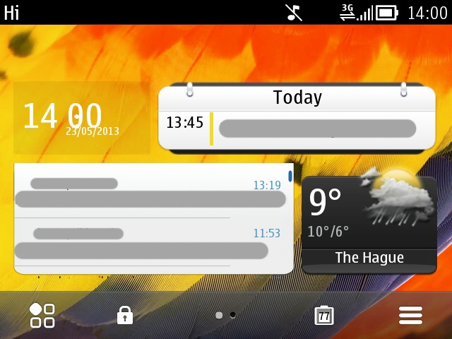
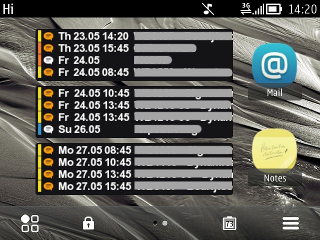
"The first homescreen is mail and calendar centered. Most of the other applications (like Log, Messaging and WhatsApp) are easily accessible using the hardware buttons. The second homescreen is all about the coming week, with shortcuts to the mail and notes apps. The clock and small email widgets are custom widgets (see the links). The calendar widgets on the second page are BizCalendar widgets."
Steve says: Quite a bit of research and effort gone into these two screens, then, especially the way the custom widgets are packed in on the first one. And an impressive demo of how to build up a homescreen Agenda view on the second. Plus a little 'extra buttons' utility action going on, methinks....
Sarvesh Kulkarni (two):
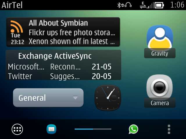
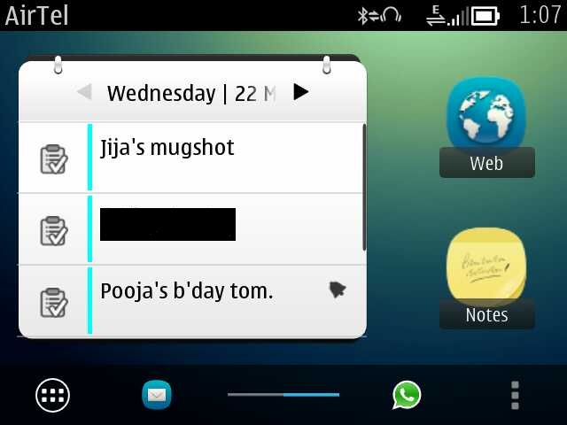
"In the first screenshot, there is the qooRss widget. And below it, the Anna-like email widget and a mini-clock widget. I don't remember exactly, but I think I got it from here. Also, there is Belle Extra Buttons!
I hate to have more than two homescreens, and also, because E6 is a qwerty phone, the one-touch app 'shortcuts' help."
Steve says: Always good to see AAS up there on someone's homescreen. Two nice and simple arrangements here, again with a custom email widget (maybe Nokia should never have axed this for Belle?)
Andy Hagon (two):
"Here are my two E6 homescreens, nice and simple. I've re-jigged the physical shortcut buttons to keep icons on the screen to a minimum, so a long press of Contacts takes me to Settings (don't ask why!), a short press of Calendar key activates the ScreenSnap camera utility (although temporary until I get NuevaSync sorted out), and a short press of Messaging key takes me to a new SMS and long press to the general Messaging app.
I like the simplicity of Symbian Anna on the E6, and how I can squeeze quite a lot of info and apps into one screen. Upgrading to Belle makes sense in a lot of ways, but I'm quite happy with this set up for now. And as a back up phone, I don't feel an urgent need to go to Belle... yet!"
Steve says: Yes, Andy's back, he couldn't resist having an entry in both homescreen articles(!) And he deliberately sought out the old Anna firmware for his E6, which offered (if you remember) d-pad navigation up and across the widget grid, something which got 'lost' in the transition to Belle. Two nice backdrops here and a neat arrangement of shortcuts make for a very pleasing look.
Andrey Ivanov (two):
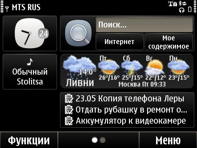
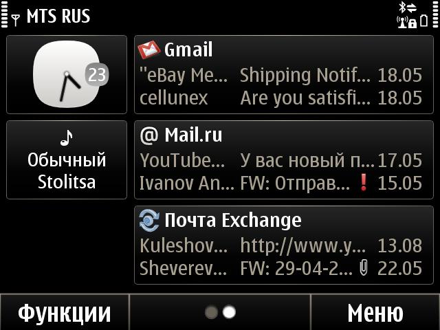
"I tried Symbian Belle on the E6. The device, in my opinion, is more suitable with Symbian Anna."
Steve says: Another user with Symbian Anna installed, by choice. Wow. That looks like qooWeather on the first screen, plus three mailboxes (two IMAP and one Exchange) on the second. But hey, it's all in Russian, so....(!)
Pawe? Czarkowski (three):
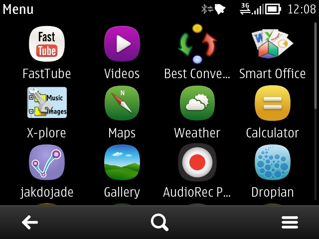
"Attached are my homescreens screenshots - and menu, due to the fact I launch most apps from there. Nothing special, just the most important stuff. My one-touch keys mappings are:
- calendar: Files/Xlator (legacy dictionary, lifted straight from S60 5th edition with no optimisations for S^3 or VGA screen whatsoever; I just can't live without it!
- contacts: Opera Mini/Music player (Quazar doesn't work well on the E6)
- messaging: Slick (awesome IM client, from Lonely Cat Games, freeware, with me for about seven years, from N70)/Messaging
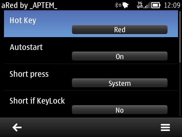
Also included is a screenshot of the S60 3rd Edition (no optimisations, etc.) utility 'aRed' letting you basically use the red/hangup key as a one-touch key. Clumsy, but highly customisable, including mapping Camera as a red key long press(!) I've used it for five years straight, starting from the Nokia E52. It's from the darker side of the Internet, so I'd prefer not to link to it!"
Steve says: Apart from the dodgy reassignment of the 'hangup' key here, I was impressed by the consistent thinking for the right hand bank of toggles, i.e. they're the same on each homescreen and so muscle memory will always hit them. Though I did find it odd that most of these duplicate toggles on the drop-down notifications pane in Belle - maybe Pawel never uses this?
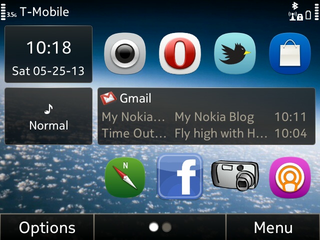
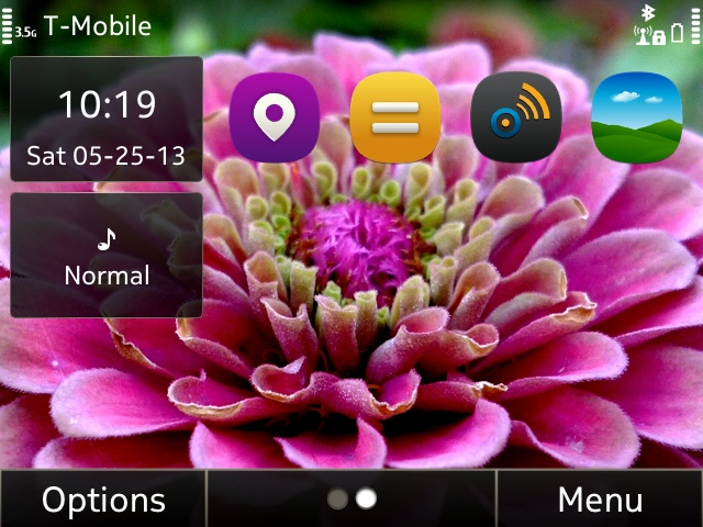
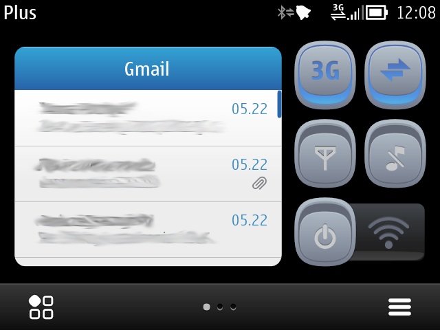
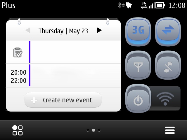
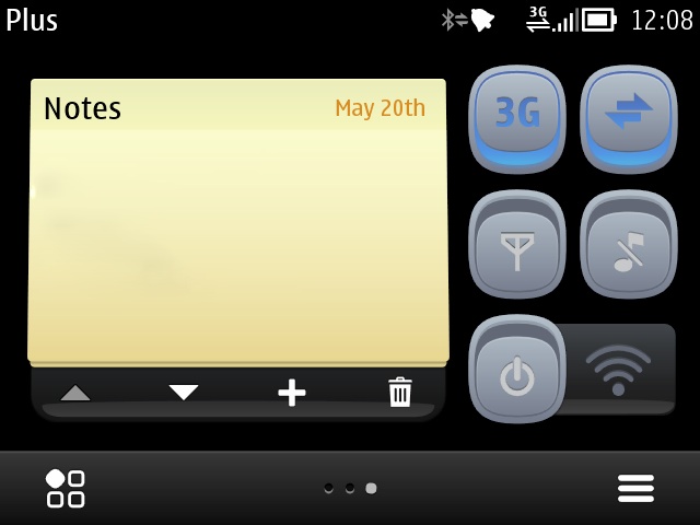
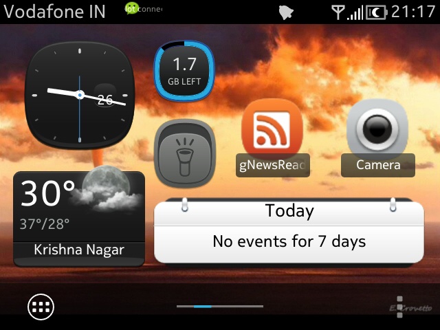
Steve Litchfield (i.e. me, three):
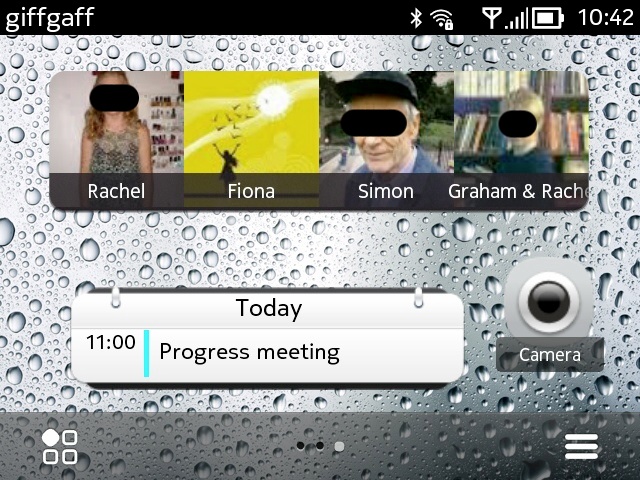
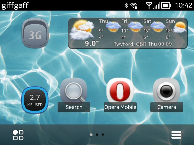
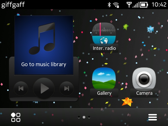
The thinking here is:
- to not to have too many homescreens. With only three, the other two are always just one keypress (left/right) or swipe away, whereas with four or more, you've got to think harder about where things are and do more presses/swipes to get there.
- to have different wallpaper on each homescreen, so that there's a subliminal clue as where I am in my 'system'.
- to have the Camera shortcut in the same place, falling naturally under my right thumb, on each homescreen. With no camera shutter button on the E6, it's utterly bizarre that you can't assign Camera to any of the 'one touch' keys, but at least these shortcuts mean that getting a shot off isn't too much of a chore. Anyone know a quicker way into Camera on the E6?
- to avoid too much duplication with my 'one touch' key assignments. In fact, there's the 'next event' from Calendar, plus my favourite contacts, so there is some overlap.
Aniket Chakrabarty (five):
Steve says: By far the most homescreens in use in this feature, but nicely themed. Home/Status; IM/Social; Email/Office; Office(overflow?!)/Navigation; and Multimedia, along with different wallpapers for each, presumably for similar reasons to me.
As before, if you have a Nokia E6, or are thinking of picking one up on clearance, hopefully these examples have sparked something in your brain - how could a number of 4:3 VGA homescreens work for you? Comments welcome!
No hay comentarios:
Publicar un comentario