Most companies tend to test new features and product designs in the wild with a small subset of people. The great thing about that is that on the Internet, the world is a tiny place. A few tipsters have sent in some screenshots and a video of a new design that YouTube is testing out, and we've confirmed that it's legitimate.
Here's what a YouTube spokesperson said to us:
With more videos coming to YouTube every minute we're always experimenting with ways to help people more easily find, watch and share the videos that matter most to them. As always, we'll consider rolling changes out more broadly based on feedback on these experiments.
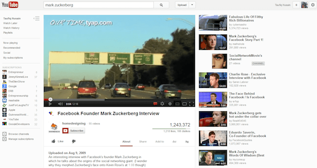
First, let's take a look at the screenshot and then we'll see what's new. I really like it and I hope that it's something that sees the light of day for the entire userbase:
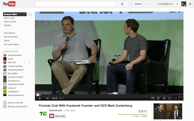
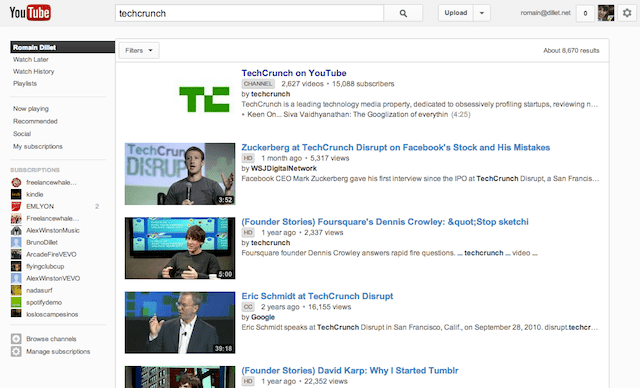
What you'll notice on this video page is that it has a navigation bar on the left-hand side, which drives you to interact with more of your playlists and subscriptions. This is a direction that YouTube has been going in for quite a while, as its current homepage is heavily focused on the channels that you're subscribed to.
Here's what I see for a video page right now, sans left-hand navigation:
(I love that YouTube suggests videos about baldness. They know me well…)
The great part about the design that YouTube is testing is that you don't get "lost" when someone sends you a link to a one-off video. Right now, you can click through similar videos of course, but by bringing all of your subscriptions to the navigation, the site makes sure that you can start digging right in. It's smart.
Here's a video walkthrough from another tipster with a differently designed homepage:
What can we learn from this? Google's video unit is not standing pat on simply owning the space that it's in, and its designers are given the freedom to play around with different things and get some real-world reaction. Clearly, these things aren't turned on for me, but I really like what I'm seeing.
There are elements that one could say feel like "Google+", but you have to remember that Google is working on unifying all of its products, and all of these properties sit under the same company. Basically, Google+ is Google, as I've stated time and time again. More importantly, Google has been consistent with this messaging as well.
Are you seeing this design test? Either way, what are your thoughts?
[Photo credit: Flickr]
YouTube provides a platform for you to create, connect and discover the world's videos. The company recently redesigned the site around its hundreds of millions of channels. Partners from major movie studios, record labels, web original creators, viral stars, and millions more all have channels on YouTube. YouTube is predominantly an ad-supported platform, but also offers rental options for a growing number of movie titles. YouTube was founded in 2005 by Chad Hurley, Steve Chen and Jawed Karim, who...
Google provides search and advertising services, which together aim to organize and monetize the world's information. In addition to its dominant search engine, it offers a plethora of online tools and platforms including: Gmail, Maps, YouTube, and Google+, the company's extension into the social space. Most of its Web-based products are free, funded by Google's highly integrated online advertising platforms AdWords and AdSense. Google promotes the idea that advertising should be highly targeted and relevant to users thus providing...


No hay comentarios:
Publicar un comentario