If you're a new entrepreneur or an angel investor and you haven't heard of AngelList, it's time to get a clue. The hybrid social network, communication and crowdsourcing tool is designed to connect first-time entrepreneurs with angel investors. It's "easily the most important innovation in the industry," as 500 Startups' Dave McClure commented in response to our coverage last month of AngelList's 2011 Yearbook. That product offers users, among other things, a highlight reel of all the activity that went down in the community (500 startups and 2,500 investors joined, resulting in a total of 12,500 introductions), fundings, and more.
Now, we've learned that AngelList is in the process of experimenting with more than just timelines plus CrunchBase data. AngelList Venture Hacker (and former Head of Product at Friend.ly and WePay) Khang Tran says that the company's goal is simple: Help great startups connect with great investors, and, in doing so, it's experimenting with how startups present themselves to investors with a new "pitch deck page."
Co-founder Babak Nivi tells us that the deck remains experimental and that the team may decide not to launch it officially, or may simply incorporate components of it into startup profiles. But, as StartupStats pointed out, while the team is not explicitly saying it, the potential here is to offer its community a standardized format for the oft-used pitch deck, which startups use to introduce their business to investors.
As Polaris Ventures Principal Partner Ryan Spoon wrote earlier this month, the pitch deck is never more important than the actual product/business itself, but finding the best, most succinct way to describe or present your startup is essential to piquing the curiosity of investors and getting them to want to learn more.
Most investors (and journalists) receive hundreds of pitches every month, so finding (as he says) crisp yet complete ways to express your startup's vision, impact, traction, and so on can be the difference between going on to success or finding yourself in irrelevance. Seeing as AngelList has become an extremely valuable resource for founders to be introduced to investors, it's no wonder that they are experimenting with optimizing the design, layout, and media by which startups make themselves known.
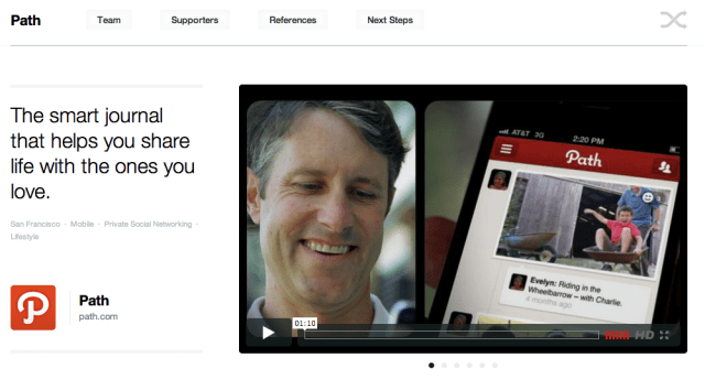
As you can see from this example here , or the one below, the new pitch deck includes the startup's name, location, logo, domain, as well as a carousel that features video and images of the product. Below that, you'll find the team, where they've worked, their areas of expertise, investors, quotes from investors, and the ability to follow or share their profile.

Khang Tran has been the man in charge of the project, and he says that the team drew its inspiration from the original deck of Tailored (a.k.a. DressRush). As most entrepreneurs are well aware, creating a pitch deck is pretty much the best way to get a meeting with an investor. But it's also annoying, time-consuming, and it's difficult as all hell to design a beautiful, succinct presentation that gets investors clamoring for more. Most people struggle when talking about themselves, let alone something as close to their heart as their business.
AngelList's new approach could be a great way to reduce the friction, standardizing the way in which startups format their pitch decks, but the key for AngelList is making sure that they continue offering startups the same (and increased) opportunities for engagement, across the whole slew of profiles on the site, while still bringing them quality investors. That's a pretty tough line to walk, but if AngelList can make profiles less of an eyesore overall, this could be a boon for startups, as investors will spend more time on the site, click on more profiles, hopefully resulting in more introductions.
Personally, I think the pitch decks look great, and streamlining and optimizing the design of the site seems to naturally lead to more engagement. Of course, standardization is double-edged, as it gives those great companies who might not shine in a pitch more equal footing, though it could dilute and make it harder for the great companies to stand out, considering they all come in the same package. But even if it leads to more meetings, is that ever a bad thing? More meetings yes, but more opportunities for startups to shine outside of the page.
While Twitter seems to like it, chime in and let us hear your reaction. Yay or nay?
No hay comentarios:
Publicar un comentario