 Regardless of whether you like them or not, the creation and promotion of infographics has become absurd and out of control.
In fact, there's almost certainly an infographic that illustrates this deluge of information in an easily digestible visual format.
Good infographics are great but many are bland, lots are bad, and some terrible. And to find the inglorious selection of infographics discussed in this post I only had to look at a small selection of tweets from the past week.
If you are thinking about making one, here are four examples not to follow...
1. 20 reasons to switch to Google+
Type:
Misguided | Promotional.
Overview:
An infographic extolling the virtues of Google+ - probably aimed at a younger audience, and 'creatively' visualized using the image of a girl blowing bubbles in the countryside.
Problems:
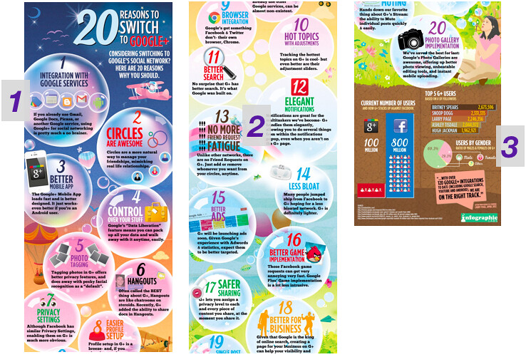
1. Why bubbles? What's the relevance? Are they some kind of tenuous nod to Google+ Circles. If that's as far as the link goes they could've equally used plates crashing out of a cupboard or crisps falling out of a bag.
2. Regardless of who this is aimed at, the tone is disproportionately promotional and the points are obviously biased. If I think very long and hard, I can barely pluralise the reason for using Google+.
3. It's mostly prose: any semblance of infographic is left till the end, where it's revealed that Snoop Dog is second to Britney Spears on Google+, before a statement in CAPS slams the doors on the idyllic pastoral scene by announcing that Google is 'ON THE RIGHT TRACK'.
Takeaway:
Don't make the tone obviously promotional, actually visualise information, and make sure the imagery is fitting and interesting rather than arbitrary.
2. Eat red meat & die
Type:
Extreme | Unconvincing.
Overview:
A deeply chilling infographic about the dangers of red meat consumption.
Problems:
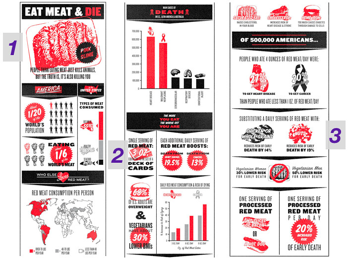
1. It's fanatical and massively ham-fisted. And begins, aptly, with an image that looks like a beef-fist.
2. Given the seriousness of the issues discussed, some stats and statements are unconvincingly garbled and excessive. There's also a genuinely strange comparison between the size of a portion of meat and a DECK OF CARDS, which sounds contradictorily tiny and is almost a reason to go out and buy celebratory kilograms of steak.
3. The solutions aren't realistic either: you cannot directly substitute red meat with 'nuts'. Fish, maybe. But not 'nuts' alone.
Takeaway:
Back an argument with convincing numbers and proportionate sentiment - even on a biased agenda, and especially when the message is serious.
3. 2012 social media marketing industry report
Type:
Bland | Broad
Overview:
This infographic about social media marketing isn't so obviously bad but it's about as interesting to look at as an eyebrow.
Problems:

1. The bland design and pedestrian visualization. There's nothing visually captivating here; why would anyone share this? Did anyone ask that question before rushing this out?
2. Most of the findings are a bit underwhelming too: "Marketers seek to learn more about Google+". Well, If that's the case then these curious marketers should immediately go to infographic 1: for 20 impartial tips on why Google+ works so well.
3. There's no real hook: social media sites are saturated with infographics about social media. This statement could've been added as an overall footnote but then this infographic would've made even less sense.
Takeaway:
Don't just directly turn figures into stats alone with no wit or imagination. Nobody will care - and at least make sure the message is interesting and distinctive.
4. Tupac projection machine
Type:
Non-infographic | Image
Overview:
Demonstrating the increasing theme of basic images that are fragrantly tweeted as infographics, this one's just a picture. A picture of some kind of bizarre but admittedly intriguing Tupac projection machine.
Problems:
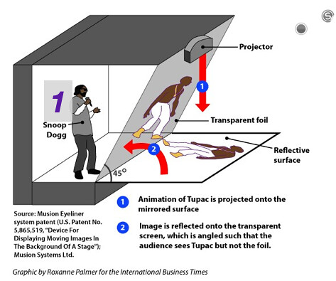
1. What's going on? For no immediately explained reason, rap superstar Snoop Dog pops up - for the second time in this post - to sinisterly lurk inside a parallelogram that's hidden behind a 45 degree angle. And there's lots of unexplained foil.
Is Snoop Dog the sinister mastermind behind infographics, conducting affairs from the safety of this foil-lined parallelogram? After a quick web search I figured out that this is actually about a projection that occured - quite famously - at the Coachella Music Festival, but there's no supporting context or info on the graphic to make this immediately obvious.
2. Plainly, this just isn't an infographic. And the whole things especially confusing if you arrive expecting one - and get this.
Takeaway:
If it's just a diagram, picture, or prose, then it's not an infographic so why tweet it or promote it as one?
Overall Takeaway:
If you're making an infographic don't make it bland, unconvincing or promotional. Make it inventive, informative, truthful, and of course make sure it actually is an infographic.
Otherwise, what's the point?
Next time: INFOGRAPHIC: Top Ten Ways to Completely Annihiliate a Papa John's Pizza Parlour.
No hay comentarios:
Publicar un comentario