 Telecoms selling wireless devices and services face unique conversion challenges.
Supporting customers through a complex sales decision made once every few years that often includes a bundle of phone and tariff plan, add-on services and accessories requires attention to nine key areas from home page to shopping cart.
1. Value propositions
Telecom service providers are highly competitive with promotional offers, and make good use of their home pages to showcase them. Homepages should maintain "scent" from offline advertising, displaying current offers and promotions tailored to a visitor's region.
But offers come and go, and consumers are skilled at comparison shopping. Smartphones and feature phones are commodities - they're usually available from every operator at similar prices.
Unique value propositions and social proof help the customer understand why, no matter what device they are looking for, you are the carrier they should choose.
Value props should appear on product pages as well as home pages, as customers may arrive through paid search, email campaigns, QR codes or affiliate links.
2. Product and plan discovery tools
Mobile devices greatly improve our quality of life, and consumers seek to find the right phone at the right price. But with so many makes, models and features to choose from, customers can suffer from the "paradox of choice." Even customers who know what brand or OS they want need help selecting the right model and accessories.
Category pages with filtered navigation and sort options are table stakes. Guided product and plan finders like Vodafone and Maxis are advanced tools.
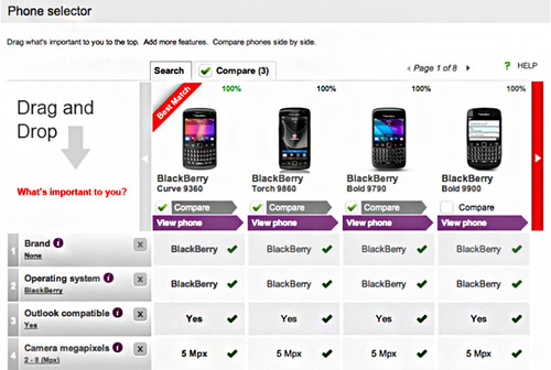
Vodafone enables the user to prioritize, add and eliminate brands and features from a comparison table.
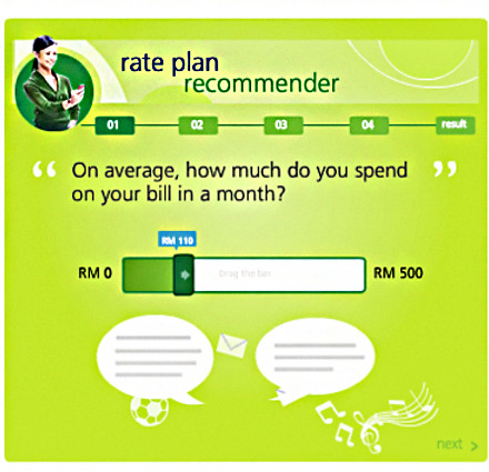
Maxis uses a stepped "quiz" format to recommend the most suitable plan.
3. Site search presentation
Sort and filter tools should be made available on search pages in addition to category pages.
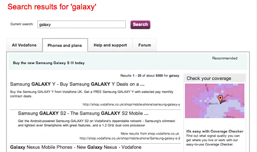
Users should be able to separate product results from support content and forum threads.
4. Rich product content
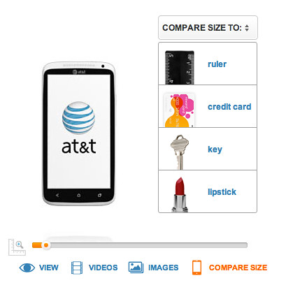
Multiple images are helpful to any product page, but 360 degree views, size comparison, videos and interactive demos help customers experience the device sight-unseen and build confidence in the purchase decision.
5. Stepped selling
To maximize revenue, you want customers to bundle a device and plan with add-on services and accessories. Without a guided, stepped process customers may neglect the add-ons.
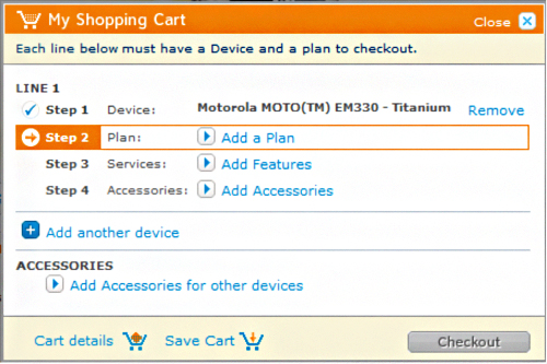
There are many ways to design a stepped process, from lightboxes to interstitial pages. AT&T presents a linear process similar to a checkout.
6. Make smart recommendations
Coming back to the "paradox of choice," presenting fewer cross-sell suggestions can actually lead to higher attachment rates. Choose product suggestions by margin, relevance, sales rank or customer reviews, but make it clear that recommendations play nicely with the device the customer selected.

7. Upsell in the cart wisely
There is debate whether cross-selling in the cart helps or hurts conversion. The answer is both yes and no. It depends on the cross-sell design, usability and content.
Does it distract from the checkout button? Are cross-sells relevant? How many are presented? Are price points suitable? Can they be added directly from the cart or do they hijack the visitor out of the flow?
Cart merchandising is a tactic that should always be tested and re-tested. Testing once and deeming it a failure without tweaking your design and merchandising and re-testing leaves recurring revenue on the table.
8. Save cart contents
Persistent carts keep contents in tact across sessions, and are important for any e-commerce site. Mobile plan and tariff transactions may require buy-in from family or co-workers, and final commitments may not happen in a single session.
If your site must comply with the EU privacy directive, there are plenty of good examples of how to gain consent.
No hay comentarios:
Publicar un comentario