Short Version
Motorola made plenty of waves when it introduced the Droid RAZR for Verizon last year, and somehow I doubt AT&T was very pleased with that move. With that one launch, Motorola instantly made AT&T's high-end line of Android-powered Atrix smartphones look chunky and downright un-sexy in comparison
Now with the Atrix HD AT&T has its own vaguely RAZR-esque device to push to the masses, but how does it stack up against its forebears? Or, better yet, how does it compare to the devices that occupy the top tiers of AT&T's smartphone portfolio? As it turns out, the answer is "pretty damned well."
Features:
- 4.5-inch 720p LCD display with ColorBoost
- Android 4.0.4 Ice Cream Sandwich with Motorola's custom UI
- 1.5GHz dual-core Snapdragon MSM8960 processor
- 1GB of RAM
- 8GB of internal storage, expandable with microSD cards
- 8MP rear camera, 1.3MP front-facing camera
- Runs on AT&T's LTE network
- MSRP: $99 with two-year contract, available as of July 15
Pros:
- Motorola didn't screw with Ice Cream Sandwich too much
- Excellent display
- Surprisingly strong spec sheet
Cons:
- Uninspired design
- The camera is generally pretty lousy
- Battery life isn't the greatest
Long Version
Hardware/Design
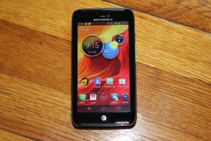 I'm a sucker for a handsome phone, and to put it plainly, the Atrix HD isn't much of a looker. It's not ugly by any stretch (it's far too inoffensive for that) but it seems like a considerable step backward from the progress Motorola made with devices like the Droid RAZR.
That said, the Droid RAZR's influence is undeniable — if one of those svelte, angular devices suddenly got chubbier and softer around the edges, you would have an Atrix HD.
But let's put those gripes aside for a moment, because there's another one to dig into. The Atrix's impressive 4.5-inch LCD display (ensconced in a protective layer of Corning Gorilla Glass) takes up most of the device's face, but it seems a hair smaller than it actually is because it's bounded by a pretty substantial bezel. In a way though, that bezel is something of a trademark of the Atrix family — the very first one had quite a bezel on it too, as did the Atrix 2.
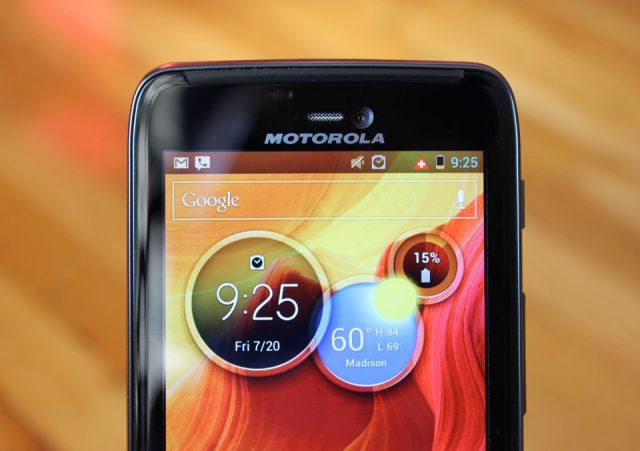
A notification LED and the 1.3-megapixel front-facing camera sit to the left and right of the Atrix's earpiece respectively, while a Motorola logo squeezes between those components and the top of the display. Centered just below the display is an AT&T logo, which happens to look an awful lot like a capacitive button — after years of using iPhones, my thumb instinctively reached for it a few times before I managed to get it accustomed to its surroundings.
Nestled at the very top of the device are ports aplenty since Motorola opted to stick the headphone, microUSB and microHDMI ports up there. The microSIM and microSD card slots are nestled under a pull-out plastic tab along the Atrix's bottom left edge. Meanwhile, the volume rocker and the infuriating sleep-wake button sit high on the device's right edge; I say infuriating because pressing either too high or too low along the button's ribbed edge won't bring the Atrix to life.
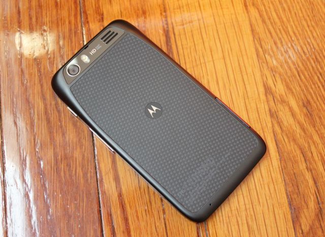
Fortunately, the Atrix's rear end is far less problematic — unless of course you're not a fan of the patterned Kevlar that takes up a majority of the space. Save for a thin and chintzy-feeling layer of plastic that runs around the rear's outer edges, the only other thing not covered in the scratch-resistant material is a gently sloping plateau containing the 8-megapixel camera pod, LED flash, and rear speaker.
While the Atrix HD looks downright plump in comparison to its Verizon cousin, that doesn't mean it has the weight to go with it. In fact, the situation is quite the opposite — at 4.9 ounces (the same as the iPhone 4/4S) the Atrix feels almost disconcertingly light given its curvy physique. I know, it's a tough job to strike a comfortable balance between size and weight, but the device's overall feel doesn't do much to inspire confidence.
Software
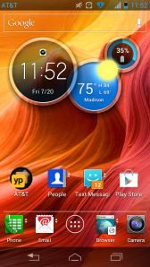 After seeing Motorola clutter up its Android devices with its overbearing custom UIs for years, playing with the Atrix's tweaked spin on Ice Cream Sandwich is like being able to breathe easy for the first time. It's certainly not stock ICS, but Motorola has apparently decided to leave most of Google's handiwork well enough alone — frankly, good on them.
Even more surprising is that what Motorola added to the mix is either generally unobtrusive or genuinely useful. Take for instance the small pair of arrows that now live next to certain apps like the phone dialer or the stock web browser. They're there as a little visual hint, as swiping up or down on those icons allows users to jump into a quick view of information related to that app — for the dialer, a swipe brings up a list of favorite contacts, while a swipe on the browser icon displays the user's bookmarks. Sure, they're mostly things that users can set a widget for, but adding a subtle way to easily access and hide that kind of information is terribly thoughtful.
Also — and this may be a remarkably dorky admission — but Motorola's default Circles widget is a mighty nice touch. The widget's three circles display time, weather, and remaining battery life respectively, but as with those app icons, swiping up and down on individual circles lets users switch between different bits of pertinent data. Prefer a digital time readout over an analog one? Swipe away. Want to switch from a battery meter to a data usage tracker? You know what to do.
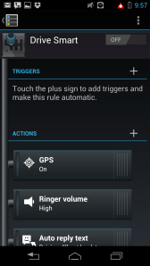 Motorola also transplanted SmartActions to Ice Cream Sandwich, which (if you haven't yet heard) allows the device to execute certain user-defined actions when triggered by information like time or location. I've always fancied myself as more a "go with the flow" kind of guy, so I admittedly don't rely on the automation feature much, but it's simple enough to create an action for every stop or random event in your day.
Still, It should be known that there's a peculiar sense of fun to be had in cobbling together new Actions, just because of the sheer flexibility afforded to the app's users. Be on the lookout for SmartActions notifications though, as the app will keep suggesting new possibilities to you whether you like them or not until you pop into its settings and prevent it from doing so.
Perhaps the only truly clumsy part of Motorola's UI is how users add new homescreen pages. You see, the Atrix HD has two of them set up out of the gate, and swiping to the right from the main page brings the options of adding a blank one or choosing from a series of homescreen templates to fire up. The problem here is that the transaction is noticeably jerky, especially considering that navigating through menus and apps is otherwise incredibly smooth. There are arguably cleaner ways to handle this process — a spin on HTC's classic "hold down the home button" approach comes to mind — but it's a minor gripe at best.
Add some redesigned icons, and you've got Motorola's take on Ice Cream Sandwich in a nutshell. Apologies if I'm gushing a bit — I've never tried to hide the fact that I don't like what manufacturers usually do to stock Android, so its little surprise that I've quickly grown to like Motorola's "make minor, thoughtful improvements" approach.
As with every other smartphone AT&T has sunk its metaphorical teeth into, the Atrix HD comes with its fair share of bloatware. Most of those pesky apps can be uninstalled without issue (hallelujah!), and the rest can be disabled and hidden without too much effort. Sure, it's not quite as good (or as satisfying) as removing them outright, but the little victories are better than none at all.
Camera
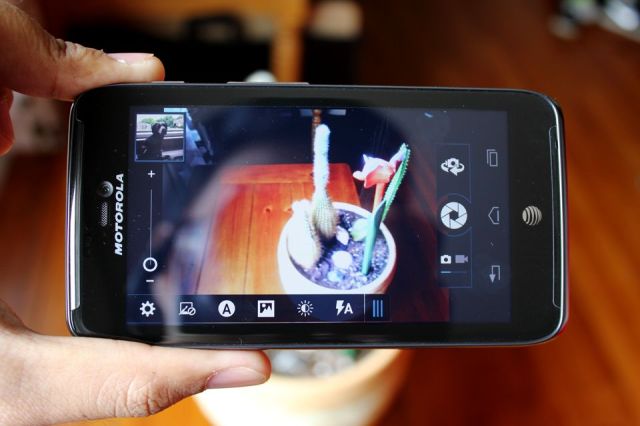
The Atrix HD has some great things going for it, but top-notch camera functionality just isn't one of them. Don't get me wrong — the camera will do in a pinch when you absolutely have to snap a photo, but its performance is ultimately underwhelming.
The issues here are numerous. Autofocus was a bit on the screwy side, for one — when left in full auto mode, the camera easily homes in on nearby objects but struggles to produce a sharp image when trying to focus on something farther away. White balance too seemed off, which sometimes led to predominantly white shots taking on a blue cast. Low light performance was similarly disappointing, with a fair amount of grain visible once light dims below optimal levels.
In fairness, it's not all bad — like with other Ice Cream Sandwich devices snapping shots is incredibly quick, and videos recorded in 1080p don't come out half-bad all things considered. On the off chance you think that a good camera is the single most important feature a smartphone can have, you'd do well to steer clear of the Atrix HD. Otherwise, the weak-put-passable camera is a notable sore spot in an otherwise solid device.
Display
While I'm more than happy to knock the bezel that runs around it, I can't do the same for the Atrix HD's 4.5-inch 720p display — it's yet another pleasant surprise in a phone that seems designed to confound expectations.
As usual for TFT LCD panels, the Atrix HD's display lacks the deep, sumptuous blacks seen in AMOLED displays, but white levels were consistently bright. On top of that, the display's combination of size and resolution means everything is nice and crisp. To be more specific, the display features a pixel density of 326 ppi — handily beating powerhouses like the Galaxy S III (306 ppi) and matching handsets like the iPhone 4/4S.
Then there's the color situation. Everything is nice and vivid (especially the tweaked app icons the Atrix is laden with), and colors remained bright as I bounced from viewing angle to viewing angle. Motorola also saw fit to throw in their new Colorboost functionality, which pumps up color saturation for more vivid images.
The Atrix is far from the first handset to try something like this — Sony's Xperia ion tried the same thing with its Mobile Bravia engine but it pushed saturation to nearly lurid levels. Motorola's Colorboost enhancements thankfully didn't push things quite that far so users can expect and images visuals to pop instead of going outright nuclear. That said, not everyone may enjoy that additional visual flair and there's no way to disable it, so it's definitely worth taking a look at in person before taking the plunge.
Performance
Well now — the Atrix HD may not look like much of a contender, but there's some real horsepower packed inside that unassuming frame.
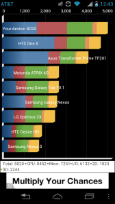 Motorola wasn't very forthcoming with processor details when the device first popped up on their website on one fateful July evening, but AT&T later confirmed that the Atrix HD runs on the same dual-core 1.5GHz Snapdragon MSM8960 chipset as seen in heavyweights like the HTC One X and the Galaxy S III.
That's quite a catch for the budget-conscious handset, as it regularly puts up Quadrant scores just north of 5000 (the average of five trials was 5084) — not shabby at all, especially compared to the One X's five trial average of 4995 and the U.S. Galaxy S III's average of 5063.
That said, there was virtually no lag to be found while navigating between through menus and swiping through multiple pages of apps. Firing up and playing through some Grand Theft Auto III and Minecraft Pocket Edition was similarly smooth, as were my usual test videos (i.e. old episodes of Doctor Who). Suffice it to say, the Atrix should have no trouble keeping up with even the most demanding daily grinds.
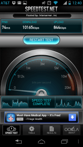 As far as the Atrix HD's network performance goes, I found little to complain about. It's always sort of a crapshoot testing from my particular corner of New Jersey (especially because AT&T hasn't yet seen fit to bring LTE online around here), but the Atrix HD managed to pull down an average of about 9.6 Mbps down and a strangely slow 859 Kbps up. Call quality too offered few disappointments — calls were generally very clear for people on both ends, though there tended to be a bit of audible buzz from time to time. Maximum call volume could have been a little higher though, but on the whole I had no trouble nearing people on the line, and vice versa.
I'm a bit of a stickler for nice speakers on smartphones, and the three-hole speaker embedded into the Atrix HD's rear is decidedly above-average. It's far from perfect (audio tended to be a tad on the echoey side) but it's plenty loud enough or a little grooving on the go — something that plenty of other handsets have trouble with.
Battery
Though not as disappointing as the camera, the Atrix HD's battery did skew toward the underwhelming side of things. Like its slim Verizon-bound cousin, the Atrix sports a sealed 1780 mAh battery underneath that Kevlar black plate. That battery gave Jordan some trouble when she reviewed the Droid RAZR way back when, but the situation isn't quite as rough this time around.
The Atrix HD managed to plug along for 5 hours and 10 minutes of our usual stress test — an automated series of Google Image Searches with the display set to 50% brightness. Meanwhile the Atrix HD only lasted just under five hours in our video stress test, in which the device loops a 720p video at 50% screen brightness and with volume cranked all the way up.
When it came to getting me through a normal day of calling, web browsing, checking emails, and sending obnoxious text messages, the Atrix managed to hang in there for just under eleven hours of on-again-off-again use before finally going dark. As always, your experience is going to differ from mine — that ten hours was enough to see me through most days but if you're the type to unplug your phone and start your day when the roosters crow, you'll almost definitely have to reach for that charger before day's end.
Really, the most frustrating thing about the battery is that Motorola could easily have gone for something bigger without sacrificing too much in size. With its 8.4mm waistline, the Atrix HD is just over half a millimeter thinner than the Droid RAZR Maxx. Some concessions probably had to be made for the updated hardware that went into the thing, but would it have killed Motorola to pop in a slightly more substantial battery?
Conclusion
Let's touch briefly for a moment on what the Atrix HD isn't. It's not the kind of that phone will turn heads as you walk down the street. It's not the most solid feeling device you'll ever pick up. It's not a terribly great camera, either.
It is, however, a hell of a phone for just $100. What the Atrix HD lacks in style (and it lacks a lot in style) it makes up for with plenty of substance — a mostly untouched flavor of Ice Cream Sandwich, a surprisingly strong spec sheet, and a great display make it a wallet-friendly dark horse that stacks up favorably to the carrier's heavyweights. While an extra $100 will afford you a device that combines striking looks and some serious horsepower, the Atrix HD is an excellent choice for those who couldn't care less about style.
No hay comentarios:
Publicar un comentario