Against this fairly impressive list of advantages, the E6 has three fairly major downsides, most of which I'll try and address or work around below, namely:
- Compatibility issues with existing Symbian applications - around 50% simply don't officially support the VGA screen resolution and so don't appear in the Nokia Store for the E6. Which doesn't mean that you can't experiment with side-loading apps written for nHD screens, but more of that sort of hacking below!
- The small 2.46" screen makes the E6 relatively poor for multimedia consumption and relatively poor for web browsing, in particular. In addition, some screens and fonts can be hard to read - though I largely address these issue below.
- Symbian Nokia Belle brings advantages under the hood, but it's unashamedly aimed at all-touch nHD devices, which means that some UI screens (e.g. homescreens, Web) are either optimised badly for the VGA 4:3 screen here and/or are only navigable using touch, with no d-pad or keyboard options whatsoever.
- Problems with dust getting under the display. Perhaps not unique to the E6, but some E6s, including mine, do seem somewhat prone to dust. I'll have a feature on taking an out-of-warranty E6 apart to fix this in due course.
All of which sets the scene for 'pimping' the Nokia E6, i.e. doing everything I can to bring it up to full, useable functionality, as at Autumn 2012. You may wish to follow all of the steps below or simply cherry pick the ones which are easiest or most needed.
Firmware
This is a contentious issue. Starting with Symbian Anna, which had been tailored fairly well to the d-pad and keyboard, all the Symbian^3/Anna devices then got an upgrade to Belle and then to Belle Refresh, which brought significant under the hood improvements in terms of codecs, compatibility, application upgrades (most notably to Web, see the links above). In fact, Belle Refresh still hadn't been approved yet for my E6 product code, so I used other (cough) means to flash on the generic 'Euro' Belle Refresh firmware.
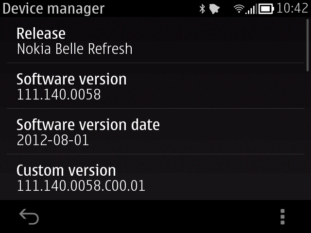
As mentioned above, Belle isn't exactly perfectly optimised for the E6 and there's a serious school of thought which says that Anna was preferable in that the homescreens and application launcher were far better optimised for d-pad use. I did try flashing on Anna (again) but failed - it seems that downgrading firmware is a no-no in terms of Nokia tools - special certificates are needed, for security reasons. So, even if Anna-plus-selected-app-upgrades proved better overall, I couldn't possibly recommend it to you, the reader, because it's just about impossible to re-implement. In any case, I think Belle Refresh has just enough that's new, shiny and better that, with the tweaks below, it trumps pimping an Anna-based system.
Do make sure you get Belle Refresh, though, by hook or by crook - the properly debounced keylock switch alone is worth the pain of upgrading!
Full-screen wherever possible
Given the physically small screen, it pays huge dividends to try and avoid situations where content is obscured by toolbars. Here's how to fix two of the biggest culprits - Web and Social. In essence, try not to use either of them!
- Web - switch to Opera Mobile or Opera Mini
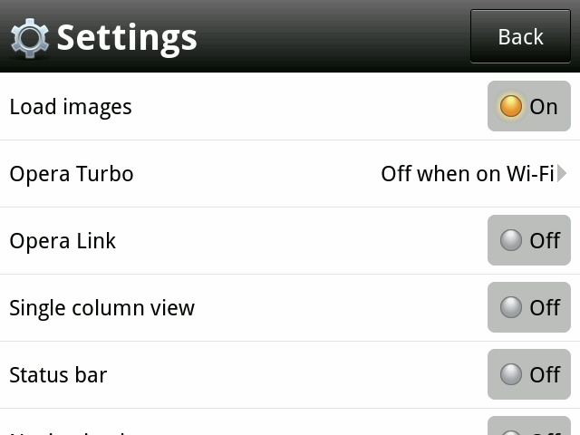
The problem with Web for Symbian Belle is that it's geared to portrait nHD screens and the toolbar at the bottom is permanent - unbelievably, there's no way to turn this off! The solution, albeit a drastic one, is to switch to Opera Mobile or Opera Mini, both of which have the option to disable the 'navigation bar' in Settings, so you can browse web sites full-screen. Add in the varying amounts of content compression (depending on which version you use and your settings) and you have a reasonably fast, full-screen way of browsing even quite byte-heavy web sites on your small-screened E6.
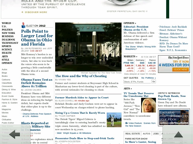
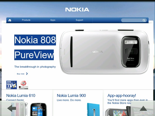
You can get either Opera browser by going to m.opera.com in Web on your phone and tapping the right link. Once installed, head into Settings and turn off the 'Status bar'. I also like to have the 'turbo' mode turned off when on Wifi and on when on cellular, since this gives a speed boost when bytes are coming in more slowly:
Actually, there's another option, which is where number 2 in the next bullet point comes in....
- Centralise your E6 social use around Gravity
Although there are several Twitter clients for Symbian and, of course, Nokia Social built in, my overwhelming advice is to ignore all of these and install Gravity - always get the latest version from here. Yes, it's a commercial application, but worth its weight in gold, for three reasons:
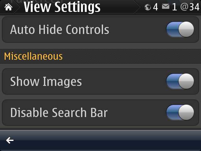
- Each of its social and service timelines can run in a clever hybrid full-screen mode, wherein the toolbar is auto-hidden when you're swiping upwards, i.e. to see more content further down the display - the toolbar then reappears when you swipe downwards, to go back up, ready for use. In 'View settings', turn both 'Fullscreen' and 'Auto Hide Controls' on and you're ready to rock.
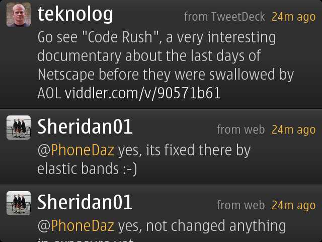
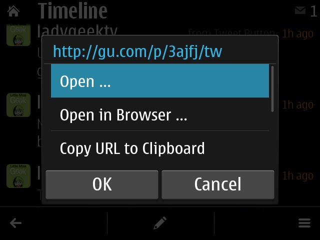
- When you tap on a link in Gravity, there's not only a great chance that you can simply 'preview' its content - so for an image, you get to see just the image and not all the surrounding web page frippery of the hosting site, but there's also a full instance of Web built-in - but without the permanent toolbar limitation. In other words, tap a generic web page link from a social update and opt to 'Open' it directly in Gravity and you're browsing full-screen, all the time.
- In addition to the well publicised advanced handling of Twitter and Facebook, did you know that Gravity also has support for both Google Reader and YouTube? In fact, Gravity makes a surprisingly good client for keeping up to date with your subscriptions in YouTube on the E6, with no messing around with mobile web sites or needing an extra add-on application. Watch out for an article on these extra aspects of Gravity very soon on AAS.
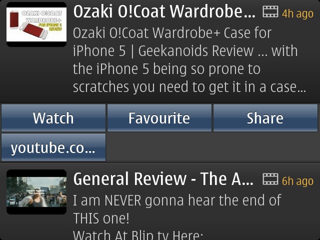
With the full-screen entry of text for replies and updates, Gravity on the E6 is a fairly sumptuous experience. For my eyes, I do like to keep te 'Font size' set to 'Large', as seen here. - Each of its social and service timelines can run in a clever hybrid full-screen mode, wherein the toolbar is auto-hidden when you're swiping upwards, i.e. to see more content further down the display - the toolbar then reappears when you swipe downwards, to go back up, ready for use. In 'View settings', turn both 'Fullscreen' and 'Auto Hide Controls' on and you're ready to rock.
Display fonts and appearance
In addition to fiddling with the display font size in Gravity, mentioned above, you may find it very helpful to make a tweak or two globally on the E6. Summarising my previous article:
Somewhat obvious, but crank the brightness up and give your eyes more of a chance. You'll find this in Settings/Phone/Display. Although there's greater power consumption involved, the E6 has such a large battery that I doubt you'll notice much difference.
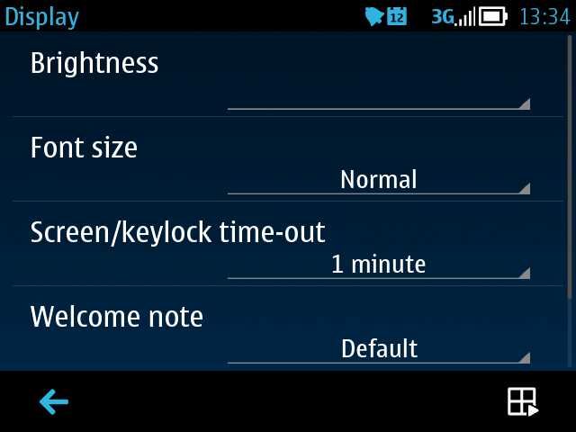
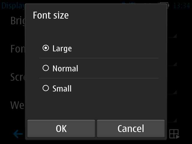
In addition, there's a setting in the same dialog as above, letting you change the 'Font size' to 'large'. This does have an effect on most dialog panes and scrolling lists (e.g. in Contacts) in the interface, but is a not a cure-all panacea - third party applications in particular will retain their original font choices and text may still be too small. But well worth a try.
The last resort is to use Font Magnifier, a commercial utility that Nokia licenses for all its qwerty candybar phones. Essentially, it substitutes font sizes of its own for standard sizes used by the OS, at quite a low level. Thus, Symbian OS wants to use a 13 point font to display a message, but with your custom setting in Font Magnifier applied, what actually gets written to the display is (for example) a 15 point font, or even larger. Setting Font Magnifier up is really easy - you don't have to know anything about font sizes - you just adjust the on-screen slider by the magnification amount needed and then tap on 'Apply' on the menu. The E6 reboots and you're all set. There's a little trial and error needed, according to your eyesight - I found that using about "117%" was about the maximum I could get away with, in that it made most text large enough to read easily without screwing up the formatting of many applications' screens.
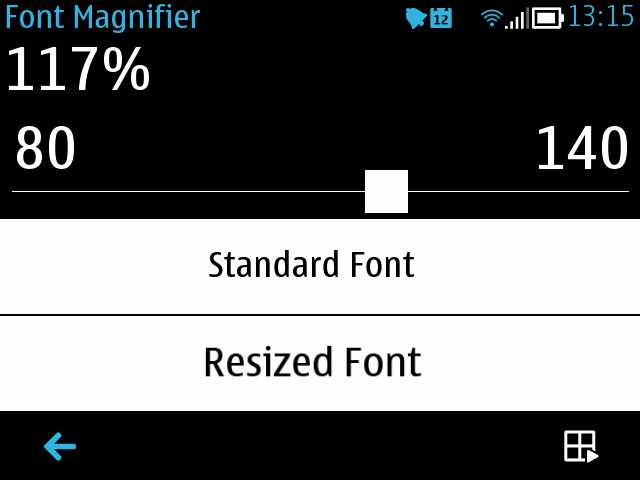
Adjusting the Font Magnifier slider as needed; to set, tap on the menu icon and then on 'Apply'
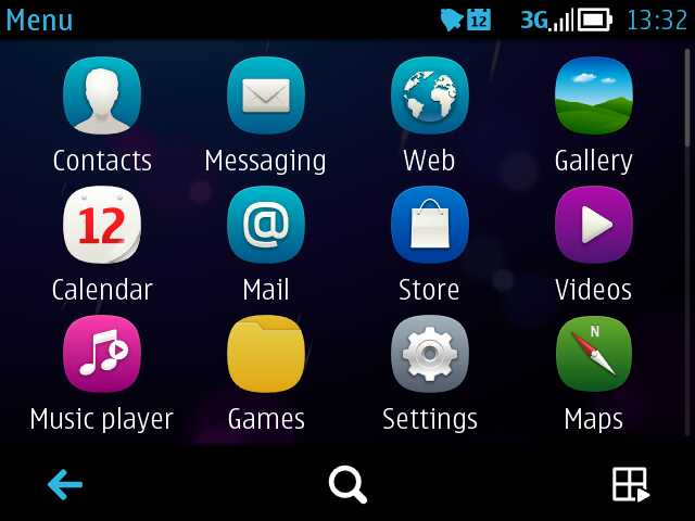
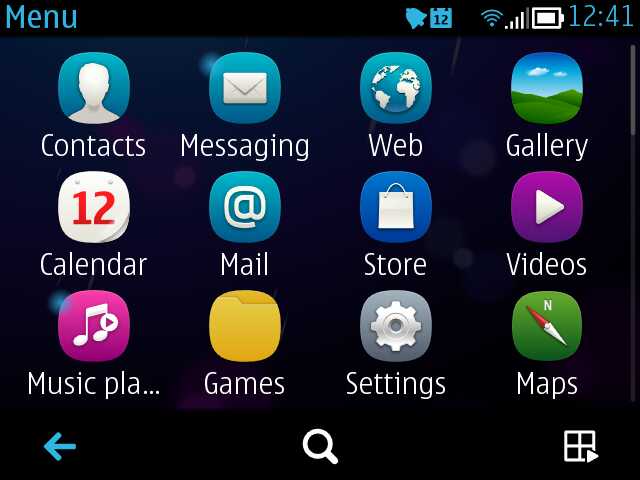
Before and after - the app launcher menu, with everything zoomed by 117% on the right
NB. Note that some Symbian applications with heavy graphical bent, e.g. Calendar's Month view, ignore even the Font Magnifier setting. But these are, thankfully, the exception and not the rule!
Homescreens
Regular readers will know that I'm a stickler for a simple homescreen setup - wasting valuable seconds swiping around six homescreens is just annoying, especially when with the E6 there are the aforementioned six programmable hardware shortcut buttons to launch or switch to apps. After a huge amount of experimentation, I ended up with this set up:
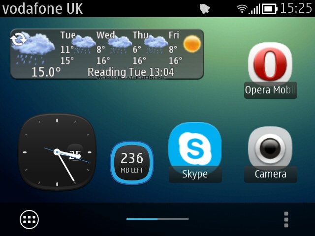
Nokia's standard Maps Suite weather widget hasn't (yet) been produced for the E6 (because it would have to be reworked for the higher resolution), but fear not for qooWeather's weather forecast widget is excellent, as shown here. Skype and Opera Mobile are two oft-used applications on my E6 for which I didn't have spare hardware shortcut keys. Note the analogue clock, useful as both information and also a shortcut to the Clock application (for alarms, etc.), plus the very useful Symbian Belle Refresh 'Mobile Data Tracker', letting me know how I'm getting on with this month's data tariff...
Finally, note the Camera icon, bottom right. There's no camera shutter key on the E6 for the obvious reason that snaps are taken in normal 'upright' mode and the d-pad is the obvious shutter button. Oddly, Camera can't be assigned to a hardware key, so there's the choice of finding it in the main application menu or putting it on the homescreen. In fact, because really quick access to Camera is often so important, to catch that 'moment', and I don't want to be caught on the 'wrong' homescreen, I put the Camera shortcut icon on both my homescreens, in the same place, so that 'Home' will always give me the icon I need in the same place, for easy and quick activation:
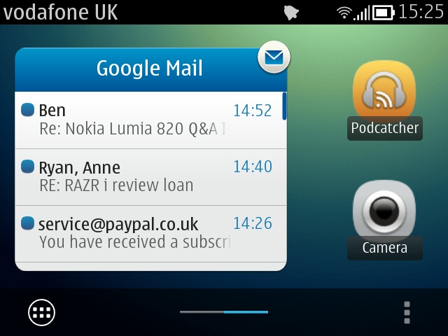
Note also the Podcatcher shortcut. Like Camera, the E6's button shortcut system doesn't seem to accept this app as a valid choice! Hence it's on a homescreen shortcut. I've experimented with several of the E6's over-sized Belle widgets - Calendar was quite useful but with a dedicated hardware button a few mm below, it seemed a bit redundant. The Music player widget was also somewhat redundant, in that once music's playing on the E6, confirmation and a shortcut appear on the drop-down notifications bar. Leaving the (also large) email widget, which is handy as it reminds me of anything urgent that has just come in.
And before anyone asks, this is my favourite Belly Jean theme, giving a vanilla Android look and feel... 8-)
Application menu
With screen real estate again at a premium on the E6, the change to Belle, with its 'flat' application launcher, was a potential disaster. However all that's needed is a little tweaking. We've already mentioned the large number of hardware and homescreen shortcuts, so you won't need to dive into the scrolling application menu more than a couple of times a day. What's important is that, when you do, it doesn't take five minutes of scrolling to find the application you're looking for. I have two strategies:
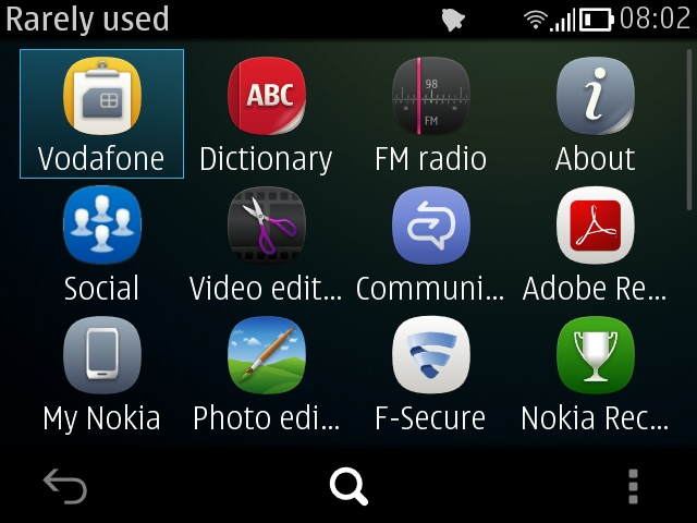
- Make a new folder ('Options/New folder') and call it 'Rarely used' (or similar). Then long press each icon that you think you'll almost never need and 'Move to folder', putting each in this new folder, out of the way. Don't worry, you can be as zealous as you like here, you can still find the apps again using strategy 2 below(!). After five minutes of 'moving', your application menu should be lean and mean, with probably no more than about 20 or 30 applications in a couple of screens of icons.
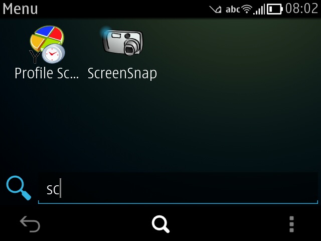
- Use the E6's qwerty keyboard to quick find applications. In just the same way as you can start typing on the keyboard on the homescreens to quick-find contacts (what - you mean you don't already do that?), you can also mash down the 'Home' button to bring up the application menu and then immediately hit the first character or two of any application that you know is installed - the icons reduce down instantly to just the apps quick matched. In practice this is a huge time saver, especially if you suspect that the icon you need is down near the bottom of the app menu or filed away in a folder.
Media consumption
Music and podcasts are actually a stronger suit on the Nokia E6 than on almost all of the other Symbian phones of recent times, thanks to the d-pad. You see, this may not be obvious, but rather than just stabbing at a touchscreen for music control, you can press in the d-pad to play or pause, or press left or right to go back or forwards. Long presses left and right allow cue and review functions too - it's a lot easier to do all this than try and time finger contact with a touchscreen, trust me, especially when on the move.
One of the weakest areas of the E6 is its form factor in terms of suitability for video consumption. Whereas 4:3 aspect ratio videos were all we had for years (e.g. QVGA, VGA), almost all video material that is available today comes in some form of widescreen form, usually nHD or WVGA or 720p, which means that if you try and play it on the E6 (whether as an MP4 file on mass memory or microSD, or using the YouTube web site or a YouTube client), you'll get black bars top and bottom so that the horizontal resolution fits nicely on the E6's VGA-width screen, like this:

Which is a bit galling when you're already watching the video on a small screen - the last thing you need is 30% of the display area blocked off with black bars! The best solution is to use a feature that almost noone knows about - the Symbian video player's ability to crop in at playback time. The setting is remembered too, and the cropping function is almost always available. Tap on a video during playback and then on the '...' icon and 'Change aspect ratio':
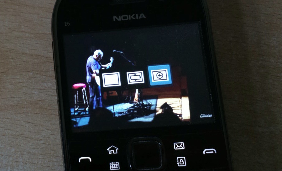
The left icon is the default ('fit to width'), the middle one is 'stretch', essentially stretching the video frames to fit the vertical height as well - in this view, you'd see every pixel in the original video frames, but everything would look a little deformed and odd.
For general video watching on the Nokia E6, I highly recommend giving the third option a try: 'zoom'. Here, the video is fitted to height and the bits of the video frame that lie to the left and right of the edge of the display are omitted. In other words, you're seeing the whole of the central 80% or so of the video frame and missing just the outer bits. On a small screen though, this gives a really decent magnifying effect, as can be seen below, in the equivalent full-screen grab of the same scene shown above with top and bottom bars:
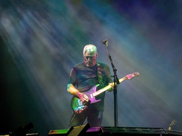
If the difference looks dramatic here, large on-screen in your web browser, then be reassured that it's just as dramatic on the small E6 screen while watching. In fact, add a 99p phone stand and the E6 makes an acceptable little mini-TV or video player in the kitchen while you're cooking or doing the washing up...
Camera
Although the E6 has a physically smaller screen than devices like the Nokia N8, it's worth noting that all the same advanced options are there in the interface, from ISO adjustment to colour balance. Experiment!
Outdoors, in good light, the EDoF camera produces very good images indeed, with a fast shutter speed and zero lag because there's no focussing needed. Just make sure not to get closer than about half a metre to your subject and you'll be fine, i.e. usual EDoF practice.
Indoors, in low light, the E6 camera struggles, as do almost all camera phones, in all honesty. You can often get best results by turning off the dual LED flash and simply upping the ISO 'Light sensitivity' to 'high' and trying to snap subjects (usually people) when they're still for a moment. This is harder than it sounds, especially for kids and pets, but time the shot right and you'll still get a decent photo. Which, for a camera unit as small as the one in the E6, is something of a feat.
Also worth noting is that general Symbian imaging applications also generally work fine. For example, Nokia's free Panorama tool. I installed this and then took the test shot below on the E6 in overcast conditions - click to enlarge or download. Not bad results, considering the lighting:
Gaming
Gaming on Symbian in general has always been a bit of an afterthought. The blame must ultimately lie with the development tools, i.e. that it was always a bit hard for new developers to come on board and be productive. The number of quality games produced for Symbian in total isn't much more than a hundred, by my estimation. And those are mainly hard-coded for nHD-screened devices - only a fraction of these work properly on the higher resolution landscape VGA display on the E6, which means that gaming choices on this Communicator are rather limited.
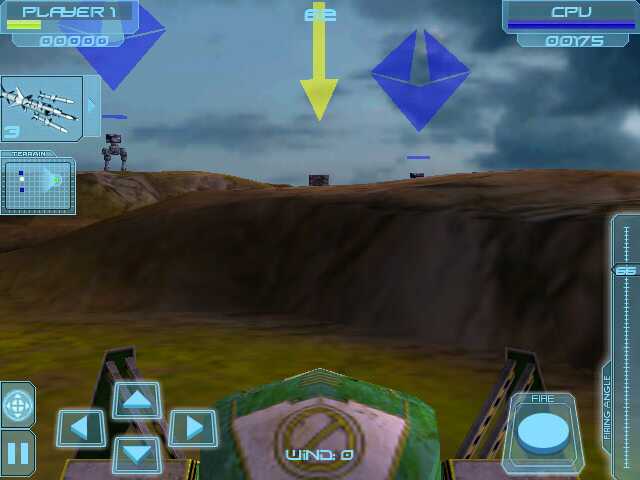
Regardless, we've done a dedicated feature on E6 gaming, with titles like Yacht II, Angry Birds, Mau Mau, Iron Sight HD (shown below) and Raging Thunder HD all getting highlighted. So it's not quite all work for the E6 owner...
Miscellany
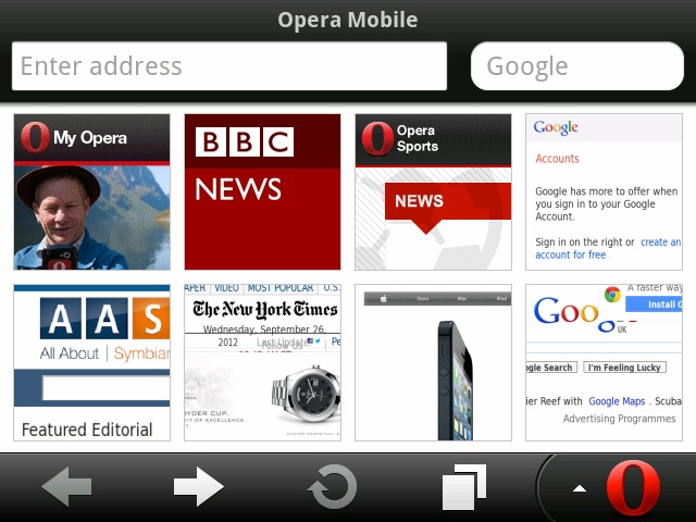
Although Gravity, above, does a great job of handling Twitter and Facebook, I'm also rather partial to Google+, though there's no official API for this yet, which means I had to think laterally in terms of accessing this on the E6. Happily, plus.google.com worked rather well in Opera Mobile, as shown below. I have it set to one of my Opera Start page panels and then Google+ is only ever a tap away:
Although a surprising number of Symbian applications aren't shown in the Nokia Store for the E6, at least half the time it's because the developer hasn't bothered to let the Store know that their application does work on this device. For example, the popular Handy Safe Pro, which works fine on the E6 with only very minor cosmetic issues here and there - at the moment you have to buy this from the developer (in this case, Epocware) and download/sideload the SIS file in the old-fashioned way.
So, if you can't find a particular application in the Nokia Store for the E6, go looking online for the developer and try their web site or contact them by email - don't give up immediately!
In summary
I dared to call the Nokia E6 a Communicator in the title above - I stand by this, despite it not having the full clamshell or transforming form factor of the earlier devices. In my use, the E6 is a consummate all rounder device, something that copes with all my essential mobile needs with a long battery life, a robust form factor and a plentiful supply of spare batteries. In this sense, it's arguably more of a Communicator than the E7.
Hopefully, if the E6 appeals to you too, armed with the wealth of tips above, you can get even more out of the device that you'd previously dreamed.

No hay comentarios:
Publicar un comentario