viernes, 30 de noviembre de 2012

Zynga Shares Sink 12% After Renegotiated Partnership With Facebook Makes It Just A Regular Developer

You might think Zynga's newfound flexibility from the end of its exclusivity agreements with Facebook would encourage investors. Instead, $ZNGA is down 12.21 percent after-hours, likely because it's lost its special relationship with the social network. Now it can launch games elsewhere and use non-Facebook payments and ads on Zynga.com, but it might stop getting valuable preferred treatment.

As of 4:30 pm PST Zynga's share price is down $0.32 or 12.21 percent to $2.30 in after-hours trading, while $FB is holding steady (down just 0.07 percent). That's after a good day of regular trading for the two that brought Zynga up 4.68 percent to $2.62 and Facebook up  3.64 percent to $27.32. The after-hours fall could stunt two weeks of recovery that saw Zynga making a comeback from a low of $2.10 in early November.

So why is this renegotiation problematic for the gaming giant? Zynga built and bought its way into a buddy-buddy relationship with Facebook in the early days of the platform. Zynga was building games that drew tons of time-on-site and return visits to Facebook. Meanwhile, it was spending a boatload on ads because a high viral coefficient meant that when it bought one new user, it scored several of their friends for free.

Because it was driving so much of Facebook's revenue, Zynga was in a good place to negotiate. By the start 2011 it would contribute a full 19 percent of Facebook's revenue. But back in 2009 and 2010, Zynga was aggressively pushing to pay less than the standard 30 percent tax on Facebook Credits. However, there was no proof that that deal ever went through.

Instead the two publicly announced a deal in May 2010 to have Zynga exclusively use Facebook Credits for five years at presumably the normal tax rate. Eventually they would also have deals to use Facebook's ad units and virtual currency payments system Credits on Zynga.com and exclusively launch games on Facebook. The two companies were cosy together.

This year has been a different story as Zynga has hit tough times. By October, Zynga had only accounted for 7 percent of Facebook's total revenue, down from 12 percent a year before. Its share price cratered, many executives left, and its standalone website hasn't been a hit. Its special relationship with Facebook offered some hope, though. The potential for early access to beta marketing products and APIs, and Facebook testing its first foray into an offsite ad network on Zynga.com could give it an advantage over other developers.

That leg-up was partly lopped off today. You can read Anthony Ha's analysis of the amendment to their partnership agreement that the two companies just filed. Sure, Zynga.com could get a lower tax rate by using another payment system or be paid more by hosting ads for someone else. And it could exclusively launch games on other social networks. But Facebook is the lynchpin of Zynga's business. Preferred treatment there could easily be worth more than all these other opportunities combined.

That's how Wall Street seems to be interpreting it, at least. Zynga's statement said it wanted to renegotiate the terms in a quest for flexibility. That could just be spin, though. Facebook may have wanted to un-anchor itself from a sinking ship and appear more fair to the rest of its developer ecosystem.

That might also be why my sources say Facebook didn't want the clause in the amendment that notes it is now allowed to build its own games. I hear it has no plans to build games, and it damn well better not unless it really wants to piss off its other developers and cause a mass mutiny or exodus.

[Image Credit: 8th Circuit]


Zynga was founded in July 2007 by Mark Pincus and is named for his late American Bulldog, Zinga. Loyal and spirited, Zinga's name is a nod to a legendary African warrior queen. The early supporting founding team included Eric Schiermeyer, Michael Luxton, Justin Waldron, Kyle Stewart, Scott Dale, John Doerr, Steve Schoettler, Kevin Hagan, and Andrew Trader. Zynga's mission is connecting the world through games. Everyday millions of people interact with their friends and express their unique personalities through our...

? Learn more

Facebook is the world's largest social network, with over 1 billion monthly active users. Facebook was founded by Mark Zuckerberg in February 2004, initially as an exclusive network for Harvard students. It was a huge hit: in 2 weeks, half of the schools in the Boston area began demanding a Facebook network. Zuckerberg immediately recruited his friends Dustin Moskovitz, Chris Hughes, and Eduardo Saverin to help build Facebook, and within four months, Facebook added 30 more college networks. The original...

? Learn more

How Facebook Tagged Me as a Copyright Violator

Mashable OP-ED

Doctor Who Snowmen No

I am a copyright violator, and Facebook knows it. At least, I was up until early this morning, when Facebook took action to enforce the copyright on the cover photo I had uploaded the day before.

As a fan of the UK show Doctor Who, I was excited to see BBC America release a couple of preview photos from the program's Christmas special, including a compelling picture of a couple of scary-looking snowmen — very Nightmare Before Christmas stuff. As with other notable pop culture events, I wanted to share my excitement on Facebook.

The thing that provoked the strongest reaction was the photo itself, and it happened to be the perfect dimensions as my cover photo, I chose to use it there. What better way to share my enthusiasm for the show, and maybe convince a few Facebook users to check it out?

The photo stayed put for the rest of the day I uploaded it. But when I woke up the next morning, it was gone.

I looked in the album of my cover photos. It was still there. I began to upload another photo and saw this message:

Pick a unique photo from your life to feature at the top of your timeline. Note: This space is not meant for banner ads or other promotions. Please don't use content that is commercial, promotional, copyright-infringing or already in use on other people's covers.

That message is the boilerplate that you see whenever your cover pic is empty. I don't believe I saw this when Facebook first introduced Timeline. Indeed, Facebook's Help page on cover photos doesn't mention copyright at all.

SEE ALSO: This Tool Perfectly Crops Your Cover Photo for Facebook Timeline

It's unlikely the BBC would take issue with the fact that I wanted to express my excitement about one of their shows to all my friends and followers. After all, this was a press photo — one that the channel distributes for the express purpose of getting in front of as many potential viewers as possible.

I also manage a Facebook Page, the one for Mashable Tech. When the Page has no cover photo, and you try to add one, you see a slightly different message:

Pick a unique photo to feature at the top of your Page timeline. Note: This space is not meant for promotions, coupons, or advertisements. Your cover photo should not be primarily text-based or infringe on anyone else's copyright. Learn More about choosing a cover photo.

The difference in wording is subtle, but important. For any brand Page, it's hard to imagine the a cover photo that isn't at least a little bit "commercial" or "promotional." But brands are given some leeway — a good thing for Mashable's Tech page since we often upload photos of gadgets we recommend.

Individuals, apparently, aren't granted such latitude.

I'm not taking serious issue with what Facebook is trying to do here, just the way in which they did it. Though the notion of a copyright violation in this case is ridiculous, I appreciate the spirit of what the policy upholds. If everyone were allowed to upload album covers or movie posters, Facebook cover photos (which are public and visible by anyone, whether they're on Facebook or not) would become a massive, tacky catalog of pop culture, the digital equivalent of the Las Vegas Strip. Or worse, MySpace.

Still, I never got so much as a note from Facebook about what they did. The only clue as to what happened came after the fact. The company also took the unusual liberty of deleting the caption I wrote for the pic. Clearly, the process has room for improvement.

Has Facebook ever removed your cover photo? What did you upload, and how did you feel about the removal? Share your experiences in the comments.

BONUS: 10 Great Facebook Cover Photos for the Holidays

More On PeopleBrowsr And Its CEO Jodee Rich, Who Has Been Involved In Long Legal Battles Before

As you might have heard last night, PeopleBrowsr, the maker of social influence service Kred, has filed legal actions against Twitter for cutting it off of its full firehose of data. It was given a temporary restraining order, which has kept the current data deal in place. Twitter told TechCrunch last night that it had every right contractually to do so, whereas PeopleBrowsr is crying "anti-competitive" practices.

In short, it's getting ugly.

We've learned that this is not the first time that PeopleBrowsr's CEO, Jodee Rich, has had an ugly end to a company. It's well documented in other news pieces and through legal documents. Upwards of 16,642 pages of transcripts, to be more specific. When a company is potentially nearing its end, people will pull out all of the stops. Especially its CEO and only investor.

In a court case, ASIC v Rich, PeopleBrowsr's current CEO, Jodee Rich, was accused of failing to meet his duty as an executive of the company One.Tel telecomunications:

ASIC alleged that Rich and Silbermann failed to exercise due care and diligence by failing to keep the board of directors of One.Tel sufficiently informed of material information about the true financial condition, performance and prospects of One.Tel, especially in the period leading up to the cancellation of a proposed rights issue in May 2001.

ASIC sought $92m in damages and a lifetime banning order against the former One.Tel directors.

When I spoke to Rich today, he said he was vindicated in this case and "Along the way, I learned a lot of litigation."

The above case was a huge claim, and not one that would make you jump to fund a company like PeopleBrowsr. As I mentioned, nobody has funded PeopleBrowsr except Rich; he's put $5 million+ of his own money into the company to date, we're told. Do with this information what you'd like. Consider this when looking at the Twitter case through the lense of a poor company getting the shaft from a data-hungry powerhouse. Because it's simply not true.

During our discussion, I asked Rich what he'd like to accomplish with this legal action against Twitter:

We've had a long relationship with Twitter and we've built our business on the Twitter firehose and analytics. And we think it's the beginning of a very exciting opportunity and we're hoping to keep long-term supply from Twitter. The endgame is to keep a longterm supply of the Twitter firehose for PeopleBrowsr.

It's not just this legal issue, though, we've been told there are other issues at the company. In reaction to claims of an uncomfortable working environment from multiple sources, including refusing to offer health insurance to its employees, Rich managing the company via email instead of in person, and repeated outbursts by Rich and other management in reaction to missing deadlines on shipping product features (due to executive mismanagement), Rich said:

We have a very positive and very open and very result-oriented culture here, and we have a team of people who are doing an amazing job. I think it would be fair to say that I'm an experienced manager and executive, and this time around it's important to me as we move forward we move forward with people who are A players and people who are focused on results. I'm not interested in people who want to join us because we have better food than Google.

This current situation can only make things more uncomfortable for everyone involved.

In a piece with Australian publication Business Spectator earlier this year, Rich described his "new life" with PeopleBrowsr:

Rich is understandably cautious about hyping any new business but he can't help but talk big numbers: "We now have a database of over 100 billion public conversations indexed across community, location, influence and other variables," he says. "It's early days but we are happy with the progress."

Asked what he had learnt from the past, Rich will only say he's "enjoying" life in a private company – though he did not take the opportunity to rule out a public listing.

Taking PeopleBrowsr public doesn't seem like a possibility at this point, especially if it wants to move forward with legal actions against Twitter, which is also a private company. Legal proceedings are long and drawn out, expensive, and could potentially fail to achieve what it set out to in the first place. While this is clearly something Rich is willing to gamble on, we'll have to wait to see just how long he wants to push it.

[Photo credit: Flickr]


PeopleBrowsr, the creator of influence measure Kred, is a global leader in the social analytics revolution. We believe social analytics can accurately depict human behaviors like Influence and Generosity, and that the openness and transparency of social networks will be the catalyst for the next great leap in community and productivity. ~~~~~~~~~~~~ Social media nurtures collaboration and openness, and fundamentally changes the way humans interact and coexist. PeopleBrowsr's mission is to assemble the collective intelligence provided...

? Learn more

Jodee Rich is an Australian entrepreneur and CEO of PeopleBrowsr, a leader in social analytics and the creator of Kred influence measurement. Prior to PeopleBrowsr, Rich was the catalyst of several successful technology ventures. In 1980 he established Imagineering, a microcomputer software and hardware distributor with operations in Australia and Southeast Asia. He later formed One.Tel, a service provider of GSM mobile and long distance calls, One.Tel, in 1995. One.Tel UK was purchased by British Gas,...

? Learn more

Created in 2006, Twitter is a global real-time communications platform with 400 million monthly visitors to twitter.com, more than 140 monthly active users around the world. We see a billion tweets every 2.5 days on every conceivable topic. World leaders, major athletes, star performers, news organizations and entertainment outlets are among the millions of active Twitter accounts through which users can truly get the pulse of the planet.

? Learn more

Alleged WikiLeaks Source Bradley Manning Takes the Stand

Bradley Manning

Bradley Manning, the army private accused of leaking diplomatic documents and secret files to WikiLeaks, finally made his voice heard Thursday, as he took the stand at a pretrial hearing in Fort Meade, Md. Manning's lawyers are asking the judge to drop all charges on the grounds that his treatment following arrest in Baghdad was too harsh ("unlawful pretrial punishment" in legal lingo).

Manning recounted his experience after his arrest on May 26, 2010, when he was detained at Camp Arifjan, in Kuwait. "I remember thinking, 'I'm going to die. I'm stuck inside this cage,'" Manning said to defense attorney David E. Coombs. "I just thought I was going to die in that cage. And that's how I saw it –- an animal cage."

Referring to his unusual treatment at Quantico, where he was transferred at the end of July, 2010, Manning said, "It was weighted against me, they were looking to justify [a] decision already made," according to the Guardian journalist Ed Pilkington, who was at the hearing. Surprisingly, even some Quantico officials showed support for Manning. In a video played by Manning's defense, a Quantico official said "I wish we had a hundred PFC [private first class] Mannings," according to the editor of the Bradley Manning Support Network, Nathan Fuller, who was in the media room at Fort Meade.

According to reporters covering the hearing, Manning, the alleged source of the most sensational WikiLeaks disclosures, seemed animated and upbeat. To Kevin Gosztola, a reporter for FireDogLake who has covered the Manning trial tirelessly, he looked "energetic," and "intelligent."

Manning's lawyer drew the 6-by-8-foot cell in Quantico where he was detained on the courtroom floor to give the judge an idea of the conditions he had to withstand for nine months. During that time, Manning was designated a "maximum custody" detainee and put on "prevention of injury" status. That meant he had to spend 23 hours a day in solitary confinement in his cell, where he was under constant surveillance, had to sleep without any clothes at night to make sure he wasn't going to harm himself, and was forced to stand naked every morning outside his cell until he passed inspection before getting his clothes back. During his testimony today the defense showed a video of Manning naked inside his cell.

He was not allowed to exercise, although Manning revealed that he was able to dance since that wasn't officially considered exercising. In his only hour outside his cell he was only permitted to walk around another room, in shackles. Manning said he was also authorized to have "a 20 minutes sunshine call." To keep himself entertained, he played peekaboo in front of a mirror. "The most entertaining thing in there was the mirror," he said.

His conditions were so harsh that the U.N. Special Rapporteur on torture opened a 14-month investigation that determined his treatment was "inhuman," "cruel," "degrading," and "in violation of article 16 of the convention against torture." Even P.J. Crowley, at the time the U.S. State Department Spokesman, publicly criticized the U.S. government, saying his treatment was "ridiculous and counterproductive and stupid." Crowley was forced to resign after that statement.

All this happened while the psychiatrists who had to evaluate his mental conditions repeatedly told Brig officials that his conditions were innappropriate and even dangerous. In the first two days of the pretrial hearing, Kevin Moore, a consulting psychiatrist, testified that his conditions were worse than some death row prisoners he's seen in his career. Navy Capt. William Hocter, the forensic psychiatrist on staff at Quantico, told the Brig officials that Manning's treatment was detrimental to his health and suggested he be removed from prevention of injury (POI) watch. His recommendation, though, was ignored. "I never really experienced anything like this," he said. "It was clear to me they had made up their mind on a certain course of action, and my recommendations had no impact."

It was so unusual that one guard referred to it as "Manning watch," the alleged whistleblower said.

When he was transferred to Fort Leavenworth, where he wasn't under POI, Manning said he was relieved. "It was a huge upgrade," he said.

When asked about some of his visitors during detention, Manning revealed that he removed his own dad from the visitor's list because his father agreed to be interviewed for a PBS Frontline documentary about Manning's private life.

Around 7:30 p.m. EST, the hearing went into recess for the evening. Manning's testimony will resume Friday, when the U.S. government will have a chance to cross examine him.

SEE ALSO: Assange to UN: Bradley Manning Has Been Tortured

In the morning, the judge in the case, Col. Denise Lind, accepted the terms under which Manning had proposed to plead guilty earlier in November. The ruling doesn't mean the judge has accepted the plea, in fact, it hasn't even been formally introduced. But this means Manning can now plead guilty to seven of the 22 charges he faces, the ones that carry the least harsh punishment — those seven charges would carry a maximum prison term of only 16 years. Basically, Manning is willing to admit that he leaked documents and information to WikiLeaks, but not much else.

Also during the day, multiple journalists covering the trial reported that the U.S. government has decided to declassify some material found on Osama Bin Laden's computer, in order to enter it as evidence against Manning. As of press time, nobody knows what this material could be.

Presumably, the U.S. government will try to argue that Bradley Manning "aided the enemy," linking WikiLeaks' releases to Bin Laden in an effort to convince the judge to convict the army private for espionage. Aiding the enemy is the most serious charge Manning is facing, for which he could potentially face the death penalty, although prosecutors have already said they won't seek that conviction, instead asking for life in prison.

Meanwhile, Julian Assange, still holed up in the Ecuadorian embassy in London, said that Manning's harsh treatment was intended to force him to testify against Assange and WikiLeaks.

Manning's treatment was "an attempt to attack [WikiLeaks] by the United States military, to coerce this young man into providing evidence that could be used to more effectively attack us, and also serve as some kind of terrible disincentive for other potential whistleblowers from stepping forward," Assange said in a rare and long interview with DemocracyNow.

Photo courtesy of Mark Wilson/Getty Images News/Getty Images

The nightmare of choosing a domain name

Posted 29 November 2012 11:51am by Tom Albrighton with 8 comments

The pain of names is mainly in domains…

Recently, I've been working on a naming project for an overseas client. The company is launching a new online business that will operate in a relatively crowded niche. All I have to do is think of its name. 

Oh, and just one more thing. The name has to be available as a .com domain. Nothing less will do. 

Creative challenge

If you've ever been involved in this sort of project, you'll know how soul-destroying it can be. 

The process of choosing a domain name consists of two phases: one creative, one destructive.

In the first, creative phase, you take the essence of the business, brand or product and express it in a short word or phrase. 

Sounds simple? It really isn't. Your name needs to be reasonably original. It (probably) needs to communicate something about the product or the business, even if only metaphorically. And it needs to be snappy and memorable. 

Having generated a list of options, picking a winner is also a challenge. The right answer rarely leaps out at you, because names only sound 'right' when they've been bolstered by professional branding and made familiar through a few years of use. (Remember the initial reception for 'Wii' and 'iPad'?) 

Naming strategies

However, that's just finding a name – not a domain name. If you want to take your name online, your options narrow quite dramatically. 

Since practically every obvious single-word domain (such as 'Apple') has now been taken, you are left with five main strategies: find an obscure word no-one's used ('Twitter'), add a prefix or suffix to a word ('Econsultancy'), combine two or more words ('Stumbleupon', 'Compare the Market'), misspell an existing word or words ('Digg'); or simply make up a word ('Google', 'Instagram'). 

If you don't mind something less snappy, less 'digital' in flavour, you can bolt a proper name and a generic term together (my own distinctly uninspiring 'ABC Copywriting'), use initials or an acronym ('BMW') or go for ultra-traditional company-naming conventions like integrating a placename ('Norfolk Windows').

While not particularly sexy, these approaches often have the SEO benefit of putting keywords in your URL.

Finally, there are also awkward, artificial ways to achieve uniqueness, like adding 'the' or hyphens to the name. 

Kill your darlings

Whatever option you choose, the acid test is the second (much shorter), destructive phase of the process.

Here you carry your beautiful newborn to the temple of the domain broker, where it's brutally sacrificed on the altar of its own unoriginality. You type your creation into the search box, hold your breath like a gambler betting it all on black, and hit 'return'. 

Usually, the ones you're most excited about are the ones with least chance of survival. Most of the time, the most plausible, catchy names will show 'Taken' for everything from .com to .me. You laugh, mirthlessly, at your own naïveté.  

Even more frustrating, though, are the slightly more devious, obscure ones that are available with most TLDs – apart from .com. It's probably only been bagged by a cybersquatter, but unless you want to try and negotiate a sale (with the price increasing the more interest you show), it's back to the drawing board. 

Finally, the few, the very precious few, are available with every suffix. Inevitably, they will be the weakest creatively, but if they have any value at all, they can stay in the running. 

This see-saw process of creation and destruction continues until you develop a shortlist. The ratio of 'usable' names to '.com available' names is absolutely eye-watering – at least 10:1, I'd say, unless you are a genius at knowing what is already taken. But you get there eventually, even if your final list is so fantastical that it looks like the fruit of a Tolkien cheese-dream. 

No place to hide

It's hard to overstate just how demoralising this is for a creative – or anyone else, for that matter. In most other contexts, ideas that are semi-derivative can be perfectly viable. It's a big world, and there truly is little new under the sun. As long as your idea isn't perceived as tired and unoriginal by the audience, there's no reason why it can't be used.  

In advertising, for example, going back to an old campaign for inspiration, or transplanting creative ideas from one industry to another, could well be perfectly viable. Given the size of the internet, there are probably dozens of blog posts with the same topic and tone as this one. But because you've never seen them, you're still reading. 

With domain names, though, there's no hiding place. Only the unique survive. And to enter your ideas into that search box is to be confronted with the cold, hard truth: your ideas, of which you were so proud, are not remotely original. Others have been this way before. 

Neil Taylor, the writer who named Ocado, wrote a book called The Name of the Beast about the process of naming brands, products and companies. Here's how he describes the unique deflation of discovering your name is unoriginal (during his time as a 'namer' at Interbrand in the 1990s):

We had so many clients wanting a .com (then as now, the default first choice when people are trying to guess what a brand's domain name might be) that we spent our entire lives coming up with extraordinarily weird names that, incredibly, had nevertheless already been registered by someone else. These were names that were so convoluted, so odd, and frankly so rubbish, that often we found ourselves sat in front of our computer screens in stupefaction that anyone else in the history of the universe had ever come up with that idea.

Numbers game

None of this is particularly surprising when you look at the numbers. According to Wikipedia, there were 192 million domain names in 2009, and by March 2010 84 million .com domains had been racked up. 

Of course, new suffixes like .me and .co have been introduced, to try and spread demand around a little. But their novelty has not translated into appeal; .com remains the daddy. 

The problem is that all the big, established brands use .com, and always will, making it the gold standard. If you want to be on a par with them (and who doesn't?), you're going to want a .com too. 

And that means, for the time being at least, we're stuck with the unending nightmare of the quest for a decent domain. 

Why Cath Kidston needs a mobile website for Christmas

Posted 29 November 2012 13:35pm by Graham Charlton with 6 comments

With predictions of futher growth for mobile commerce this Christmas, it's more important than ever that retailers tailor the user experience for smartphones. 

IMRG predicts that UK consumers will spend about £4.6bn online in the two weeks up to December 17, and that £920m of that is expected to go through smartphones and tablets. 

This example, from Cath Kidston, shows how a poor mobile experience will lose sales for retailers during the Christmas shopping season and beyond...

Site has not been optimised for mobile users

Simply load the site up on a mobile, and you can see the problem. Menus are hard to read, and some serious zooming is required to actually click on anything. 

At this stage, many mobile users will bail to save themselves the hassle. 

Error messages

Online shoppers don't want to see error messages. It erodes trust. If there is a big error message across the site, why would they risk entering their credit card details? 

It says something like 'sorry, there's an error on the xml package. Please contact your technical support...'. A definite conversion killer. 

Dodgy drop-down menus

The drop-downs work well enough on the desktop site, but here they won't go away, meaning that they obsure the first few products. 

Site search doesn't work

I have no idea why, but I just cannot use Cath Kidson's site search on mobile. It just won't let me enter any text. 

As site search is a valuable shortcut for users, and even more important on mobile to save time, this is a serious usability flaw

Poor product page images

On the desktop site, Cath Kidston has a useful zoom tool which allows you to see details of products and patterns: 

No such luck on mobile. There's no zoom tool, or alternate images, so it's hard to get a feel for the product. Also, text on delivery charges, size guides etc is hard to read without zooming in. 

No guest checkout option

Customers don't like having to register before checkout. A recent Econsultancy study found that a quarter of online consumers would abandon a purchase if they were forced to register first. 

It's a major barrier to purchase on mobile as it means more work for the shopper and, especially on a non-mobile site, more fiddly zooming in and out to fill in forms. 

Terrible password reset process

A common problem with forced registration is that you may have shopped on a site before and therefore have an account linked to your email address, yet you have forgotten the password. 

This is an issue which a guest checkout option would solve. As it is, Cath Kidston compounds the problem with a fidlly password reset process. 

First of all, you enter email address and try to guess the password. Perhaps it's the one you use for all of your online shopping? 

If not, then you're in for some pain. First of all, it deletes the one you just entered with the wrong password, meaning you have to type it all over again: 

Then, you have to open up your email and wait for the reset password. It's a jumble of letters and symbols which you couldn't possibly remember, so let's hope your phone has copy and paste:

Then, just to add another (unnecessary) step to the process, you need to change your password again as soon as you have entered the one you were sent. 

This means entering the gobbledygook password again, then the new one twice.

If your password reset process looks like this, you'd better hope your customers are really keen to buy. 

Checkout process

On desktop, regsitration issues aside, it isn't a badly designed checkout process. However, on mobile its hard to read, which means more work for the shopper. Throw in the pain of Verified by Visa, and it's a real challenge. 

Yes, you do need a mobile optimised site

There are so many potential pitfalls for the mobile shopper on this site, that I'd be amazed if many smartphone users actually manage to buy anything. 

This was pointed out to me by my wife, who made it through so far thanks to some lovely pyjamas, but finally ran out of patience when trying to rest her password. 

Let's recap: it's hard to navigate, there are big error messages on the homepage, you have to register to checkout, and the password reset process is nuts. 

Perhaps Cath Kidston feels it has no need for a mobile site, but I find that hard to accept. It's a well-known brand, one which probably attracts a slightly wealthier demographic who are likely to use smartphones. 

Of course, it'll be easy enough to check analytics to get an idea of the number of mobile visitors, as well as the average conversion rate for these users, which I can't imagine is very high. 

This should make the case for a mobile site. It doesn't have to cost much, and even a basic, stopgap site would be better than this. 

Mobile commerce is growing, and will continue to grow. Some even predict it will be bigger than desktop by 2015. 

If you don't have a mobile optimised website, and your mobile user experience looks that Cath Kidston's then you are missing out on sales. 

Agency creds: they're all as bad as each other

Posted 29 November 2012 09:26am by Stephen Fair with 4 comments

Decision-makers at companies you covet aren't interested in dancing around the matter in hand. If you want a brief, ask for it. If you want to meet them to show them what you'll do, ask for that.

Selling is about questions, not statements. It's about being interested, not just interesting.

Okay, agency credentials aren't all terrible, but I'll stick my neck out: most of them are pretty bad. Worse than that, they look just like the other set of bad credentials that your prospect received.

Fix one of those and you can stand out. Fix both and you'll get a higher response rate from your new business endeavours very quickly.

Agencies all need to find new clients from time to time. We advise some of the world's biggest and smallest agencies on how to do this. We do it for lots of them. I wanted to share a few thoughts about agency credentials.

There are extremes when it comes to agency creds documents (in case you don't call them that, I'm talking about a "deck" – the document you send someone hoping they'll be inspired to consider you as their next agency).

Some say lots about an agency. Others say lots about agencies. The really good ones say little about the agency and lots about the prospect.

Marcus Boothby-Lund, Client Services Director, Sponge NB:

Too many agencies focus on themselves in their creds, not the prospect and what they will get.

To start with, let's consider the beginning. Most agencies open their creds document with something about how long they've been in business, where they're based, how many people they have in their offices and perhaps a mention of a couple of their bigger clients.

Seems right, doesn't it? There's an old sales truism that the prospect is tuned to WiiFM (What's in it for me?). They're tuned to that when you send them some creds.

So far, they want to know what they'll get and all you're telling them is that you're a business with an address, some staff and that you've been in business for a finite amount of time. That, agency person, describes everyone.

So, scrub that until the last page. If they like what you have to say, whether you're big enough, close enough or experienced enough will become more important.

That first page is critical. Screw that up and it doesn't matter what else you've written or what examples you've lovingly turned into a visually arresting dossier of your team's genius.

If you haven't read Andy Bounds' amazing book "The Jelly Effect", go order that right now and don't send out any more creds until you've read it. Once you've read it, come back and finish this article.

Andy Bounds' amazing "The Jelly Effect"

You're back? Right, now you've understood The Jelly Effect and Andy Bounds' A.F.T.E.Rs, you can write your first page properly.

Next, are you addressing something you know about the prospect? Have they told you something about their business challenges? Did you ask about them? If your creds don't somehow deal with what the prospect is looking to fix/improve/push then why would they read them?

Creds are not there to talk about your agency – they've just ended up that way. Find out what the prospect wants to do. If you can't ask that question then don't send anything general. Do your homework, make an assumption and busk. It's bad practice, but it's still better than sending a set of creds that are simply about you.

The more you ask prospects about what they might want to achieve, what they would actually get from you (rather than what you will do while you work for them), the more effective your creds can be. We've tested this hundreds of times. We're right.

If your creds don't have a call to action (I know, it sounds a bit old school) then you're missing an opportunity to get to the point. Decision-makers at companies you covet aren't interested in dancing around the matter in hand.

If you want a brief, ask for it. If you want to meet them to show them what you'll do, ask for that. Selling is about questions, not statements. It's about being interested, not just interesting.

Create your creds as a PDF. Don't use PowerPoint, don't use Word (and more so, if you insist on Word (why are you doing that?!), don't save as .docx)  - in fact, don't use anything that isn't PDF.

Everyone can open a PDF. You can know exactly what it'll look like. You can embed links. It'll stop you from putting in awful swooshing page transitions.

Switch off your ego. Creds are not there to remind you that you have the best agency ever, anywhere. If everyone sends out a document that says little other than "we're really good", then how would anyone choose?

If you're worried that you didn't get to tell the prospect about the massive client that made you lots of money (sorry, I mean the massive client for whom you made lots of money…), don't worry too much. Keep to relevant work. If its relevance isn't clear to everyone in your office, don't include it. You're sending it to someone who will spend about 8 seconds on each page. Make it clear. Make it short.

If you use a new business agency then they should be telling you this. If you run new business in-house, then try this for say, five years and see if it works better.

If you worry about your new business efforts even a little, you could do a lot worse than giving us a call. There are lots of new business agencies though, so y'know, shop around.

Your creds should be short, absolutely relevant to the prospect's needs (which you found out by asking them, remember?) and start with a page that tells the prospect what they will get from working with you.

Stay relevant, wrap it up fairly quickly (10 pages max, anything else is ego-stroking) and only at the end can you say where you are, how many buddies you work with and that your agency is of the excellent {insert year here} crop. Good luck.

Monkey with Typewriter image used under Creative Commons licence. Originally by Heather Fallows.

CourseTalk Launches A Yelp For Open Online Courses And What This Means For Higher Education

One of the most popular topics in education technology these days is the subject of MOOCs, otherwise known as "Massive Open Online Courses." Thanks to the buzz around MOOC platforms like Coursera, Udacity and edX, there are few universities and colleges that aren't currently struggling with whether or not they should hop on the bandwagon.

Whether or not you're long or short on MOOCs, it's clear that, in the near term at least, they're here to stay. However, as colleges, universities and more begin toying with open online courses and an increasing number of students and learners take to their virtual lecture halls, the signal-to-noise ratio has the potential to get pretty unfavorable. It's for this very reason that Jesse Spaulding decided to launch CourseTalk.

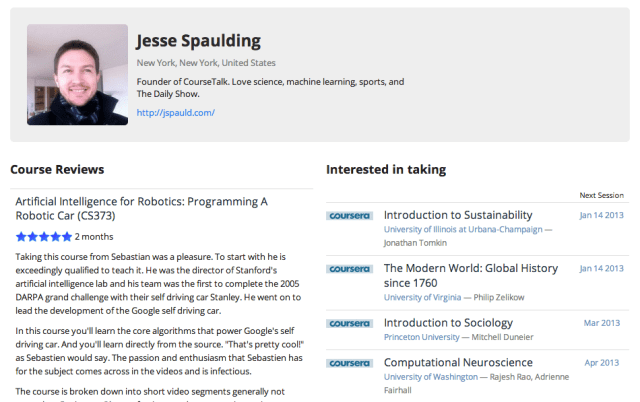
The former trader and serial entrepreneur tells us that his interest in MOOCs was spurred after taking a couple of open classes: "Machine Learning" on Coursera and "Programming A Robotic Car" on Udacity. Spaulding said that he had a positive experience in both classes and, knowing that he wasn't alone in this regard, began considering the cascading effects that MOOCs could have on higher ed. So he created CourseTalk as a way to help learners find signal in the noise of an ever-growing lineup of open online courses.

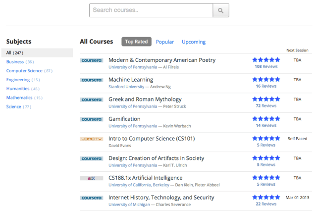
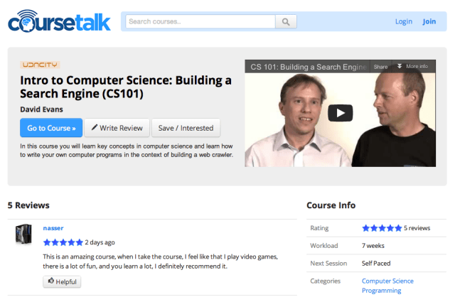
Today, CourseTalk is what you might expect — an early stage Yelp for MOOCs — a place for students to share their experiences with these courses and a way to discover new courses they'd enjoy. Given that it's still nascent, the platform's design is simple and its user experience is straightforward: Visitors can use the general search bar which is front and center, or peruse through "Top Rated," "Popular" and "Upcoming" verticals, or search by category, like Business, Computer Science, etc.

The site has also begun to compile a (growing) list of the universities offering MOOCs and offers a vertical for the Top Reviewers, as well. As to which platforms it supports? Ultimately, Spaulding wants to list all of them, but for now the focus remains on publicly available courses that anyone can take from anywhere — free or paid.

The platform is currently in the process of adding courses from Canvas.net as well as a bevy of classes from Khan Academy. The usual suspects — Coursera, Udacity and edX — are all there. Down the road, the founder also plans to add vertical services, such as Codecademy and Duolingo.

Piggy-backing on the success of MOOCs seems like a no-brainer, but it doesn't seem too far-fetched to imagine that MOOC platforms could simply add their own review systems and discovery tools as they grow, taking some of the wind out of CourseTalk's sails. Of course, Spaulding wants the site to become a discovery platform that spans all MOOC providers and really any online learning resource, so there's some safety in being a generalist.

Part of what's disrupting education at present is that learning has been unbundled, such that there are now many services with a diversity of approaches competing (at an increasing scale) for student attention. That potentially makes a fully-independent review service like CourseTalk a valuable addition to the ecosystem, presumably enabling a meritocracy, so that if a MOOC has incredible content, it doesn't matter how small it is or that it's not an Ivy.

On the one hand, let's not get too far ahead of ourselves. To be sure, the number of MOOC platforms are growing — Coursera seems to be having to bat its university suitors away with a stick. It feels like there's real demand among universities, and there's no doubt that nearly every higher-ed administration has "MOOC" in big red letters on their whiteboards. But there's the question of whether this demand is just peer pressure or digital FOMO. In other words, colleges have long been accused of being slow to adopt technology, so if they miss this one, ho boy. The shame.

When a space gets its own Yelp, it's generally an indicator of the fact that a bunch of content or businesses came online at once (or at least it seems that way when viewed from five miles up) and end users have no way to make sense of that noise. Sure, there are a lot of schools and programs rushing to take advantage of MOOCs because it's perceived as a novel technology (even though the MOOC concept has been developing for more than a few months) and because of the scale MOOCs afford.

Reaching thousands beyond the classroom walls is good for the brand and visibility of both the school and the teacher. Especially considering how important personal branding has become for content producers in the digital age. (Especially this guy.)

Many of the most famous journalists, musicians, artists and even teachers — you know them for their blogs, Twitter streams, and bylines, not their agencies, record labels or institutions. So, one way to look at it is: For professors, MOOCs can be another distribution channel, whereas a platform like CourseTalk can be an amplifier and a regulator.

But at this point the value of MOOCs for teachers is still somewhat nebulous. Distance learning and virtual, video and streaming video-based teaching probably isn't going anywhere. So there's a benefit to teachers in learning to familiarize themselves with the different platforms available, with how teaching on a massive, asynchronous virtual platform is different from a synchronous, direct virtual teaching experience and is different from teaching in the classroom.

However, professors have to rely on this latent or implied value, because generally speaking, MOOCs are free, so it's a community service project for them. And that brings up a salient implication for MOOCs and CourseTalk in turn: MOOCs really don't have a business model yet. Tons of money invested but little revenue generation. (Great discussion at Inside Higher Ed here.)

A lot of edtech pundits complain when people focus too much on the monetization (the business) side of education technology. But without revenue generation, it's not unreasonable to think that a number of the current MOOC players won't be able to survive. What's more, as of right now, MOOCs have no discernible credentialing standard. Startups like Degreed want to help solve this problem, but that's not something that's going to happen overnight.

Drop-out rates are also a problem for MOOCs and online courses. Their content isn't engaging enough. A massive asynchronous virtual lecture is still basically a virtual lecture. If MOOCs are going to survive, they have to learn how to leverage the underlying technology to increase engagement. Simply adding in-video questions and quizzes probably isn't enough. At the end of the day, MOOCs still afford universities the ability to reach new audiences, new candidates and their own students. They just have to figure out how to engage them and turn that into something that has real staying power.

If they don't, CourseTalk's reviews don't really amount to much. But for now, a reviews site like CourseTalk has exciting potential because it can start to shine the light on platforms or courses that fail the engagement test and perhaps bring a whole new level of traffic, engagement and relationships to those who do.

For more, find CourseTalk at home here.

10 tips for improving e-commerce product pages

Posted 29 November 2012 10:55am by Graham Charlton with 0 comments

Designing product pages is a fine art. There needs to be enough in there to help customers decide on a purchase, yet there is a risk of overdoing it. 

Here are some tips from Econsultancy's newly-released E-commerce Best Practice Compendium, looking at some essential features and things to try on product pages...

User reviews

If you're product page doesn't contain user reviews, you should make this a priority. 

61% of customers read online reviews before making a purchase decision, while 63% of customers are more likely to make a purchase from a site which has user reviews, according to stats from iPerceptions.

Reviews are a great sales driver, and can work for you even if customers are buying offline. In the UK, 43% of respondents said they had used their mobile to compare prices and look at product reviews while out shopping. 

Thought should also be given to presentation of reviews. It should be easy to digest the information and make sense of opinions from different people. 

For example, on this product page for a digital camera, Reevoo shows an easy-to-digest summary of the reviews according to different characteristics.

It also segments reviewers into levels of experience so that, for instance, an unskilled photographer can find the camera for them: 

Product images

E-commerce product pages have moved on in this respect over the past couple of years, though you will still see pages with a single, tiny image. Like this from Playmobil:

I've had to pick a particularly woeful site to find an example of this, which does show how e-commerce sites are using images more effectively. Still, some do better than others. 

Schuh is a great example. Lots of different views of its shoes and trainers, and even a 360 degree viewer:


Use video 

Video works as a sales driver, as it allows consumers to gain a clearer idea of products, see them in use, and from different angles. 

For example, videos on the simplypiste.com product pages increased conversion rates by 25%, as well as leading to a reduction in the number of returns. 

It uses videos to show how its products work, and the features which aren't so easy to show through standard product images: 

Show in-store stock levels

According to our recent Multichannel Retail Survey, 96% of respondents always or sometimes check online before buying in store, while 80% have reserved an item for in store collection in the past 12 months. 

This means that online retailers should do what they can to assist this process, and one way to do this is to show stock levels in the customer's locality. 

Argos does this well, allowing people to check stock on product pages, rather than making them wait till checkout. 

It's a small point, but allowing customers to check using the first part of the postcode would be helpful: 

Show me the delivery/returns info

How much delivery will cost, and how easy it is to return is a big part of the purchase decision for customers. Don't make them work too hard to find it. 

Better still, remove all doubt with free delivery and returns. Even if you can't do this all year round, it's a great seasonal tactic. 

Here, Webtogs eases customer concerns with clear messaging on delivery and returns:

Improve your product page copywriting

Sales copy is often neglected, with the lazy approach being to simply place the standard manufacturer's product description on pages. 

Good sales copy not only has SEO benefits, but also allows retailers to add a more personal touch and use a unique tone of voice. This can help your product pages stand out from the rest and really sell the benefits of products. 

There are a number of great examples, and different approaches are needed for different sites and products, but I love this example from the the J Peterman Company: 

Urgency

It can help to create a sense of urgency in the customer's mind. If they are considering a purchase, and know that there are just a few items left, or they can get next day delivery if they order quickly, then this can tip them towards the checkout. 

Here, Simply Hike has a delivery countdown which might just encourage customers with that 'want it now' mentality: 

According to Simply Group Founder Gerrard Dennis: 

It (the countdown clock) is there so the customer knows when to order it by for delivery. There are three key pieces of information in this – how long you have to order to meet the deadline, it suggests our premium next working day delivery service (since we added that it reduced complaints that customers put items on economy and it didn't arrive but it has produced an almost doubling in take up for the NWD service).

The third part is specifying the delivery day it will arrive with you on. Customers then know what day they must be around on (we also use DPD so they then get a subsequent text specifying an hour slot on the day). We modified checkout to promote people adding their mobile number so they get the benefit of this free service from DPD, also reducing calls to our customer services questioning delivery times.

Live chat

Live chat is a great way to help customers at the point when they are making a purchase decision, as well as easing pressure on call centres. 

Recent stats show that 53% of consumers in the UK and 63% in the US have used live chat

Here, Schuh employs live chat on its product pages: 

Consider using price match

Another feature I noticed on the Simply Hike product pages was a price match promise:

This may help retailers to avoid losing sales to competitors, and the reduced price may be offset if customers buy other items for the site, or are more inclined to return for future purchases. 

However, I would worry that just seeing the price match promise may prompt customers to leave the product page and head elsewhere to compare prices. One to test. 

I asked Simply's Gerrard Dennis about this feature: 

From hike the price match requests tend to come from Google shopping and obscure small websites rather than serious e-tailers  or Amazon. It does present a problem as one man bands operating from their garage have no overheads like us and our competitors, however we have a formula our customer service will use to see if we can match it.

If we can't and the product is over a certain value we will, under certain criteria, offer a £5 voucher as a good will gesture even if they don't buy from us on that occasion. That generally either swings the sale using the best price we can offer or ensures they at least come back in the future or have a good browse then.

The key to price match is we insist take we talk on the phone, we either ring them or vice versa, as conversion on a phone call is far higher than on e-mail. It also give the customer a sense of importance that we take the time to talk plus they feel more connected.  

Make sure they're quick

If you follow the advice here and add videos, multiple images, customer reviews and so on, then there is a risk that pages will become bloated and slow to load. 

In fact, a recent study by QuBit found that the average homepage took 3.50 seconds to load, while product pages were the slowest, taking twice as long to load as homepages across the board.

This is backed up by a recent article on this blog, looking at site speed of UK online retailers

TagMan recently ran a test with Glasses Direct to study page speed and conversion behaviour, measuring the impact of average page load times a user experienced and found a significant correlation to their propensity to convert. 

The conversion rate peaked at about two seconds, dropping by 6.7% for each additional second.

Moreover, page-load time for non-converters was three-to-four times higher than for converters.