Score:
79%
The unique Swipe UI of the MeeGo Harmattan-powered Nokia N9 has inspired many Maemo and Symbian developers. One aspect of its UI is the multitasking view which gave live previews of applications and could be zoomed from, say, a three by three grid, to a two by two grid; and to close applications. Whenever one tries to graft the user interface of one mobile operating system onto another, though, things are never going to fit perfectly, but compliments to the developer of Tasks Widget, who has given it his/her best shot.
Version Reviewed: 1.0
Buy Link | Download / Information Link
The point of Tasks Widget is to provide a multitasking view directly on your homescreen without having to call up the Task Switcher (via a long press of the menu key). As mentioned, this mimics the multitasking view built into MeeGo Harmattan. Not only can you view what's running, but each preview has an icon for you to close the application.
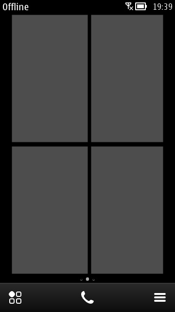
Once you install Tasks Widget, there's no application icon, and no settings; instead, you find it via the widgets list. Once added, you'll find two portrait blocks, which are grey at first, but will be populated with images of the first two applications that you subsequently run. This limitation of half a screen per widget is a departure from MeeGo Harmattan's Swipe U's full screen multi-tasking view.
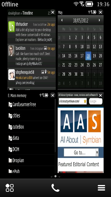
To create the full-screen view, a second widget can be added, but no more than two. The widgets don't have to be on the same homescreen, but it makes sense to have them together. Once placed, they work in concert showing previews of the first four applications launched after their activation. The previews aren't live, in the sense that you can't see things happening in real time – rather they are screenshots of the app taken just as you switched away from the app. Because of a slight difference in the aspect ratio of the preview boxes and the Symbian nHD screen, previews look slightly distorted.


Tasks Widget - before and after loading apps
Tasks Widget took me by surprise with the order in which application previews were shown, when more than four were running. I expected the order in which I'd last used my applications to determine their place in the preview windows, but this isn't the case. Instead, applications are shown in the order in which they were started. This is where some sort of user interface with options would have been useful – this behaviour should (ideally) not be hardwired.
The other benefit of MeeGo Harmattan's multitasking view is that you could pinch to zoom, to change the size and amount of applications on view. Because Tasks Widget obviously has a fixed layout, this is not possible. Also, once you tap through into an application, the Nokia Belle back button won't take you back to the homescreen; it will take you back to the previous page of that application. This makes sense, but can break your mental map. Also, when there aren't enough running applications to display, there is just a grey box on show. This feels rather inelegant, I'd have preferred it to launch the app menu, and maybe even be semi-transparent or to have a preview of your app menu.

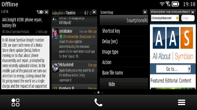
Thanks to being split into two widgets, Tasks Widgets works well in landscape orientation too
Despite the minor mismatches of Symbian and Swipe UI, there is a definite use-case for having Tasks Widget on Symbian. Five homescreens are probably more than enough for anyone, and so giving one over to a multitasking view that can be swiped to rather than waiting for a long press on the menu key, for a carousel of application previews that have to be swiped through too.
You can get Tasks Widget from the Nokia Store for £1.00
If you're interested in making your Symbian device even more like the Nokia N9, then you should read our review of GoToMenu, which adds MeeGo Harmattan's touch gestures to enable you to close and launch applications, and call the task switcher. Let us know in the comments if you've tried both of these MeeGo-mimicking applications in concert.
Recommended.
David Gilson, 19th May 2012
Reviewed by David Gilson at
No hay comentarios:
Publicar un comentario