The 'qwerty candybar' form factor brings inevitable compromises. On the one hand there's:
- a permanent QWERTY keyboard, so no loss of screen real estate or context when entering text and no fiddling about switching between different virtual keyboards to get to a punctuation character or number.
- hardware shortcut keys, from a d-pad for onscreen navigation to call/hangup keys to customisable application shortcut keys
Both incredibly, amazingly useful in terms of being productive in every day tasks. And explaining the niche popularity (of that's not a contradiction in terms!) of the form factor generally, with many Blackberry devices very similar in operation and look/feel and with many people still loving their old Nokia E71s and E72s....
On the other hand, there's the (possibly) crippling disadvantage of having a fairly small screen, around 2.46" diagonal in the E6's case. This makes the device poor for multimedia consumption and poor for web browsing, in particular, either may be showstoppers for some people.
The other disadvantage is that text on-screen can sometimes be quite small, almost unusably so in some cases. Leaving aside rendered web pages, which are a special case (see below), there are still applications which present text that's painful to read for anyone with less than perfect vision. It's notable that Blackberrys with the same size screen are most popular with young people, i.e. those with very good eyesight.
For those of us with lesser vision, the fight remains to try and make this form factor usable without inducing too much eye strain. With that in mind, I've been experimenting with various solutions...
1. Brightness
Somewhat obvious, but crank the brightness up and give your eyes more of a chance. You'll find this in Settings/Phone/Display. Although there's greater power consumption involved, the E6 has such a large battery that I doubt you'll notice much difference.
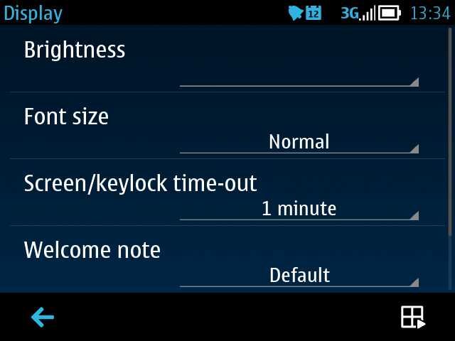
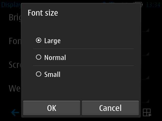
2. Font size
There's a setting in the same dialog as above, letting you change the 'Font size' to 'large'. This does have an effect on most dialog panes and scrolling lists (e.g. in Contacts) in the interface, but is a not a cure-all panacea - third party applications in particular will retain their original font choices and text may still be too small.
3. Web font size
Web pages are also not affected by the font size change mentioned above, but thankfully there's a setting buried in Web itself. Go into its 'Settings' and then into 'Page'. Scroll down to the bottom of the dialog and you'll see 'Font size'. Set this to be 'Large' as well and Web will use larger text sizes when rendering standard web pages.
Having said that, there are stylesheet and other rendering effects which override your choice of font. Web pages can be insanely complex and created by dozens of different combinations of content and other resources - there will be time when pages are awkward to read on the Nokia E6 with its high pixel density. Sometimes you can double-tap or 'splay' to zoom right in, other times you're just going to have to live with it - and squint!
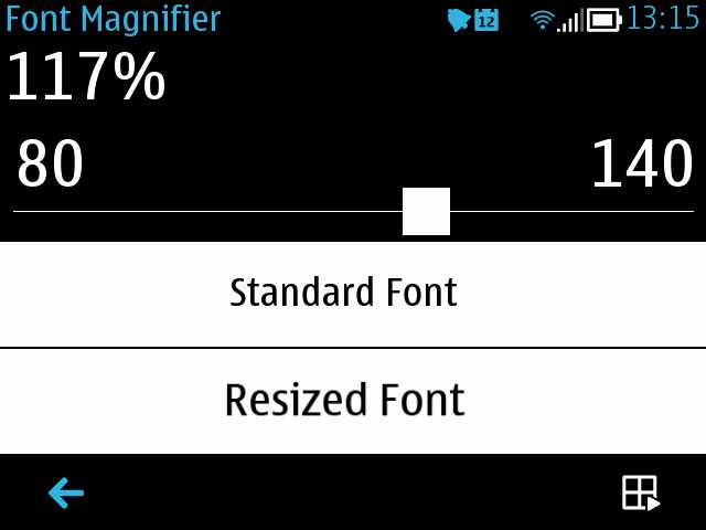
4. Font Magnifier
This is a commercial utility that Nokia licenses for all its qwerty candybar phones. Essentially, it substitutes font sizes of its own for standard sizes used by the OS, at quite a low level. Thus, Symbian OS wants to use a 13 point font to display a message, but with your custom setting in Font Magnifier applied, what actually gets written to the display is (for example) a 15 point font, or even larger.
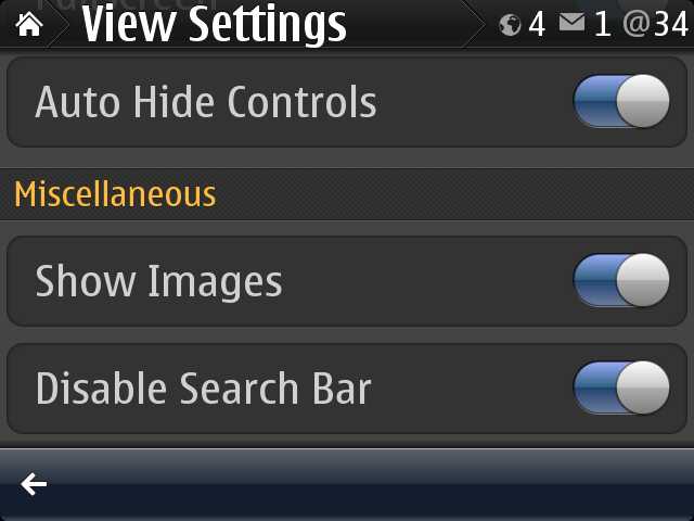
Setting Font Magnifier up is really easy - you don't have to know anything about font sizes - you just adjust the on-screen slider by the magnification amount needed and then tap on 'Apply' on the menu. The E6 reboots and you're all set. There's a little trial and error needed, according to your eyesight - I found that using "117%" worked well, in that it made most text large enough to read easily without screwing up the formatting of many applications' screens.
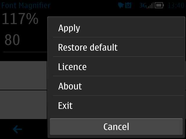
Adjusting the Font Magnifier slider as needed; to set, tap on the menu icon and then on 'Apply'
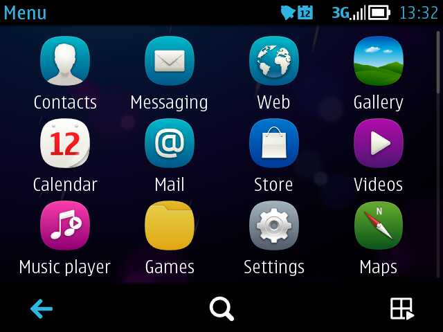
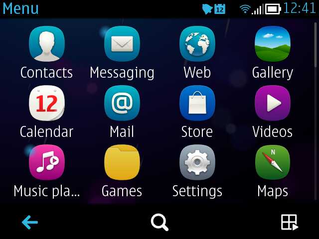
Before and after - the app launcher menu, with everything zoomed by 117% on the right
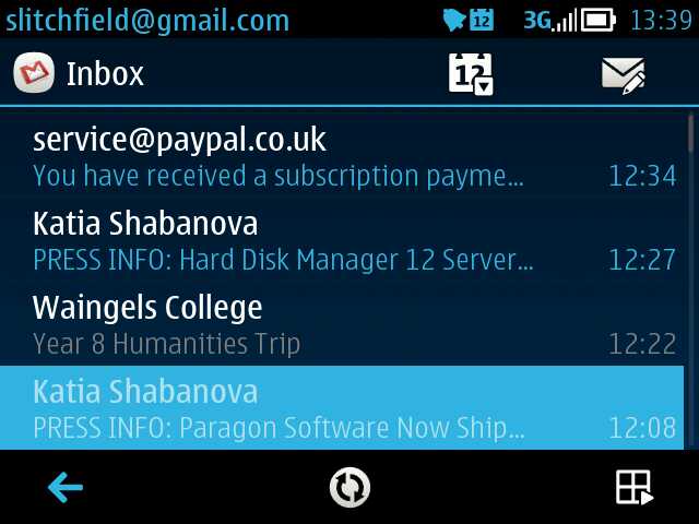
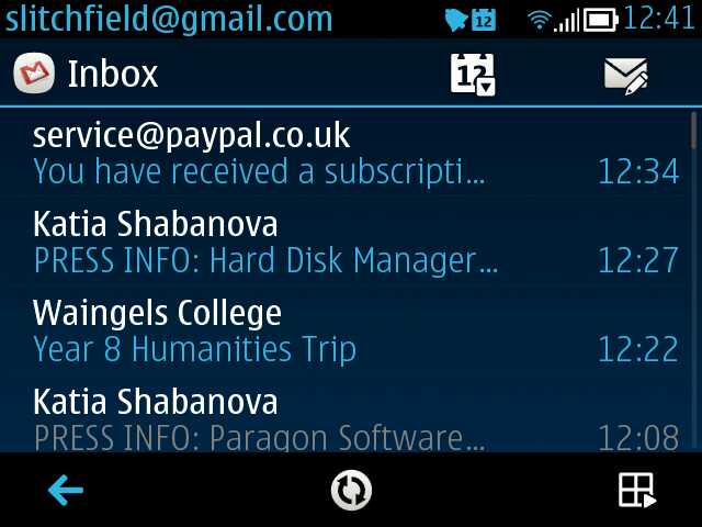
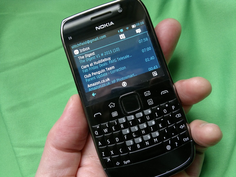
Again, before and after Font Magnifier - the main Inbox screen
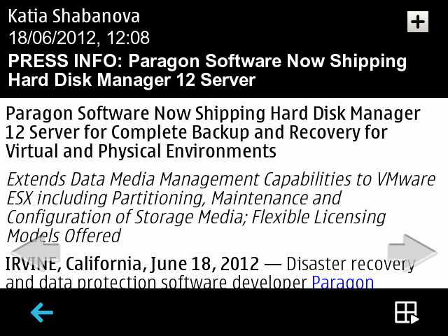
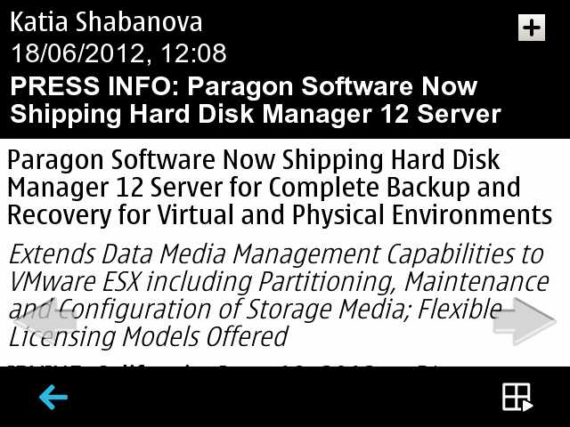
Before and after, reading an individual email
NB. Note that some Symbian applications with heavy graphical bent, e.g. Calendar's Month view, ignore even the Font Magnifier setting. But these are, thankfully, the exception and not the rule!
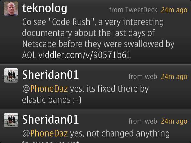
5. Gravity's latest beta
The inspiration for this entire piece came about because I tried the latest beta of the famous Gravity Twitter/Facebook/everything client on the E6. Whereas Gravity was a stunning piece of UI design on most Symbian smartphones, it was hampered by the screen aspect ratio on the E6 and the top status bar and the bottom toolbar didn't leave much room in the middle for swiping and reading content. Then I noted that the latest beta, 2.70 (7158), included the facility to 'auto-hide the controls' when swiping up (i.e. to read tweets further down the page). This works stunningly on the E6 and means that the entire screen can now be filled with tweets until you actually need to stop and go back or respond to something. Add in the existing facility to choose to view 'Large' fonts in the same dialog and social updates in Gravity suddenly become a lot more readable.
No hay comentarios:
Publicar un comentario