NB. Asri al-Baker did an icon/wrapper front end for this and other Google web services a while ago, but his server's been down for months with malware, so best not go there. Instead, try this direct approach.
Google+ runs various ways of getting to its social data/contacts/photos, not least a lowest common denominator site, go via m.google.com - this works on everything and has 80% of the functionality described here, but why settle for less? With the official HTML5 version of Google+ you can get more readable text, better formatting and more functionality.
- In Web on your modern Symbian smartphone, type in plus.google.com/app/plus/mp/558/?force=1 - don't worry, you only have to do this once!
- You'll be asked to sign into Google (if you're not already) in Web. Do so. Again, this is something you won't have to do every time, as the appropriate cookie will keep you logged in. You'll then be at the front screen of the HTML5 version of Google+, showing the default view, 'Stream'.
- Bookmark this by tapping on the star (or bookmark) icon in the Belle browser and then on '+'. Accept the form by tapping on 'More'>'Save' as you'd expect. You're done.
Here's what to expect from Google+ HTML5 in Symbian Web:
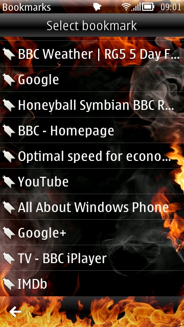
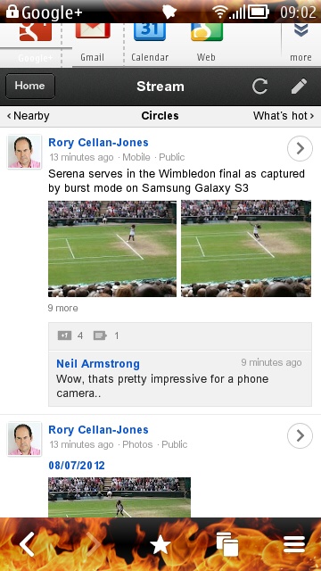
Having used the address above, here's my bookmark for Google+ sitting in the normal list; and here's the default 'Stream' page. Note briefly the Google shortcut buttons above the HTML5 'app' - ignore these, as they'll take you back to the generic mobile sites. The only buttons you want are in the black app 'bar' and on the page.
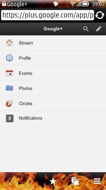
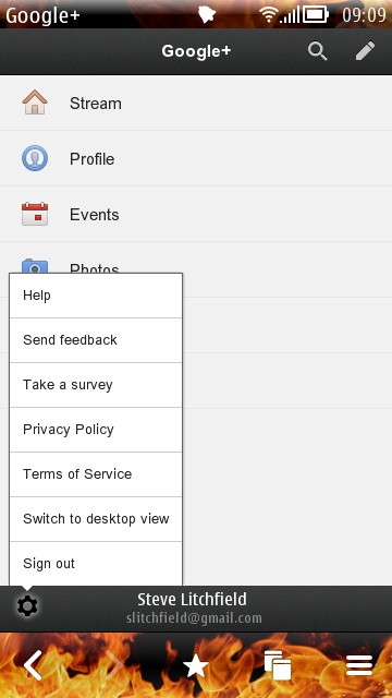
Tapping on 'Home', for example, gives you a familiar Google+ set of options; swipe up a little and a bottom status bar comes into view, with this pop-up Google+ menu. Nothing too interesting here, so let's pop back to 'Stream'...
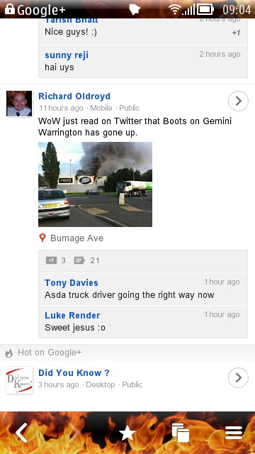

Uh-oh. Looks like a Boots store just went up... you can tap through into a Google+ post to see the full text and larger picture, just as you'd expect. You can also swipe up and down to see comments. Note the '+1' legend in the top toolbar - an easy way to add your approval of the post/news too.
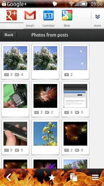
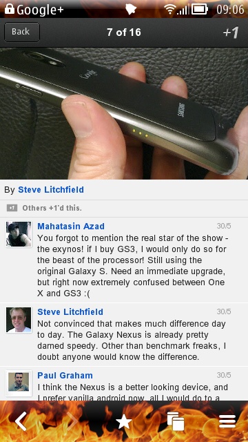
Tapping on 'Back' and then 'Home', let's explore the Photos module in this HTML5 version of Google+. Diving into my 'Photos from posts' folder, I can see at a glance how many +1s and comments each photo has attracted; I can then tap through to see the photo larger and the comments in full.
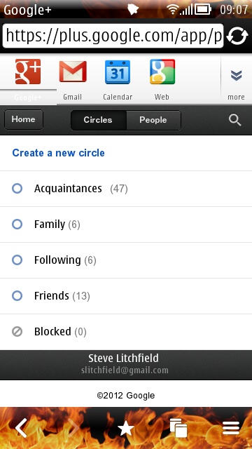
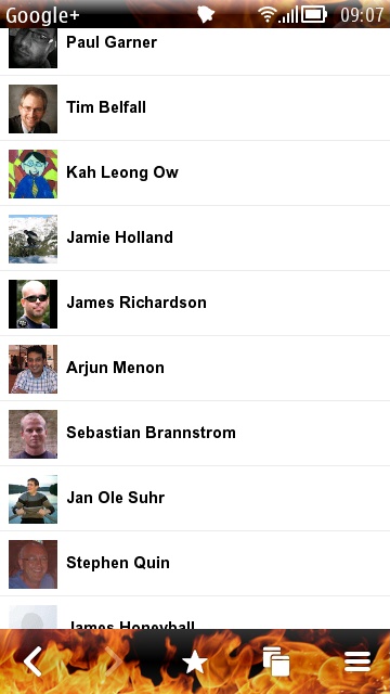
The Circles module does a good job of letting you manage your Google+ circles - you'll also get a prompt to head into the Circles wizard every time you visit the site - which can be a little annoying. Ah well...
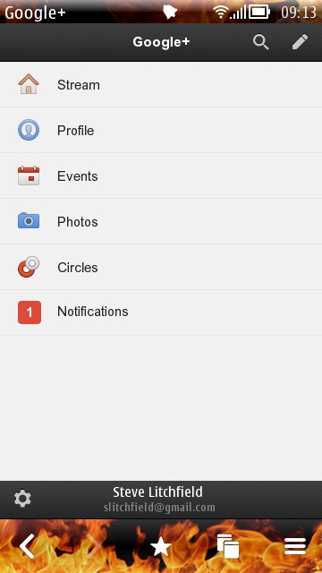
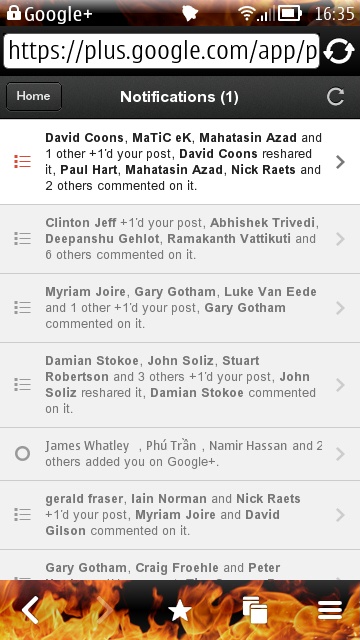
When someone replies to a post of yours (or another Google+ event, such as being added to someone's circles - it depends on your Google+ notifications settings), you'll see the little red number as above, left; tapping through shows each notification and you can tap through again, of course, into the post or contact/circle.
So there you have it - Google+ pretty usable on Symbian. It's not as slick as a dedicated app, but it's about 70% the way there in terms of experience. And with almost all the functionality server-side, at Google. Which means that as they upgrade their HTML5 site, you'll see the improvements automatically.
My only caveat is that the fonts used are fixed and are a little small on 3.5" and smaller-screened Symbian phones. This is best on the Nokia E7, X7 and 808.
PS. And before anyone asks, yes, this is the Burning Platform theme again - Defiant? Me? 8-)
No hay comentarios:
Publicar un comentario