![]() Since releasing version five of Google Analytics it's fair to say there have been a few bugs which have needed ironing out.
Since releasing version five of Google Analytics it's fair to say there have been a few bugs which have needed ironing out.
Much of this has now happened but it seems to me that one has gone unnoticed, that of the performance chart feature.
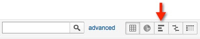
In most Google Analytics (GA) reports the button for the performance charting feature can be found just to the right of the report filter box:
I use this feature a lot to help with weighting data. For example, when thinking about conversion or bounce rates by referring source or landing page it's a great way to get a quick view of which source or page has the most impact, based on the percentage of all site visits that can be attributed to it.
However, there is a problem. The performance chart function works fine when viewed in the context of all site visits but, as soon as you start to introduce filtering using either advanced segments or the report filtering tool, it doesn't work so well.
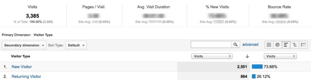
In the first screen snippet below you can see the charting function is working fine....
...but when, in this case, the 'Non-paid Search Traffic' advanced segment is applied things go adrift:
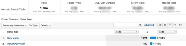
You don't need a calculator to work out that 1,274 is not 37.64% of 1,764. It seems that while the ribbon data at the top has changed to reflect the segment I have applied and the table data has also changed for the same reason, the calculations used to produce the performance chart percentages have not.
The reason why the percentages are lower is because they are still being calculated against all site visits and not the newly segmented total.
On the basis that charts are used to make digesting data easier and assuming that segments and filters are applied because the person doing the analysis is interested in that particular data set, it seems rather odd that the percentages in the performance chart should not be calculated against the newly filtered data set.
There is always the concern (from my point of view) that this is intentional and that I am missing something dazzlingly obvious but the previous version of GA did not do this. To be clear, it calculated the performance chart percentages against the newly filtered data set.
Google Analytics is a free tool and a very fine one which delivers massive value but to excuse something like this because it's free is a bit like lending somebody a car with headlights that don't work and then excusing that on the basis that the borrower was at least able to save a few quid (pounds sterling for non Brit readers).
It may be a while before this issue is resolved but until then just be careful when using this feature.
Hugh Gage is an Independent web analyst atEngage-Digital and a guest blogger on Econsultancy. You can connect with Hugh via LinkedIn.
No hay comentarios:
Publicar un comentario