Score:
79%
As successive versions of Symbian touch interfaces have emerged from Nokia, there have been power users out there waiting for better widgets to be released. This wish hasn't always been fulfilled by Nokia but third party developers can step in and save the day, and that's exactly what QooApps have been doing lately. We recently reviewed QooBattery, and now followed up with both QooCalendar and QooClock widgets. Find out if they complement or complicate the Symbian homescreen.
Version Reviewed: 1.0 & 1.03 Resp.
Buy Link | Download / Information Link
The risk with creating anything that changes or adds to any user interface is that the intangible factor of 'user experience' can be disrupted. This is something that many people will find difficult to recognise when it's executed well, but anything that disrupts it is mentally jarring.
With user experience in mind, it might be a good idea to use the Qoo widgets in concert, rather than using just one. All of the Qoo widgets have a consistent look and feel, which will help you learn how to quickly tweak the settings of each.
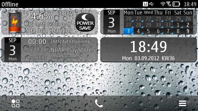
QooBattery, QooClock, and QooCalendar working together.
All of the Qoo widgets can be tapped in two places: one for settings and the other for a secondary function. This is one area in which the Qoo user experience breaks down because the placement of the largest and smallest touch areas – and the actions they perform – are not consistent across any of the Qoo widgets.
All of the widgets have a familiar rectangular appearance, as has been established since the days of the Nokia N97 and C6. This ensures that the widgets are compatible with all contemporary Symbian devices. However, given the variety of widgets that Nokia introduced with Nokia Belle, I felt rather disappointed that the Qoo widgets were still in made in the old style (i.e. there weren't Belle variants).
Criticisms aside, it is possible to tweak the appearance of each widget. Font and transparency settings are common to all widgets, while others are specific to each.
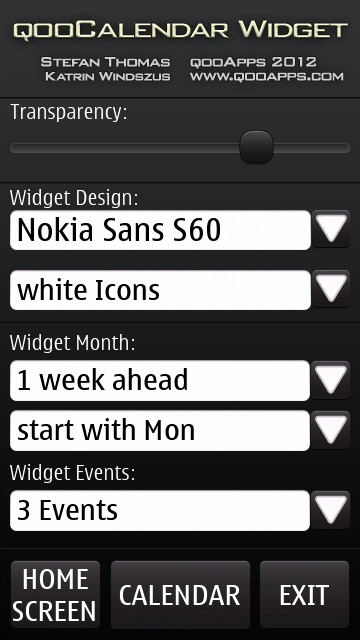
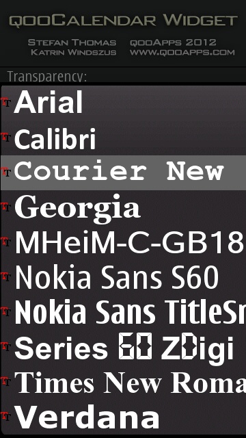
Transparency and font are common to QooCalendar and QooClock
QooCalendar
Productivity geeks like me probably lamented the updated Calendar widget in Nokia Belle. Previously [to Belle], the aesthetically boring built-in Calendar widget displayed three events, but was cramped into a single block. I had hoped Nokia Belle would introduce an extra-large Calendar widget as was done with Email. This did not happen and the new Calendar widget only showed a single event – things were worse! [Though note that the recently released Belle Refresh update introduced the much larger 'Calendar - Agenda' - Ed]
Fortunately, QooCalendar brings things back to a pre-Belle state, but with an added dash of class. Not only that, but it has an additional widget that brings a whole month widget to the homescreen too.
Both QooCalendar widgets display the current date on their left-hand sides, which also acts as a touch area to launch the Symbian Calendar application. Touching the remaining area (on either) launches the settings page, which is common to both calendar widgets.
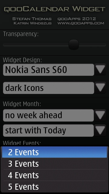
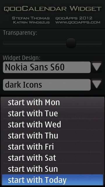
QooCalendar Settings
The QooCalendar settings screen determines the range of events that will be shown, the theme of the date icon, etc. This amount of flexibility is commendable, but the defaults are fine for those who prefer not to tinker. The fonts have a much smoother appearance than those that one finds with the Symbian Anna (and earlier) widgets.
I would have liked to see an option to crop event titles. Be default, long event titles are shrunk down so that the full text will fit into the widget. As a consequence, the font size can get so small that the event text becomes unreadable!
The events widget can show between two and five events at a time, with start times and titles. This allows you to quickly see what your immediate agenda looks like – which is exactly what a calendar widget should do.
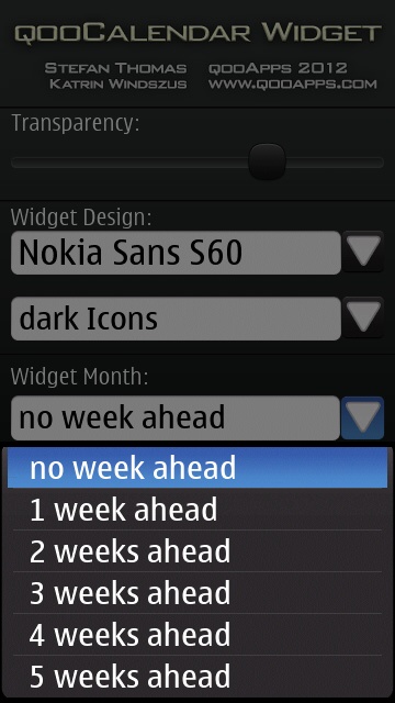
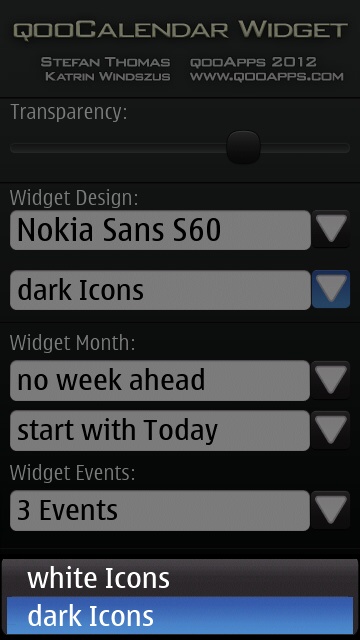
More QooCalendar Settings
The month widget is surprisingly functional. Rather than just presenting a basic calendar, it mimics the Symbian Calendar app by drawing a blue triangle in the corner of dates that have an event. At last, Symbian users can see – at a glance of the homescreen – on which days their calendar is clear!
Going back to my point about wishing these widgets were more Belle-like, I'd have liked scrolling in the Events widget, and to have the Month widget cycle through various date ranges – e.g. tapping once to show a week view, and then tapping on a single day to view its events. Wish lists aside, QooCalendar does what it does very well.
QooClock
In the days of the N97 and Symbian^3 devices, we had a clock widget which could change the phone's profile and launch the calendar app. QooCalendar does not replicate this functionality, but it does provide a single-block clock widget as opposed to the irregularly sized clock widgets introduced with Nokia Belle. The widget also launches the Clock and Alarm app, just as old and new Clock widgets have.
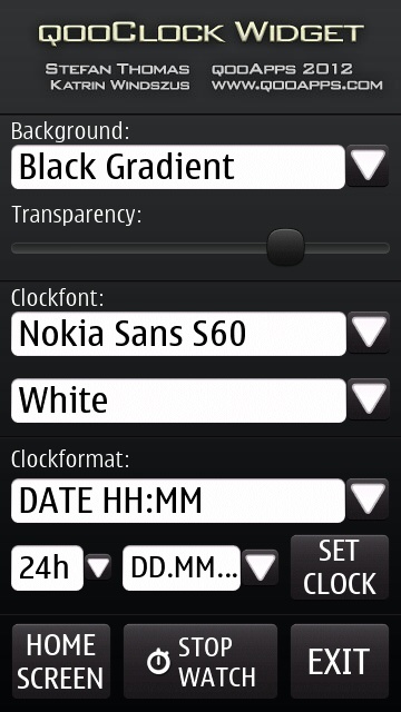
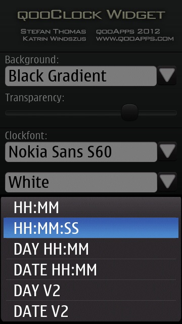
QooClock settings
Unlike QooCalendar and QooBattery, there are options to change the background of the QooClock widget. Changing the background of the clock widget could make it look like an odd-one-out beside other widgets, but then again I welcome any customisation options. The clock has various layout options – so there should be something that suits you.
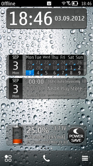
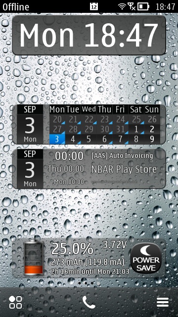
Examples of QooClock layouts
This widget has some additional functionality in that, from the settings page, you can activate a stopwatch. Once activated, you are returned to the homescreen with the widget in stopwatch mode and a stop/start button is shown on the right-hand side of the widget.
Conclusion
Even though I complained that these widgets look somewhat old fashioned in the face of the new Nokia Belle widgets, they actually make a great addition to the standard set of Symbian widgets – regaining some of the functionality that was lost in the Nokia Belle update. You can get QooCalendar and QooClock in the Nokia Store for £1.00 each.
Highly Recommended
Reviewed by David Gilson at
No hay comentarios:
Publicar un comentario