 Every time a new smartphone hits the market (like every other month) consumers are given more ways to integrate these devices into daily activities, like shopping for and researching products, socialising, and other fun distractions.
And with each upgraded device that comes out, the design geniuses at Apple, Microsoft, and others have added cool new features and enhanced graphics to improve usability.
With the never-ending array of changes, updates and improvements, e-commerce marketers are under great pressure to make sure their mobile websites not only overcome the challenges of browsing on small devices but that they also take advantage of all the capabilities available.
Site search is typically the key way mobile users look for products and content, and because site search users typically convert at a higher rate, it's important to constantly update and enhance mobile site search to maximize performance.
Here are some insights into how to make mobile sites more search-friendly, taken from our "Big Book of Site Search Tips:
Put the spotlight on the search box
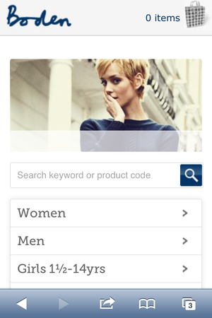
The search box should be easy to find on any regular website, but an easy-to-find search box is even more crucial on a mobile site. Display it prominently at the top of the mobile webpage – in fact, it should be one of the most obvious features on the page. Boden highlights the search box on its mobile home page.

Auto complete saves time
When you save mobile shoppers time and clicks, you help them get to products faster (and minimize errors). Auto Complete is a great feature because it suggests terms when visitors start typing the first letters of a keyword, and helps your mobile customers find what they want with less typing.
You can show the possible terms in a drop-down menu to save space on the mobile screen, and ranking the terms by the most popular keywords can further increase clickthroughs.
You should also consider bumping up the usability of this feature with Rich Auto Complete, which displays the name, image, description and price for the most relevant products within search results – although keep in mind that this may slow down performance to load the accompanying pictures.
Make refinements expandable
Refinements are a must for mobile users as they make it easier to narrow down results. On a standard website there's a lot more room to play with – you can put refinements on the left-hand side of the screen or at the top.
On a mobile screen, however, it makes more sense to show expanding lists of refinements to save space. These can be displayed with JavaScript, so they expand immediately when the user clicks on them.
SockShop does this with arrows that display available refinements as shoppers click on each choice.

Take a cue from Facebook
Add infinite scrolling: Infinite scrolling of search results is another way to reduce typing and keystrokes, because when visitors get near the end of the page, more results are loaded automatically, creating an endless scroll.
Localise site search results
Your customers love to seeing localised information that can be provided based on a device's GPS tracking. You can do this with search results, either through the GPS information or by allowing shoppers to enter their address or postal code as they search so they only see results that are relevant to their location.
This feature can drive mobile shoppers to your physical stores where they can see, touch and experience products up close. You can take it a step further by including merchandising banners on search results pages to highlight promotions or special offers in the visitor's specific region.
Point QR codes to search results
Mobile shoppers like to use QR codes to take advantage of promotional offers and get more information about products. QR codes that point to mobile search landing pages can help you increase engagement with customers and promote specific brands.
Such codes can also help jump-start the search process and encourage mobile users to dig deeper into your product catalogue.
Use keyword-specific banners to drive more interest
When mobile customers search for a brand name or product that is on sale, or if you have new arrivals you want to showcase, include a keyword-driven banner at the top of the search results page to highlight that promotion – and drive more clicks.
Above all else, you need to keep testing mobile search options and monitoring mobile visitor behavior so that you know what's working and not working on your mobile site. Change is a constant in the m-commerce world, so you need move fast to keep things fresh and engage with your on-the-go fans.
Vishal Srivastava is Team Lead - European Sales at SLI Systems Ltd and a guest blogger on Econsultancy.
No hay comentarios:
Publicar un comentario