I should emphasise before I get started that there have been several handsets which have impressed with their materials and cosmetics and yet also been very decent smartphones - I'd count the Nokia N8 and C7 in this number. They are excluded from the list by virtue of being too good(!)
I'm also excluding the Vertu 'remakes' of Symbian handsets - which are far more obviously jewellery but also incredibly rare and incredibly expensive. There was also the 24 carat gold-plated 'Oro' (shown below) - but I want to keep my list rather more down to earth!
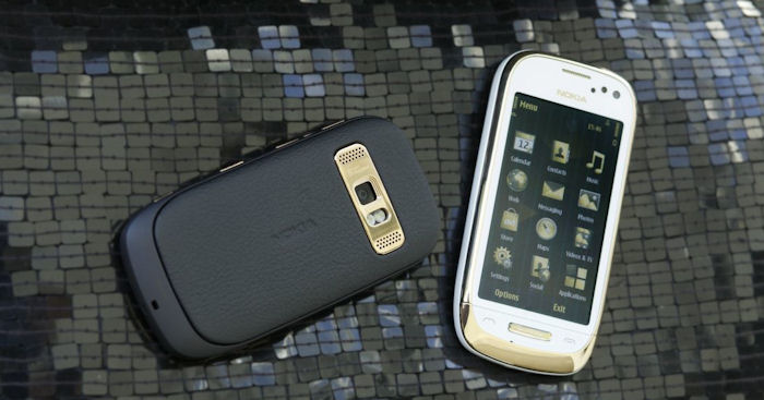
In reverse order, here are the top 10 Symbian handsets which place fashion and form over function. By all means be seen out with them but probably best to use something else as your main phone, especially these days.
10. Nokia E72
I had to think twice before putting the E72 (below, middle) in this list, since I really did love mine for a while - the shiny, shiny back metal, the gleaming accents, the feel in the hand - all premium. But the E72 was shortchanged in terms of RAM (and, arguably, processor), which meant that it always underperformed, despite its best intentions. Still looks great today, and with its QWERTY keyboard, different from the run of the mill touch slabs. But best avoided as a day to day smartphone, I contend.
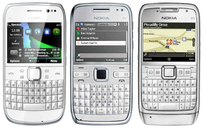
The E6, E72 and E71 - the E71 is the tank of the range, the E6 the most modern and the E72 potentially the most fashionable in terms of look and feel...
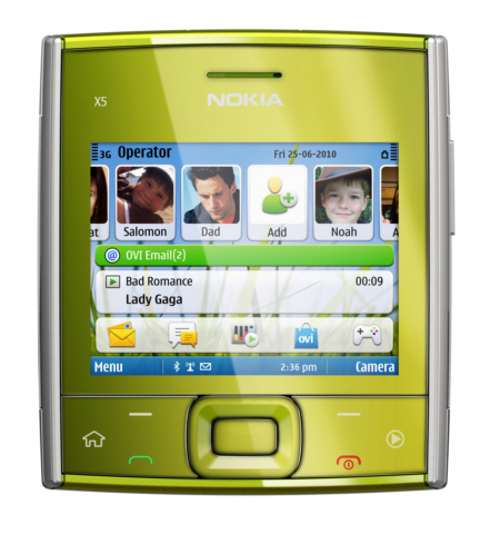
9. Nokia X5-01
Interestingly, I never even held this device, also with QWERTY keyboard but this time sliding away behind a fashionable square front. I just couldn't see the point in the form factor and I suspect most of the market agreed with me. Should have stayed as a design prototype!
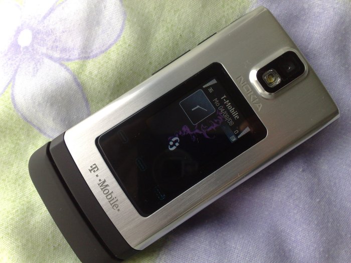
8. Nokia 6650
Class this under 'futuristic' styling, thanks mainly to the fancy LED lighting schemes inside, but the brushed steel exterior and the watch-like external mini-display help too. Pity the inside was as underspecified as a 1970 Austin Maxi. [Original review]
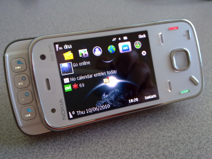
7. Nokia N86 (white)
Classic and surprisingly high spec (screen resolution aside) camera phone, re-envisioned in stylish white. Very stylish - the white version is astonishingly pretty - yet flawed at the same time, since the phone was one of the first to have an AMOLED screen, meaning that the only way to get through the day, battery-wise, was with a dark (and preferably black) theme. And yet the only thing that looks great on the white N86 is a white theme (see the 'wrong' dark theme below) - whereupon battery life will be down to a matter of hours... Shame, though.... [Pimping the N86]
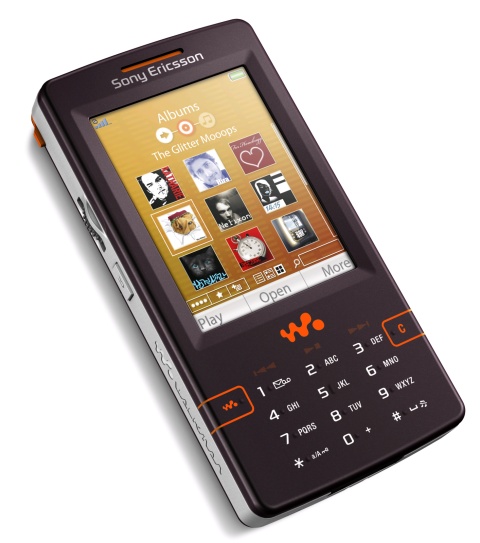
6. Sony Ericsson W950i
Rare as hen's teeth, this UIQ 3 Symbian handset was music-focussed (the 'W' bit was for Walkman) and tremendously pretty, with dark skin, futuristic and beautiful touch controls. But also the UIQ 3 interface, which was (let's be honest) a bit of a dog's dinner in Sony Ericsson's hands, and the way the control icons and functions never worked 100% of the time for me. Still, I must pick one of these back up on eBay to have another fiddle at some point....
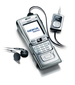
5. Nokia N91
At the time, this was the ultimate music phone, with super audio quality over headphones and speaker, with a built in 4GB/8GB microdrive (effectively a spinning hard disk - in a phone!) and all-metal construction that meant the N91 would survive most abuse. Although excellent for music, the ergonomics of the covered keypad, which, once you could get to it, was almost impossible to use fluidly, meant that the N91 was rather fatally flawed.
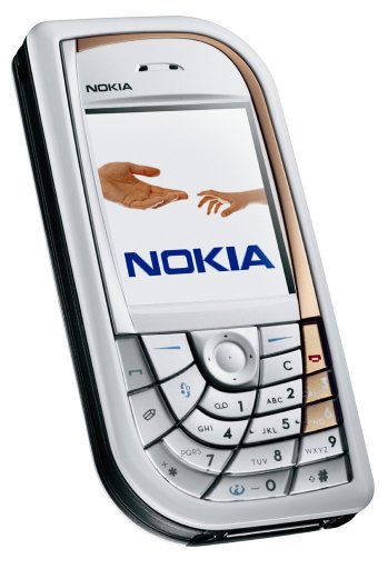
4. Nokia 7610
There were several Nokia-made Symbian smartphones with outrageously stylised keypads, but I'll pick the 7610 here as a prime example. When the designer took the standard 'boring' keypad and produced this swirling, swooshing set of curves, I'm sure the design team were very pleased with their creation. It's just a shame that it got turned into a product before someone actually tried using such a non-standard monstrosity for real. JUST. SAY. NO.
3. Nokia N76
This is quite a sad example since I had high hopes for the N76. The idea of a space-saving, efficient, stylish clamshell was quite appealing at the time. Yet the finished product had poor usability (for example, screen tech used, and the way the cables foul the clamshell opening) and it was all a triumph of shiny, metal bits sticking out in all the wrong places. Compare this to the 6650 above, for example, and it's clear that the N76, when opened up, was just ugly, ugly, ugly. [Original N76 review]

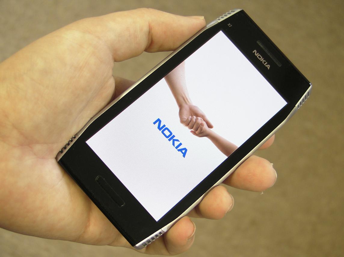
2. Nokia X7
Another big personal disappointment, the X7 promised so much: four speakers (wow), huge 4" screen (matching the E7's), the usual X-series audio quality. The reality was a curiously shaped device that was hard to hold, with sealed battery and memory, two of the speaker 'nacelles' were dummies and the two that were in use weren't aligned with the speakers inside, which in turn were mounted so close to each other that all stereo effects were cancelled out, the screen turned out not to have CBD tech after all... you get the idea. The X7 was a complete and utter design fail, approved by a company that was, by this time, somewhat in crisis.
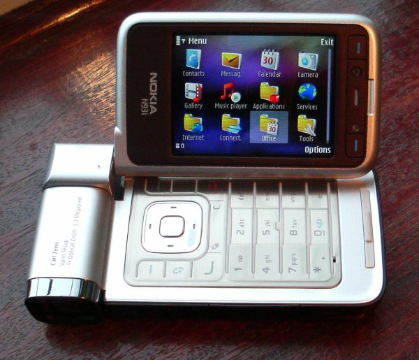
1. Nokia N93i
Keeping things personal again, so excuse the rant, but again we have perhaps the epitomy of fashion over function in the N93i. The original N93 was function-based, chunky but with as much room as was needed for the barrel camera, for the sumptuous keypad and control keys, for the novel outer display and the high quality inner one. A classic smartphone in retrospect, in several ways.
I'll admit that the re-design teams did a good job in terms of stying - the mirror finish, the subtly integrated outer display, the slimmer overall form factor - the N93i looked a million dollars and then jaws dropped as it swivelled open to do its 'transformer' party piece. Sadly, the cosmetic changes had wreaked havoc on usability. The transflective screen had been replaced by a (presumably thinner) TFT one, so you couldn't see the display when the sun was out, precisely when you wanted to use such a camera/camcorder phone. The keypad was now a fairly horrible membrane affair. And one of the standout features of the N93, the stereo audio recording, had been utterly crippled by moving the twin microphones to point upwards - presumably to record the sounds of passing birds and aircraft(!) [Original N93i review]
_______
Comments welcome. Can you think of other Symbian handsets where form and fashion have triumphed over function and usability?
No hay comentarios:
Publicar un comentario