The first part in this series tackled this moody steam scene:
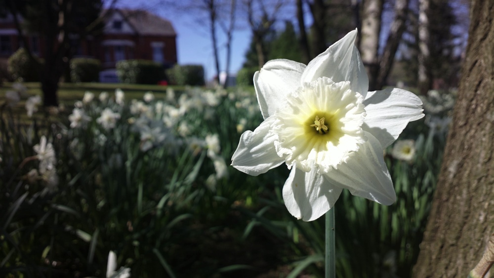
For the second part, I wanted to try something a little brighter, helped by Spring arriving in the UK, here's my shot, click it to download the original or enlarge it in your browser:
Not wishing to seem too boastful, but this shot was done in 20 seconds, in one go. In other words, unlike with the steam scene, I didn't think I needed multiple 'takes'. I was in the park with family, saw the great light and super daffodils, crouched down, took the shot and moved on. After a while, you'll develop the same feel for framing and light, hopefully, and you'll instinctively know what will come out well and what won't.
As with the first part in this series, let's take the various aspects of the shot in turn.
Light
In this case we had a patch of flowers in partial shade, with sunny background and a single flower lit by a shaft of sunlight, behind me and to the left. Ancient photographic wisdom says to have the sun in the hemisphere behind you for best results and this definitely applies to phone-shot snaps, since the thin devices we currently sport have very limited protection from the sun's rays creeping into the camera glass and causing unwanted reflections and 'flares' in the final photo.
I was shooting on the Nokia 808 in this case, which is somewhat notorious for not handling very bright spots on an image well (at least not without manual fiddling, e.g. to exposure or scene mode) and there are certainly some very bright spots on the daffodil, but I think I just about got away with it in full 'auto' mode. Having a phone camera with integral HDR would be handy here, I think (though see the section on 'Motion' below).
Position and framing
Obviously, the main subject is the gorgeous flower, but having just this in the centre and not much room for anything else - or having it small in the frame amidst a lot of other floral detail - would be too blatant - or too distracting. You'll often hear about the 'rule of thirds', which I interpret to mean that if the framing of a shot isn't obvious then aim to have the main subject one third the way from left to right (or vice versa) - it's usually evident which way to go (which way is the subject 'facing').
I then crouched down to the same level as the daffodil, so that it would appear with no tilting (as you'd get if snapping from slightly above). To avoid focussing on the centre of the frame, in the background, I focussed on the flower by tapping it explicitly, though I could have done the same on many phones by focussing with the flower at the centre and then reframing the shot before taking the final picture.
Depth of field
Taking macro shots is something that most modern smartphone cameras do well and if you go to extremes (in terms of the difference in distance between the subject and background - or vice versa) then you can even get some 'depth of field' (this is a typical 'bokeh' shot), with the flower here in perfect focus and the background gently blurred. Very artistic.
In fact, because I was using the Nokia 808, I had both good news and bad news to contend with. Its large lens makes depth of field smaller and 'bokeh' easier to obtain, but on the other hand it has issues focussing closer than about 20cm. For the 808-only, the trick is to stay at 20cm, but then use some of the PureView lossless zoom (which runs up to 3x) to appear to get closer. For the shot above, I estimate I was zoomed in by 2x. And no, don't try digital zoom on any other current device!
Motion
The heading might seem strange, given that I was photographing a flower, but in fact motion was a real problem here. Most obviously, flowers are very light and they're always bobbing around to some degree in the breeze - they're rarely still enough to take a 'dead cert' photo. Yes, the shutter speed in good light, for any phone camera, is going to be quite fast, perhaps a hundredth of a second or faster, but if the subject's moving in the wind then there will still be a little motion blur if you look closely.
What with me being a perfectionist, I used the simple trick of getting someone else (in this case my nephew) to hold the stem of the flower, just out of shot, to try and keep it still in the breeze. It still moved slightly, so I also timed the shot for when I sensed there was a small lull in the wind.
Finally, there's the motion of the phone camera too. This was on the Nokia 808, which doesn't have the Lumia 920's Optical Image Stabilisation (OIS), so I had to be careful not to 'jerk' at the shutter key. Happily, I've got quite practised at this by now. And, of course, my body had to be still, so it's always worth standing or sitting as 'stably' as you can, giving yourself the best chance of the camera unit in the phone also ending up shooting from a stationary position.
__________
If all the above thoughts and notes seem over the top or burdensome to you, note that they become second nature once you're more experienced. In practice, I noticed the flower(s), took out my Nokia smartphone, crouched down and (with the help of the extra hand mentioned above) took the shot, taking a total of twenty seconds at most.
Hopefully some of this has given you a few ideas for your next outing with your own trusty camera-equipped smartphone, anyway. Watch this space in a few months time for a third part in this series.


No hay comentarios:
Publicar un comentario