Look, it's no secret that HTC knows how to put together a nice phone. Despite the quality of its wares though, HTC spent most of 2012 releasing disappointing earnings statements and being outflanked by much larger rivals — what's a company to do in a situation like that? The answer, according to CEO Peter Chou, was to double down on innovation and design in hopes of creating a device that would truly resonate with consumers that were already up to their necks in Android phones. That device was the HTC One.
Even so, plenty of questions remain. Is it really all that it's cracked up to be? Does the One really have a chance at changing HTC's fortunes?
To answer all of the above: yes. If you're in a rush you can skip to my final thoughts here but make no mistake: the HTC One is the sort of device that deserves to be talked about.
- 4.7-inch, 1080p Super LCD3 display
- 1.7GHz Quad-core Qualcomm Snapdragon 600 chipset with 2GB of RAM
- "Ultrapixel" rear camera, 2.1-megapixel front-facing camera
- Available with either 32GB or 64GB of internal storage, no memory card slot
- NFC
- Sealed 2,300 mAh battery
- 32GB model available for $199 with a two-year contract with AT&T and Sprint, while T-Mobile offers it sans contract for $579. The $299 64GB version is an AT&T exclusive.
Test notes: Sprint has provided me with a pre-release version of the One to review, and HTC has given me an unlocked international model to play with. They're nearly identical, but I'll point out any pertinent differences as they come up.
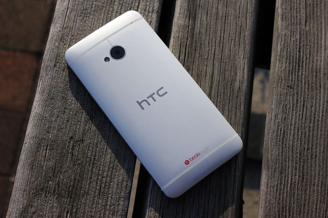
I was smitten with the One's design from the moment I first manhandled the thing back in February, and that feeling has never really gone away — the One is a truly stunning device both to hold and to look at. Samsung could really learn a thing or two from these guys.
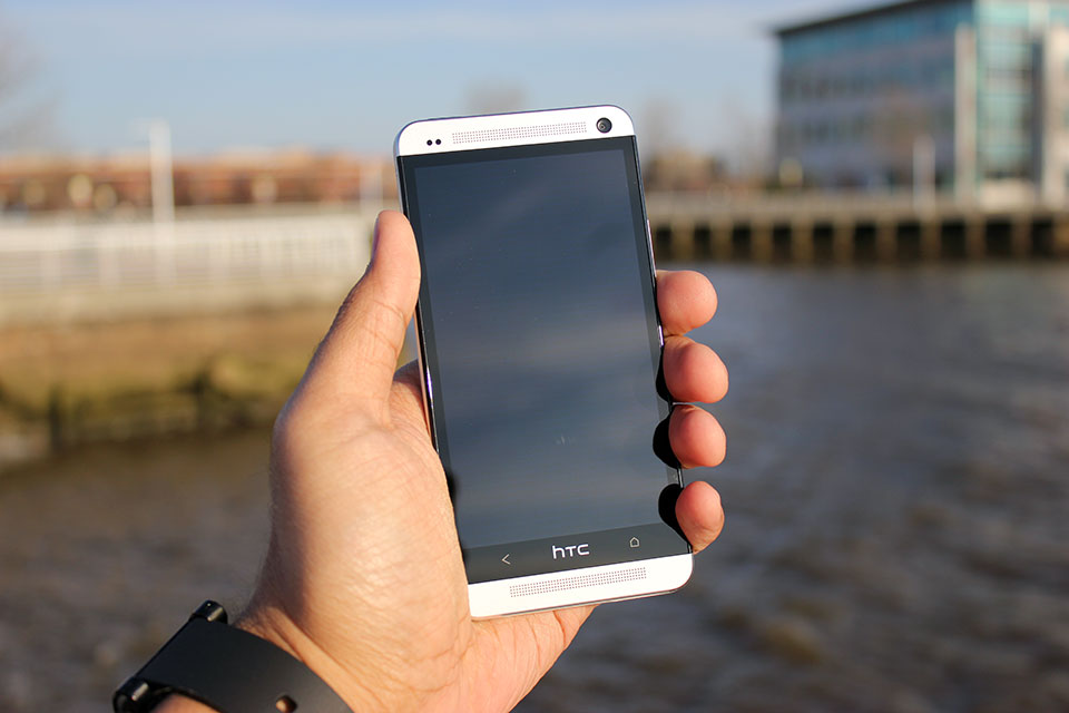
Before I get too effusive with my praise, let's take a quick tour around the device itself. The One's face is dominated by a 4.7-inch 1080p Super LCD3 display that's flanked on all sides by a thin black bezel. Sitting directly above and below the display are the One's unfortunately named Boomsound stereo speakers (a small notification LED will occasionally blink at from the top grille), and the 2-megapixel wide-angle front-facing camera rests on the top-right corner of the device's visage.
The One's sides and bottom are fairly nondescript — the volume rocker, microUSB port, and SIM slot are nestled along the right, bottom, and left edges respectively, while the top edge hosts a headphone jack and a sleep/wake button that doubles as an IR blaster for controlling your television.
Phew. Now that I've run through the laundry list, permit me to gush a bit about how the One looks.
To say that the One is understated in its design would be putting it mildly; the thing is terribly handsome in a stark, minimal sort of way. It's worth pointing out, though, that the One isn't actually that big a step forward from some of its predecessors when it comes to physical design. If anything, it represents the refinement of a design formula that HTC has been working on for the past 9 or 10 months with devices like the Butterfly and its American cousin the Droid DNA. Familiar elements like elongated speaker grilles, textured volume rockers, gently sloping backs, and highlighted camera pods seen in those earlier devices all make appearances on the One, but HTC has clearly upped the ante in terms of quality and construction this time around.
The first thing you notice as you pick it up is how light it is — at 143 grams it's only a hair heavier than the Droid DNA, and (thankfully) the One's minimal heft belies just how sturdy it feels. That's all thanks to the device's unibody aluminum chassis, which HTC says takes somewhere around 200 minutes for a CNC machine to carve out the One's frame from a single block of aluminum.
That's a considerable chunk of time for HTC to spend while some of its rivals spit out handsets like it's nothing, but the end result is a device that feels as reassuring in your hand as HTC's would-be savior should. That said, you still won't want to toss the One around all willy-nilly. The white plastic polycarbonate that runs around the device is flanked on both sides by polished, chamfered aluminum edges that are prone to picking up scuffs and dings, though some people won't care nearly as much about that as others.
Samsung could really learn a thing or two from these guys.
The One isn't without its share of question marks, though. If you've used pretty much any popular Android device before spending some time with HTC One, then one little omission will probably stick out like a sore thumb. I'm talking of course about the lack of a third soft key — the company opted to stick solely with Back and Home keys separated by an HTC logo.
If you go by the company line, the choice was made in an attempt to simplify how users interact with the One. I'd actually argue that dropping that extra button is more counterintuitive than anything else since most current Android users are likely familiar with the three-button layout, but it doesn't take too long to readjust to the two-button lifestyle.
And of course, HTC has once again seen fit to exclude a microSD card slot in its latest flagship handset. I can't really be surprised at this point considering this is a recurring theme for HTC, and it's not as big an issue as it was in other devices since HTC offers 32GB and 64GB versions of the One, but I've often looked to expandable memory as a hallmark feature of an Android device, and I'm sad to see HTC skipping them completely on its top-tier handsets.
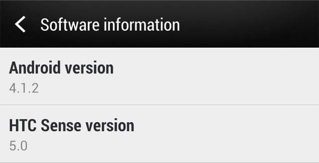
Both versions of the One I've played with come loaded with Android 4.1.2, but as always, HTC has done its level best to paint over the stock UI with its custom Sense interface. The Taiwanese company has been diligently trying to trim the fat from Sense for months now with largely positive results; Sense isn't the kludgy, overwrought beast it used to be, and Sense 5 represents HTC's biggest leap forward to date.
Put very simply, Sense 5 looks great. Stock icons and the once-bubbly default keyboard and dialer have been designed to look flatter and less skeuomorphic, and HTC has dumped its usual font in favor of Roboto Condensed, which imbues the UI with a much cleaner vibe. The app launcher has gotten quite a facelift, too — a persistent time and weather widget lives at the top of the screen, and right out of the box you're treated with a spacious 3×4 grid of applications. Tinkerers can easily fiddle with those particulars should they prefer a more densely packed grid like I do, and you can easily switch between ordering apps by name, recency of use, or whatever other convoluted scheme you can dream up.
Of course, some changes are more drastic than others. Take BlinkFeed for instance — in one fell swoop, HTC has decided to try and reinvent the Android homescreen. The concept is simple: the way HTC looks at it, smartphones are content-consumption devices so BlinkFeed was designed to surface content based on your interests and your social connections with as few steps as possible.
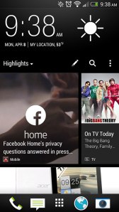 Getting Blinkfeed set up is painless enough — you can tailor your feed by selecting from some broad areas of interest (think gaming, music, politics, etc.), and by opting to receive content from your social networks, apps, and a handful of featured sources like ESPN, Vice, and Reuters (disclosure: some of Aol's media properties are featured sources). From there, all of that stuff gets splayed out into a vaguely Flipboard-y grid for your immediate perusal, and all it takes to refresh your feed is a downward swipe.
It all makes sense on paper, but Blinkfeed in practice leaves much to be desired. Why can't I add my own content sources? Why can't I just turn it off rather than manually disable each content feed and switching its default homescreen status off? The likely answer to both of these questions is a familiar one: it's all about simplicity.
BlinkFeed wasn't necessarily designed with the power user in mind — we spoke to HTC's Jeff Gordon just prior to the One's launch, and he made the feature out to be a consummate time-waster, something people use when they find themselves stuck in a queue somewhere. That's about the only time I bothered to use it to be quite honest; the rest of the time I would just fire up Flipboard or Twitter and get my content straight from the sources I wanted it from. Fortunately for me, more traditional Android homescreens are but a single swipe away, but you can only have up to four of them.
The unlocked international model doesn't have much in the way of bloatware — just a few preloaded apps like TuneIn Radio and a Kid Mode courtesy of the folks at Zoodles — but the Sprint variant doesn't fare quite as well. Expect oodles of carrier-loaded apps that range in quality from mildly useful (Lookout Security is nice to have around) to the nearly pointless (do we really need the Sprint Music Plus store when Google Play is right there?). Most of them can be uninstalled without much trouble at all, and those that you're stuck with (I'm looking at you, Sprint Zone) can be easily hidden thanks to the revamped app launcher.
As you'd expect from a device that sports a cleverly-hidden IR blaster, the One also comes pre-loaded with a remote control app developed in partnership with Peel. I'll be the first to admit that I'm no TV buff, so my experience with the remote control feature was short and sweet — the setup process was over in a matter of moments, and the One succeeded in turning my television on and changing the channel and volume a few times. After popping in my zip code and selecting my cable provider, the app also provided guide data for all the shows I don't watch. While it's unlikely to replace your actual remote, it works like a charm and that's frankly a lot more than I was expecting.
With the One, HTC has officially bowed out of the megapixel race. It's easy enough to write off the word "ultrapixel" as a spurious bit of marketing fluff, but the One's camera manages to prove that pixel size really does make a difference.
Photos taken with the One look phenomenal when viewed on the phone's crisp 1080p display — they're nicely detailed and colors were vivid (perhaps a little too much so, more on that later). Sadly, a bit of that impact is lost when you transfer them to PCs or televisions. The shift towards fewer larger pixels instead of more smaller ones sounds like a good idea, and it mostly is, but there's a sort of fuzziness apparent in some of the One's photos that keeps my support from being full-throated. I suspect it's an issue that won't matter to a majority of users — the results are definitely more than adequate for [insert social network name here], and I've found the shots the One takes are still more pleasing than many of its competitors. If anything videos seem to fare little better; my test clips were all crisp and bright, and to my surprise the microphones blocked out plenty of background noise.
Speaking of competitors, the camera sensors in most of them struggle in low light but the One manages to dodge those issues rather nicely. It's surprisingly good at capturing light even when it's in short supply and manages to do so without introducing much grain into the situation. It's worth noting that the ability for the One's sensor to pick up as much light as it does has an impact on color reproduction. Consider the comparison shot with the iPhone 5 above — the One captures more of the scene, but some details (like the tree branches in the bottom left corner of the photo) are lost because of overexposure.
As far as the Camera app itself is concerned, it remains remarkbly clean and easy to operate. Switching between the front and rear cameras takes a single swipe, popping into Zoe mode takes a single touch, you see where I'm going. Beyond the simplistic interface though is an impressing array of settings — you can muck around with ISO, white balance, timer, scene modes, face detection, and even the review duration for recently snapped photos. Honestly, I find the idea of layering filters on top of perfectly good photos to be a little ridiculous, but the One has plenty of them for you Instagram-types to fiddle around with too.
And then there are the aforementioned Zoes, those peculiar little three second video clips that HTC has started to push with the One. When I first played with the One, I was downright dismissive of the concept. I'm still not entirely sold on them, but I've grown just a little more appreciative of the notion. My biggest issue with them is how you're supposed to manage the things. It's simple enough on the One itself — the short clips are accessible from the Gallery app and you can use the HTC Share service to post them online for 180 days, but the real problem emerges when you try to pull them off the device through USB. Zoes are locally stored as very brief video snippets but as a series of stills as well, so pulling them off the One en masse feels a bit more labor-intensive than it should.
Goodness, it seems like just yesterday that finding a 1080p display on a smartphone was a rare and wondrous event. These days nearly all the major Android players have worked those sorts of high-resolution panels into their new flagship phones — just look at the Optimus G Pro, Xperia Z, or Galaxy S4 to name a few.
 Even with such notable rivals to consider, the One's 4.7-inch Super LCD3 panel is perhaps the best smartphone display I've ever seen. Text and high-res images were remarkably crisp (not a surprise considering the display sports a pixel density of about 474 ppi), and the colors are bright and accurately reproduced. While some displays pump up color saturation to lurid levels and others exhibit a pale cast, the One strikes a thoughtful balance between those extremes.
I haven't noticed any distortion or discoloration despite seeking out some of the most awkward viewing angles — in short, the One's display is a real pleasure to ogle.
One of my biggest issues with the 5-inch 1080p panel found on the Droid DNA was that it just wasn't all that bright compared to the competition — it was perhaps the most notable miss for an otherwise impressive display. Thankfully, HTC has addressed that issue with the One. When screen brightness is cranked all the way up on both devices, the One's display is noticeably more luminescent than its cousin and shines on the level of devices like the Nexus 4 and the iPhone 5. It may seem like a trivial upgrade, but the weather's getting nicer and that bump in brightness has definitely helped outdoor visibility, too.

Let's just get it out of the way now: with a Snapdragon 600 chipset and 2GB tucked away in its handsome frame, the One was able to handle every task I threw at it with aplomb. Swiping back and forth between BlinkFeed and my more traditional homescreens were utterly seamless, as was scrolling down long webpages, and crafting ornate rococo structures in Minecraft Pocket Edition. If you're the type that prefers numbers to anecdotes, the One's five-run Quadrant average topped out in the low to mid 12,000s, handily blowing away devices like the Nexus 4 and the Droid DNA. Running Geekbench on the thing yielded similar results: the lowest of three trials was a 2728, which puts it on top of the performance heap again… for now anyway. It won't be long at all before other devices start to catch up in terms of pure power, but there's little question that the One will be able to handle nearly anything you load onto it and that's really all that matters.
All that power comes at a cost though. The One managed to stick it out for four hours and 21 minutes of our standard battery test, in which the device is made to run through an endless cycle of Google image searches over the wireless data connection with the screen lock turned off and display brightness set to 50%. Granted, less than 4.5 hours doesn't sound all that great, but bear in mind that's nonstop usage — in my experience, the One always managed to make it through a full work day's worth of checking emails, firing off text messages, playing music through the Boomsound speakers, and playing the occasional game with at least a little juice left over.
I won't dwell too much on network performance for two reasons: your mileage will almost certainly vary from mine, and Sprint can be frustratingly sketchy in my particular corner of New Jersey. In case you were itching for a dose of schadenfreude for the day, I was never able to pull speeds greater than 2 Mbps down and my upload speeds topped out at 3.5 Mbps — that's not really the One's fault but man, that really hurt. On the upside, call quality was just peachy on both version of the device I tested (you know, in case you actually wanted to use this thing as a phone).
I need to take a minute here and touch on one of the most impressive features HTC has baked into the One, and it may not be what you expected. I've reviewed my fair share of phones during my tenure here at TechCrunch, and with few exceptions they've all mostly let me down when it came to sound reproduction and quality. The One simply doesn't — it's got the best speakers on any smartphone I've ever used. Granted, that's not really saying much since most smartphone speakers are downright wimpy, but the One's BoomSound speakers managed to pump out crisp, loud audio along with a surprising amount of bass too. The jaunty bassline in Paul Simon's You Can Call Me Al was bright and easily discerned, and not once during my testing did the One fall prey to the dreaded muddy audio syndrome.
I can boil the preceding 3,000 or so words into a few brief sentiments for you to chew on: the HTC One is easily the best device that the company has ever crafted, and it's perhaps the single nicest Android phone I've ever used. Despite some minor faults, I haven't so much as picked up any of the other Android smartphones scattered around my office during my time with the One unless I absolutely had to. It's really that good.
And yet, after releasing a smartphone to near-universal acclaim, HTC's future is still unclear. As Matt pointed out a little while back, building the perfect phone just isn't enough anymore. These days it seems like technical expertise and the achievements that stem from them can often be overshadowed by lavish ad campaigns and the ability to churn out devices at a breakneck pace. That said, the mobile industry has never really been what you could consider meritocratic — the market is fast and unforgiving, and there aren't many companies that have learned that lesson as clearly as HTC has.
There's no question that the One will be facing some very serious competition in short order, but if you're looking to pick up a new phone in the weeks or months to come it's definitely worth your consideration. Trust me, you'll find plenty to like here.







No hay comentarios:
Publicar un comentario