Social publishing site Scribd has given itself a new look over the past month or so, with a new logo, a redesigned website, and an update to its iPhone app.
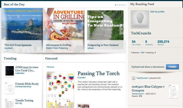
CEO Trip Adler and his team gave me a quick tour of the new features last week. The website was previously dominated by your social feed, showing you the documents uploaded and read by other users that you're following. Now the social feed has been pushed off to the side, and in its place there's a feed of "featured" content, which has been hand-picked by Scribd.
The problem with the old layout, apparently, was the fact that the social feed can be pretty empty when you first sign up and haven't found anyone to follow. Adler also says the site has lots of good content that "wasn't getting surfaced enough." With the new layout, Scribd can help ensure that the best content doesn't get buried, while also giving new and casual users something interesting to read without their having to hunt for it.
The distinction between new users and "power users" came up repeatedly during our conversation. It seems that Scribd is making a big push to make the service more friendly to new users while still serving the more serious fans. In this case, if you're already following a lot of other users, the social feed hasn't disappeared — it's just a bit less prominent.
The iPhone app has also been redesigned with a new featured section, and it includes a bookmarking feature for reading documents offline. We can expect to see the redesign and the bookmarking feature to appear Android and the mobile web, too — Scribd's goal is to eventually bring the mobile website to feature parity with the native apps. Adler also notes that mobile is becoming an increasingly large part of the company's business, now accounting for 10 percent of traffic and 20 percent of ad revenue.
 As for the new logo, it's not a dramatic change. (The current logo is the one at the top of the post, while the previous logo is directly to the right of this paragraph.) However, the Scribd team says that by flattening the logo out and removing the extra color, they're hoping to make it a little more "modern" and "mature", as well as easier to reproduce in a variety of contexts.
It has been a relatively quiet year for Scribd, at least from a press perspective, aside from the near-sale of its newsreading app Float. Still, Adler says the company has been growing, with 25 million "quality" documents uploaded by its users. (The number doesn't includes things like documents that are entirely privately.) The company has also made two big additions to the management team — VP of Engineering Sabeen Minns, formerly VP of Product and Wireless Software Development at Palm, and Head of Product Lilia Martinez-Coburn, formerly VP of Product and Marketing at TownHog.
And Adler says Scribd is now profitable, with about 50 percent of its revenue coming from ads and 50 percent coming from payments (either for premium for features or for certain documents/e-books).
Scribd is a social reading and publishing website. The company houses tens of millions written works, including best-selling books, magazines, research reports, recipes, presentations, and more. Scribd enables users to upload documents of varied formats, including MS Office Documents, Google Docs, PDF and ePUB files. Scribd then makes those documents searchable (across the web and within the documents themselves), social, and easy to embed within websites and blogs. Scribd's document reader has been embedded more than 10 million times...

No hay comentarios:
Publicar un comentario