The grass is greener on the other side. It's what many people think when eyeing up a change in phone platform. And it's true, the grass is greener... but that's mainly because the camera's not so good over there and tends to over-saturate things [see what I did there...?]
- I'd rejected Windows Phone as a possible Symbian replacement for all the reasons David quoted here, much as I liked the Lumia 800 hardware and much as I enjoyed the fresh UI, I just couldn't live with the limitations day to day.
- I'd rejected iOS - the limited hardware selection, the high cost of the only really decent device, the lack of true multitasking (so no gathering podcasts in the background, for example), the way Apple knows best at every turn, all started to grate.
- I'd rejected Blackberry too, much as I loved the Bold 9900 hardware (video review link) and even the latest OS 7, if only because this was a 'dying' OS too and I was supposed to be leaping forwards, not sideways.
So Android it was, for my week living in the future.
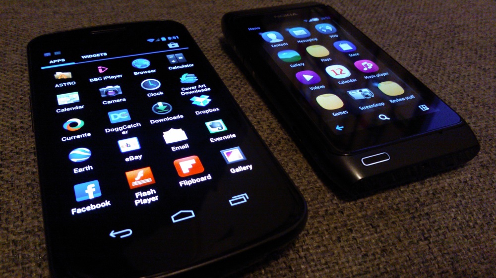
Now, I'm no stranger to Android, having written the Smartphone Essentials magazine Android Helpdesk for a year, plus three years of Android Phones Show reviews. So I know my way round the OS, I know most of the tips and tricks, which meant that it didn't take more than a couple of days to get my Galaxy Nexus (video review link) kitted out with everything I needed, mirroring just about all the things I used to do on Symbian and adding a few more besides. Job done.
Or was it?
- I loved the Galaxy Nexus's large screen - ok, the device itself is perhaps a bit too large for day to day use, but I got used to it for the extreme pleasure of flicking around the giant 4.65" Super AMOLED screen, ploughing through social updates, watching video, YouTube in HQ mode, and so on. Amazing. Astonishing. The device is also kind of beautiful in its minimalist blacker-than-black way, as with the Nexus S, I love fondling it, even with the screen off (don't laugh at the back!...)
- I loved Android's application choice. Where, in the Symbian world, I'd need an application and there might be two alternatives (if I was lucky), on Android there would be ten and most of them would be quite good.
- I loved the Google/Gmail/Reader integration, everything just worked and was pretty darned quick.
- I loved the way Android was geeky in much the same way Symbian is - plenty to fiddle with, plenty to customise, I could set the Nexus up however I pleased, from homescreens to folders to widgets to replacing built-in apps with third party ones.
So.... at the risk of being called a Symbian or Nokia fanboy (again), why am I back on my N8? After all, given the positives on the Galaxy Nexus above, surely the N8 is a glaring step back in technology time? Well.... yes and no.
Despite the Nexus's glowing benefits, there were several things I really, really missed from Symbian. Again, note that I'm no rose-tinted glasses, Nokia/Symbian fan - see my article from a couple of days ago, slamming the companies for some huge mistakes they made in the last few years. If I take any 'position' at all, it's that all phones and mobile OS are imperfect, all have pros and cons, but at least I can hopefully see past marketing speak and prejudice.
_____________________
What did I miss about my N8? Some of the following will be obvious and mentioned before (so I'll keep them brief here), while some attributes may be surprising to you:
- Camera. Obviously. The 12mp sensor and Xenon flash on the N8 are a known quantity, recognised even by Symbian haters. The Galaxy Nexus's camera was passable for casual shots and sunny scenes, but any of moving people indoors were a disaster. Here's the scenario: Jubilee weekend here in the UK, family party, indoors. My little 2 year old grand-niece toddling around trying to blow a vuvezela (don't ask!), and someone stuck a bowler hat on her. It lasted there for two seconds before she sussed and whipped it off. But not before I had my N8 out of camera standby in a second, focussed in another half a second and the Xenon flash and big sensor got the shot. Perfectly. Not blurred. Frozen in time. No other modern phone on the planet (other than the N8's successor), however much you spent, would have let me grab this photo.
- Speaker. This is a big one for me (watch out for an editorial coming soon), though I accept it may be a non-issue for others. The Galaxy Nexus, and a surprising number of other Android smartphones, have really, really weedy loudspeakers, to the extent that I could almost not listen to podcasts on them - I just couldn't hear them over normal household noise (water running, family, etc.) - I was forever looking for headphones, for my Bluetooth speaker, or for my external FM transmitter - the N8 and indeed almost every other Nokia in recent times has had a decently loud speaker and I have no such issues.
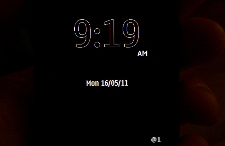
- Always-on clock. Perhaps the single most underrated feature of the AMOLED-screened Symbian phones from Nokia. I've got so used to looking up and seeing the time, especially in the middle of the night (shown below) - every time I had to reach out, sleepily, find the Nexus and press its power button just to find out how the night was going, I longed to have my N8 back.
- Multitasking. This was an odd one, and I can only put it down to lack of RAM and/or Android 4.0. In theory, Android works the same way as Symbian, i.e. applications can chug away in the background and, when you tap on their icon again, should simply pop to the foreground, exactly where you left them. However, on several occasions I'd come back to (e.g.) Doggcatcher (the Android third party podcasting client) and see to my surprise that it was launching itself again - it's true that the app was clever enough to remember where I'd got to in each podcast, but that's not the point. It seems as if Android 4 is (over) aggressive in killing anything that's not perceived as active. On my N8, I'm used to pausing a podcast at 7.30am when I get up, listening to a bit more over lunch and finishing it off while making dinner in the evening - in each case, I expect it to resume instantly and it does. Every time.
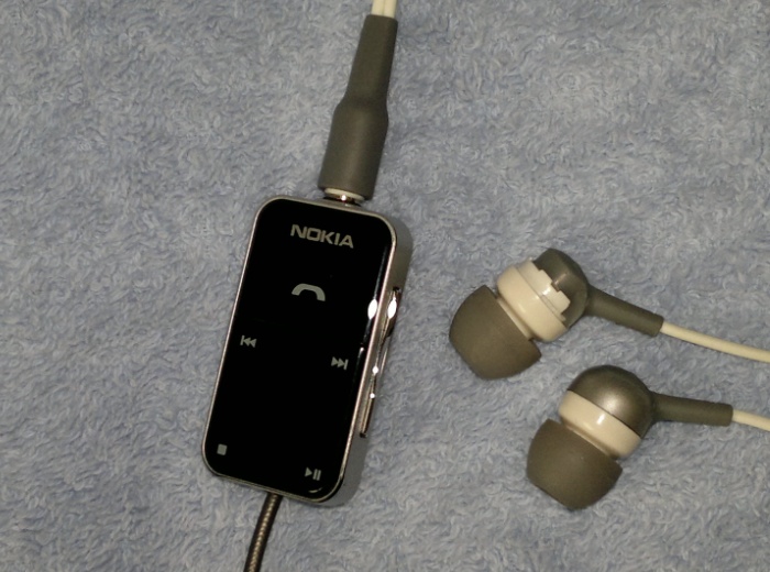
- Remote control audio. Along the same lines, I'm used to pausing music or podcasts on my N8 using one of Nokia's multimedia headsets (mine shown below), getting on with handling an interruption and then pressing a button to resume. Or to skip ahead a few minutes to avoid an advert. This seems to be very much a Nokia/Symbian thing - on the Nexus, as on most other competing smartphones, you only get a 'call pick up button' - this doubles as a pause button, and even a 'skip to next track' button if you press it twice. However, having paused playback in this way, if you delay more than a few seconds before trying to resume, you'll find the button's been deactivated - you have to power the Android phone's screen on again and then press the button to resume, rather foiling the point of the remote, hands-free functionality.
- Battery life. Now, listen up. This factor is a popular misconception. When a Symbian user claims better battery life than his/her Android counterpart and gets shouted down, the fact is that they're both right. I've used every phone under the sun and can state categorically that, when used intensively for similar purposes, there's no discernible difference between Symbian and Android. i.e. when running at full tilt, with similarly-sized screens and radios (etc) on, the main limiter is purely the size of the battery fitted. However, there's a big difference when used day to day in more 'relaxed' circumstances, because Symbian's a lot better at 'idling'. Used lightly (i.e. regular email/social but no sat-nav or camera use), my N8 will happily get through two days on a charge, on a 1200mAh battery. With the same circumstances, my 1750mAh-equipped Nexus will be dead after day one, simply because Android sucks power faster when trying (and largely failing) to idle.
I ended up getting the Galaxy Nexus Extended Battery, which took it up to 2000mAh and made sure that I didn't run out of power by bedtime, but I still had to be sure to charge it overnight. My N8 allows me to be a bit more forgetful and to be a little more erratic at charging and I appreciate this.
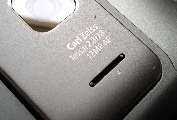
- Build quality. Unusually, the Nexus is one of the few top Android phones without Gorilla Glass and, as a result, it's picked up a number of scratches. So we have a plastic back that doesn't inspire much confidence and front that's surprisingly fragile. I always had to worry about where I was keeping the Nexus, so that it didn't rub against anything damaging, and about how I held it, in case its thin form crashed the ground. In contrast, I've now dropped my N8 so many times onto the tarmac and I've had it in pockets with everything under the sun, and it still works perfectly, the screen's still pristine and the only signs of use, after 19 months, are some small chips out of the aluminium on the back (see the camera island, below) and around the screen's metal rim.
- Size. Throughout the week, I found various places for the 4.65"-screened Nexus. In my front trouser pocket (OK, but often got in the way of my posture, or rested at an awkward angle, or was hard to get out when seated), in my jacket pocket (OK, when the weather wasn't too warm for a jacket or coat) or on my hip (too large, really - I have a belt case that fits, but it ends up ultra-geeky!) Contrast that with the far more svelte N8, easier in any pocket and relatively unobtrusive, even in a slimline hip case.
- Multi-service micro-blogging. A fancy term, by which I mean posting the same status update or photo to both Facebook and Twitter at the same time. On my N8 and Symbian, there's the over-white and clunky Nokia Social, whose star turn is, indeed, to do just this. One update and it's fired off to both social networks. Even better is the third party Gravity, not only allowing me to run with an AMOLED-friendly dark theme but also incorporating a variety of social networks - assuming that I want to post a photo, the same caption is remembered 'per photo', so I can tap on each network and don't have to re-type anything, which is pretty neat. I tried and tried on Android but all solutions which claimed to be able to blog to multiple networks at the same time proved to fiddly and complicated. There were clients and plugins galore, but nothing got close to Gravity on Symbian. Sorry.
- Sat-nav. In theory, Google Maps Navigation might be superior - with its far greater database of points of interest and better searching, it's definitely easier to find stuff on Android, and touches like switching to Street View when you get to your destination are cute beyond belief. However, in practice, Nokia Maps blows it away. Far more natural voice guidance (actually sounds like a real person - shock horror), a more refined display and - the big one - working totally offline thanks to preloading country maps. So, with the Nexus, when I needed it most, lost out in the country somewhere, I was totally at the mercy of ultra-slow GPRS data - yes, the current route was cached, but if I wanted to look for a destination miles away then I was out of luck. With my N8, I just preload the whole of wherever I'm going and data is only then needed for speeding up the first GPS fix and for 'point of interest' searches.
- Music quality. You know, the Nexus comes with some nice in-ear headphones and music playback sounds perfectly fine. Just as with most phones these days. But then you listen to a device like the N86 or N8 (or, going back, the N96 or even N91) and you realise the extra effort that Nokia has put into the audio output circuitry. Music sounds more alive, with deeper lows and higher highs. With decent headphones, I'm constantly blown away by how good my N8 sounds.
- Profiles. Another much underrated feature of Nokia phones in general. On Android, you can wind the volume down until the phone is silent, and/or you can put the phone in 'Aeroplane' mode, but, out of the box, there's not much more granularity. Yes, there are third party utilities on Android to set up more control, but I find the system of predefined (and customisable) profiles in Nokia phones so much more flexible.
- Landscape. This is going to sound a petty complaint, but it drove me mad how the Nexus (and nearly all other Android smartphones) would resolutely switch back to its portrait homescreen, even though the phone was being held sideways and I'd been watching videos (or similar) in landscape mode. How it is possible that Google hasn't coded in a switch to landscape into its homescreen after three years of heavy development? In contrast, happily back on the N8 and Symbian, every screen works whichever way round I'm holding the phone.
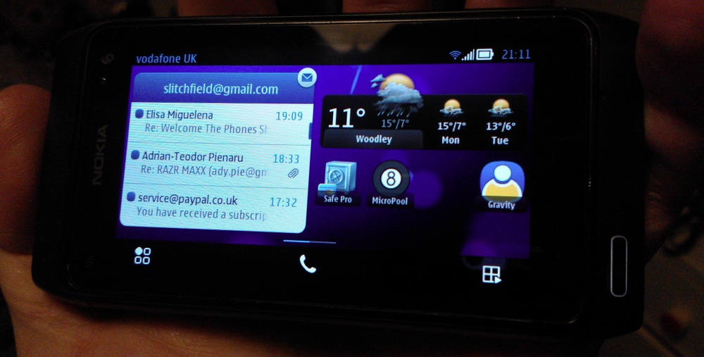
- microSD. We're getting down to the minutae now, but it's such a pain switching to new microSD-less phone and realising that I've got to load on all my music and media again. In contrast, I can switch between a dozen Symbian phones and all I've got to is pop out the microSD card and insert it into the new one.
- Micropool. There, I've said it. I'm addicted to the game, and it doesn't run under Android. Pool Break Pro on the Nexus is the best of the bunch on Android, but it has a much fiddlier 3D interface - Micropool is the perfect balance of simplicity of interface and skill of play. And I need an N8, or similar, to play it.
Please, please think before trolling in the comments below. This list has not be meant to be, in any way, a generic critique of two mobile OS, or even of just the N8 and Galaxy Nexus. I think that if you put the two devices side by side and analysed all functions, across the board, for generic/average users, the Galaxy Nexus from Jan 2012 would fairly easily see off the 2010 Nokia N8. But this article has been all about my own, personal experiences. I love both phones, but as I toddle off into the sunset, I've ended up with my first love the N8... Again.
Comments welcome on your own experiences, especially if they've involved direct N8 - Android comparisons in real life use.
Steve Litchfield, 3 June 2012
No hay comentarios:
Publicar un comentario