Pebble smartwatches have been hitting doorsteps for a little while now, but my colleague Darrell Etherington and I have only just been able to join the party. The reasons for the extra wait differed for the two of us — I was a late backer, and his got stuck in Canadian customs — but the timing seemed right, so here's our tag-team review of the device that helped kick start a new era of smartwatch hype.


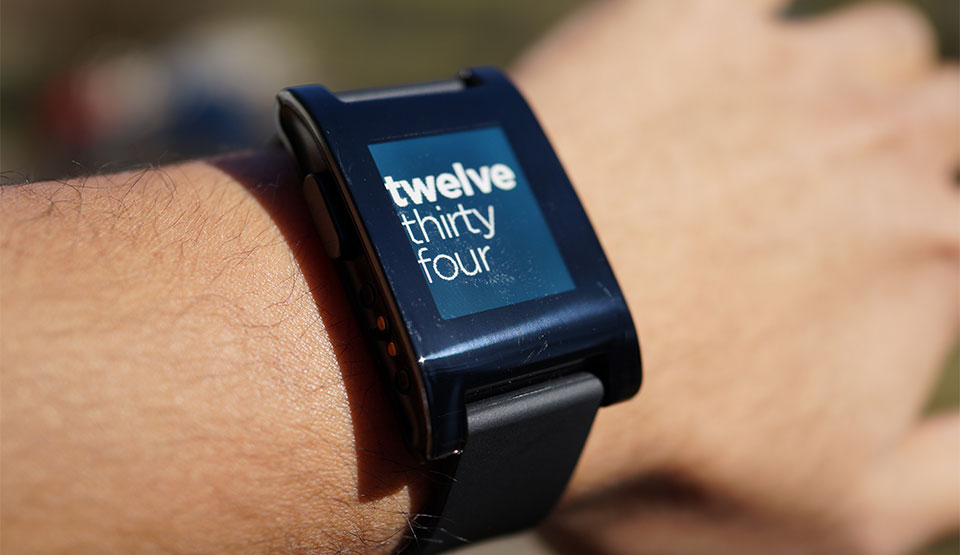
Darrell: The Pebble has one huge advantage over other smart watches right out of the box: aesthetics. This is a watch that lets your geek flag fly without being ass-ugly. The watch face options aren't necessarily all that awesome, but set it to the text face that comes pre-installed and don't worry about the rest. Also, black was the right choice, even if it was the only choice if you wanted one of the first shipping devices. Black watch on black strap in the Pebble looks fantastic on most any wrist.
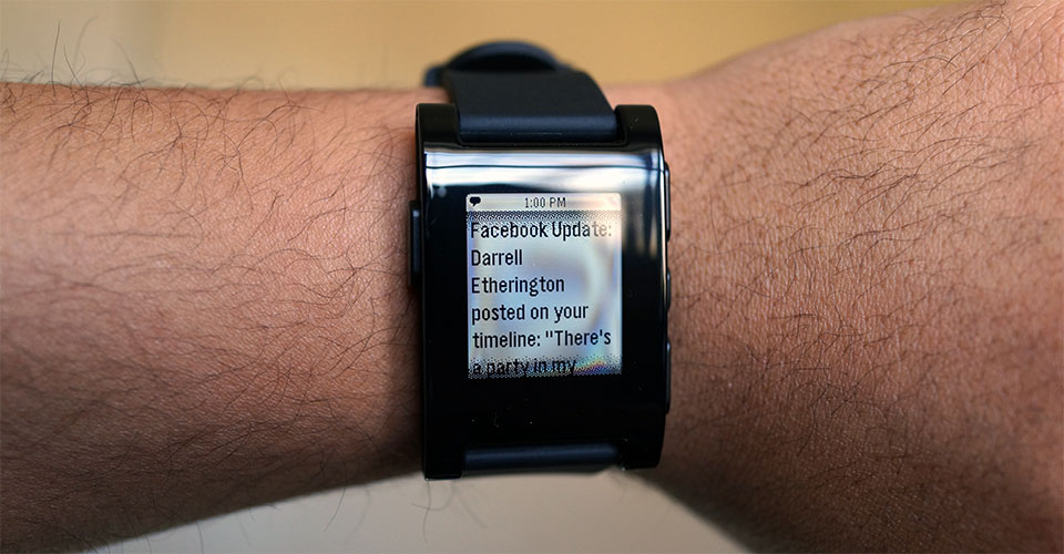
The screen is legible enough, but in some light the glue becomes visible to the point of annoyance, which is a rookie mistake and should not make it into production units, if the Pebble team is worth its salt. It affects all the Kickstarter units I've come across so far, however, so that's not a good sign.
Chris: I don't think the Pebble is quite as handsome as Darrell does — it's not bad looking, but it's hardly a fashion-forward timepiece. Still, some of the promises that Pebble has made to its backers have positively influenced the watch's look — rather than including something like a standard microUSB port for instance, the Pebble sports a magnetic charger so as to keep the whole shebang waterproof. The included rubber strap is plenty comfortable too, if a bit on the drab side. That's easily remedied though — the Pebble apparently works fine with any 22mm watch band though, so the sky's the limit as far as customization goes.
While we're talking about design, the Pebble's iOS and Android companion apps are both intuitively laid out (which is critical since the Pebble would be largely useless without them). The sync process is very brief, and once that's done you're quickly guided into setting up notifications — the whole process can be knocked out in just a minute or two. And of course a tiny vibration motor whirrs whenever you get a notification, though the wrong kind of aftermarket watchband may make it harder to feel.

Darrell: Compared to the MetaWatch, using the Pebble is like a breath of fresh air. It's almost the difference between proving that a smart watch as a concept is a good idea vs. something no one needs. From display, to overall look, to usefulness and dependability of features, the Pebble just blows the MetaWatch out of the water. Some might miss features like weather, stocks, and more that you get with the MetaWatch, whereas the Strata struck me as a novelty that quickly lost its charm, the Pebble already seems like something I'd have to at least adjust to living without.
Chris: Unlike Darrell, the Pebble is my first foray into this whole crazy smartwatch thing, and my time spent with the thing has generally been very positive For the past few days I've been switching between linking the Pebble with my iPhone and my Droid DNA, and it wasn't long before I began to prefer the experience on the latter just because of the extra granularity Android affords me. Under Android, I'm able to pass along notifications from Facebook and Google Voice (!) in addition to more standard fare like calendar entries and text messages.
Thankfully, the four-button navigation scheme used to handle all these notifications and menus is incredibly straightforward. The top and bottom buttons on the right side allow you to (what else) scroll up and down through menus, while the two remaining buttons take you forward and back. Hardly a flashy way to get things done (especially when some smartwatch rivals lean on touchscreens for operation) but it mostly works like a charm.

Darrell: There are still issues with the Pebble. Email notifications cut out when using it on iOS when it drops the Bluetooth connection and reconnects, for instance. Caller ID and message notifications work consistently, however, so this isn't a huge issue. The menu system could also use work; it'd be nice to be able to rearrange items in the list to make frequently-needed ones easier to access. Adding watch faces from the app just puts them at the bottom, and that's going to become a bigger issue once you have third-party apps to manage from the Pebble. The backlight is also immensely inconsistent; don't even bother with the automatic ambient light sensor, just turn it on at night and off during the day, or keep it on all the time if you're not that concerned with eking out as much battery life as possible.
On iOS, despite the fact that limitations are limited, the ones that it does provide work well. I actually prefer it to Android, since the limited support (only iMessage/SMS, email, phone and calendar notifications come through) means you won't face a constantly buzzing wrist.
Chris: I'll agree that notifications work, but the way they're implemented leaves plenty to be desired. Let's say you get more than one message within a short period of time — the Pebble will only ever display the most recent one, so you're going to have to go digging for your phone anyway. Now, I never expected the Pebble to replace my phone(s) for these sorts of tasks, but I was looking for something that would at least help me triage the constant flow of messages and updates and the Pebble isn't quite there yet.
I haven't had much luck with the ambient light sensor, but that really hasn't been an issue for me. I've been leaving the backlight setting on pretty much all the time and haven't seen a huge loss in terms of battery life — I can get about 5-6 days out of it with everything turned on, and the backlight is off most of the time anyway.
Since we're talking about inconsistency though, what about these screens? They're not always the prettiest things to look at while in direct sunlight, mine in particular — it's not as notable when the Pebble is just displaying a clock face, but there are some cloudy patches of coloration visible when I navigate the menu outdoors. Apparently it's just a natural thing, but it's still sort of unpleasant to see every day.

Darrell: The Pebble is still a little rough around the edges (visible glue at some angles under the display, which isn't a problem limited to a few isolated units), but it's much closer to the vision I had in my mind of a wrist-mounted, smartphone connected computer than anything else I've used so far. It still feels like a first-gen device, but it doesn't feel like a prototype. But now that rumors of an Apple smart watch are swirling, most users who don't feel a pressing need for this kind of device would do best to take a wait-and-see approach, especially if they're already using an iPhone.
Chris: I'm frankly a little torn when it comes to the Pebble — it's very limited in some key ways, but as a whole it's a portent of very exciting things to come. People who haven't already bought into all this smart watch hype probably won't find anything particularly revelatory or earth-shaking here, though I can't say I feel like I've wasted $150. If anything, I think of it more as investment in what the Pebble platform can actually become as it matures and garners more developer support.
No hay comentarios:
Publicar un comentario