NB. All of these designs run Symbian OS, though there are at least three different UI variants on 'top' - UIQ/Series 60/Series 90. Hopefully most will be familiar to you!
Warning: some of these designs (especially at the pointy end of the 10) may boggle your mind and cause bodily eruptions - I suggest you avoid drinking liquids that may stain as you read on...(!)
10. Nokia E55
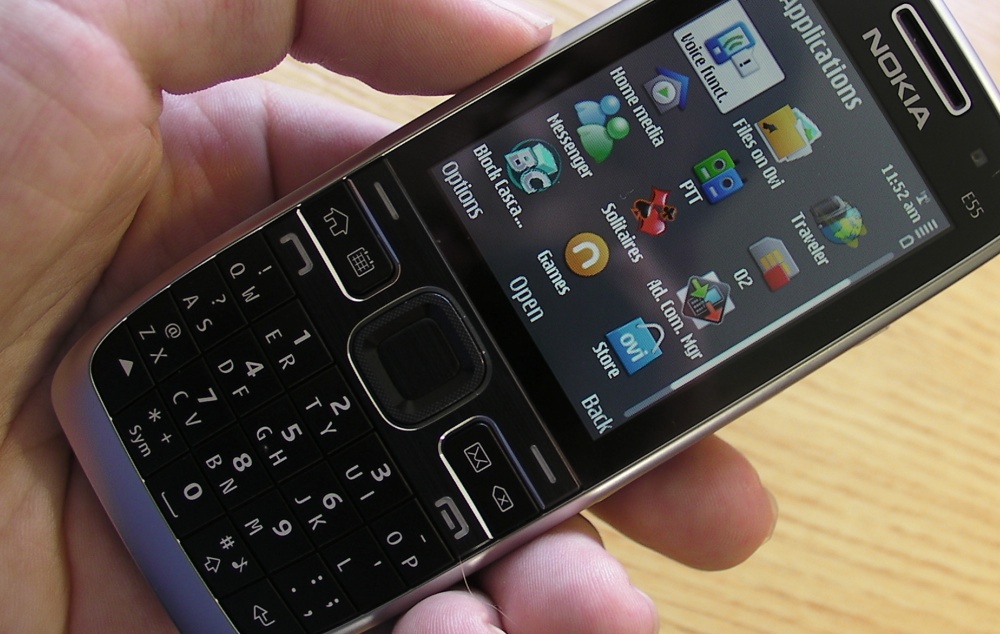
Never mind my rant at the time about cosmetics (the silver/grey version had an impossible to see keypad in most light conditions), the weirdest thing about the Nokia E55 was its 'Compact QWERTY' keyboard, wherein you'd mash down the key for the letter you wanted, regardless of the 'other' letter assigned to the key, and the software would work out what you wanted to say. In use, it worked surprisingly well, with only occassional halts while you muttered "Now, how the heck do I enter that?", but you have to admit that it was odd. So odd, in fact, that the design was never used by Nokia again. Which is a shame, I think Compact QWERTY had more development in it, I'd have liked to have seen where it went....
9. Sony Ericsson P910
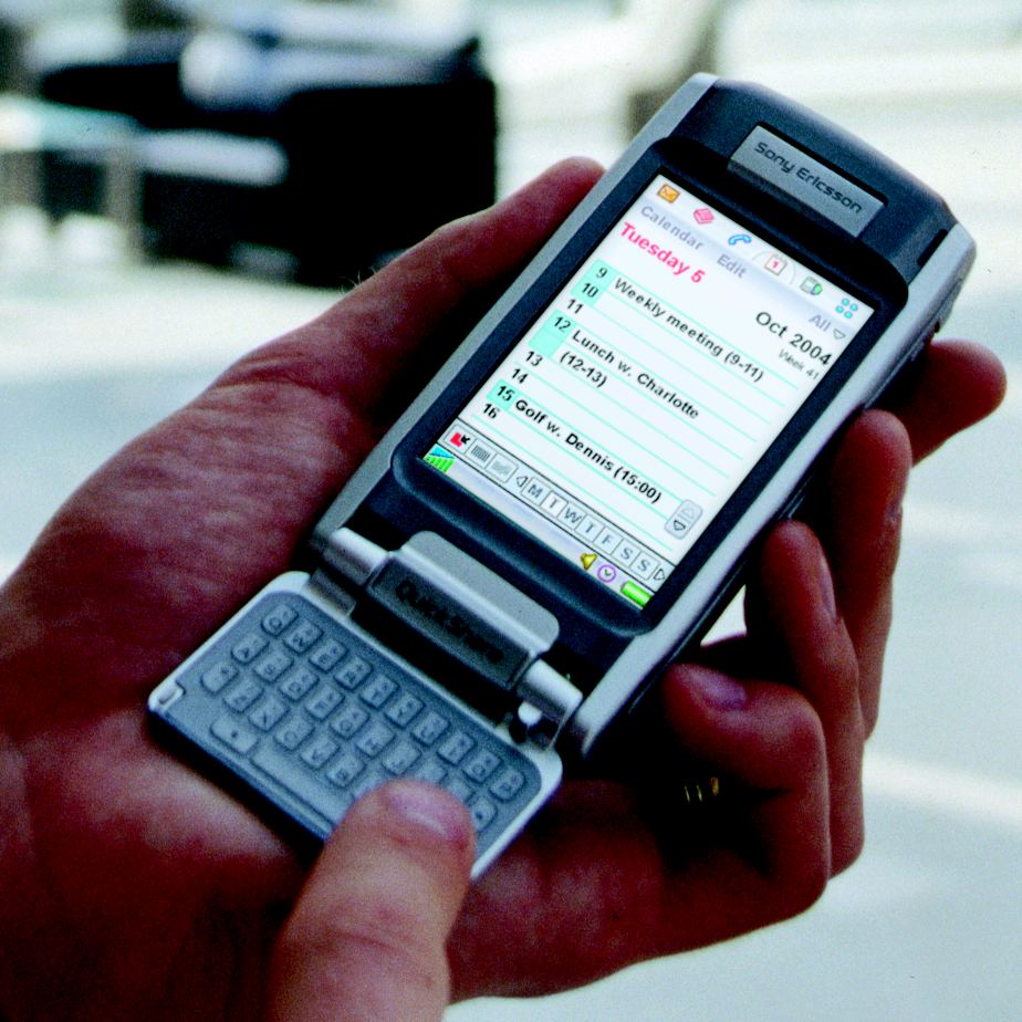
I've gone on record before about the P800 being the 'pure' design and the P900 something of a bastardised version, with a forced electronic keypad and coiled ribbon cable in the hinge. The P900 was higher spec though, so we all learned to live with this and the world was happy. Then Sony Ericsson, up a design creek without a clue paddle wondered what else they could do with their Symbian flagship and some bright spark suggested adding a QWERTY keyboard for the P910. Eh? Where on earth would you put it? On the back of the keypad. Well, duh, obvious really. And ugly. And impractical. And horrible.
And... yes, downright weird. After this, the whole line of Symbian UIQ smartphones got a big shake up. Thank goodness for that.
8. Nokia 7610
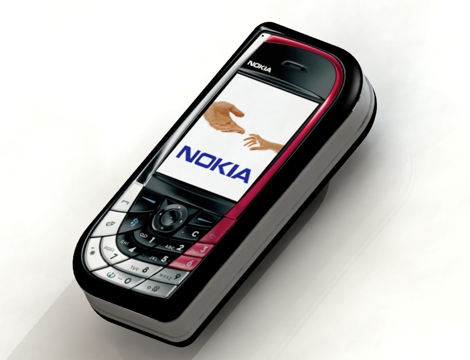
The 7610 was one in a string of smartphone designs with utterly weird keypad designs. One can only guess that manufacturers were trying the 'throw everything at the wall and see what sticks' approach. Certainly the 7610 design didn't, with a thoroughly disorientating skewed keypad. Admittedly it looked quite stylish and sexy in a quirky way, and if one had this phone from the start and had used nothing else, then that keypad would be all you knew and familiar. But, in the midst of a phone world which had standardised on a rectangular keypad, it was odd and painful to use.
7. Nokia X5-01
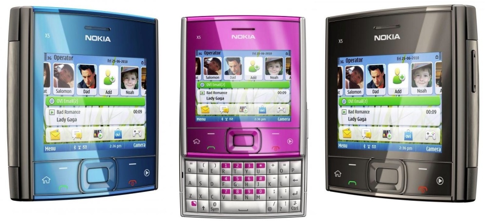
As a piece of lateral thinking, I guess you could give the Nokia X5-01 a pass - there's a square simplicity when closed and a fully useable (think E71) keyboard when open. A win-win? Well, not really. It turns out that a square isn't a great shape for a phone - the human hand is used to something it can grip its fingers round, something taller than it is wide. Funky colours though!
6. Nokia 5700
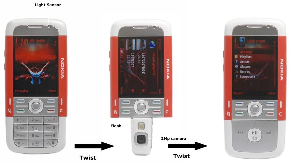
This wasn't the very first twist-bottom Symbian smartphone, but it was the most dramatic, with keypad, music player controls, camera and speaker all housed in the bottom section. It's very Thunderbird 2 - you can almost hear the theme music playing in your head as the hardware turns to change its function... The labelling of the main control keys is also quirky, off to the side - I bet loads of new users pressed the labels and not the buttons...
5. Sony Ericsson P1i
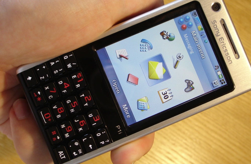
Now, don't get me wrong, the Sony Ericsson P1i certainly wasn't ugly, and build quality was pretty good, but check out the lower third. This wasn't the only 'dual function' keyboarded device - the earlier M600i had had it too, but this is standing in for the breed. In theory, it's a great idea - have each key hinged in the middle so that it can rock left or right, depending on which letter the user needed. And, in practice, if you simply forgot about the mechanism and mashed away, you usually ended up the right results - but it never felt 'right'. The constant changing in key resistance vector as you aimed for different letters was disconcerting. Sony Ericsson abandoned this (weird) design after the P1i, I believe, which was probably just as well...
4. Nokia 7710
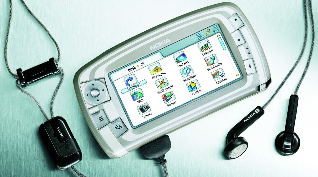
Maybe I'm doing the short lived Nokia 7710 a disservice by filing under weird, but it's certainly an odd data point in Nokia's smartphone history, not least because Nokia canned the project shortly after release (in favour of Series 60/S60). Today, used to large screened smartphones used in landscape mode a lot, the 7710 looks more conventional than it was at the time. I thought of the 7710 though, not just because of the oddball form factor and UI (Series 90) but because of those right hand side buttons, which still baffle me today. What are they each supposed to do? Talk about unintuitive....
3. Nokia N-Gage
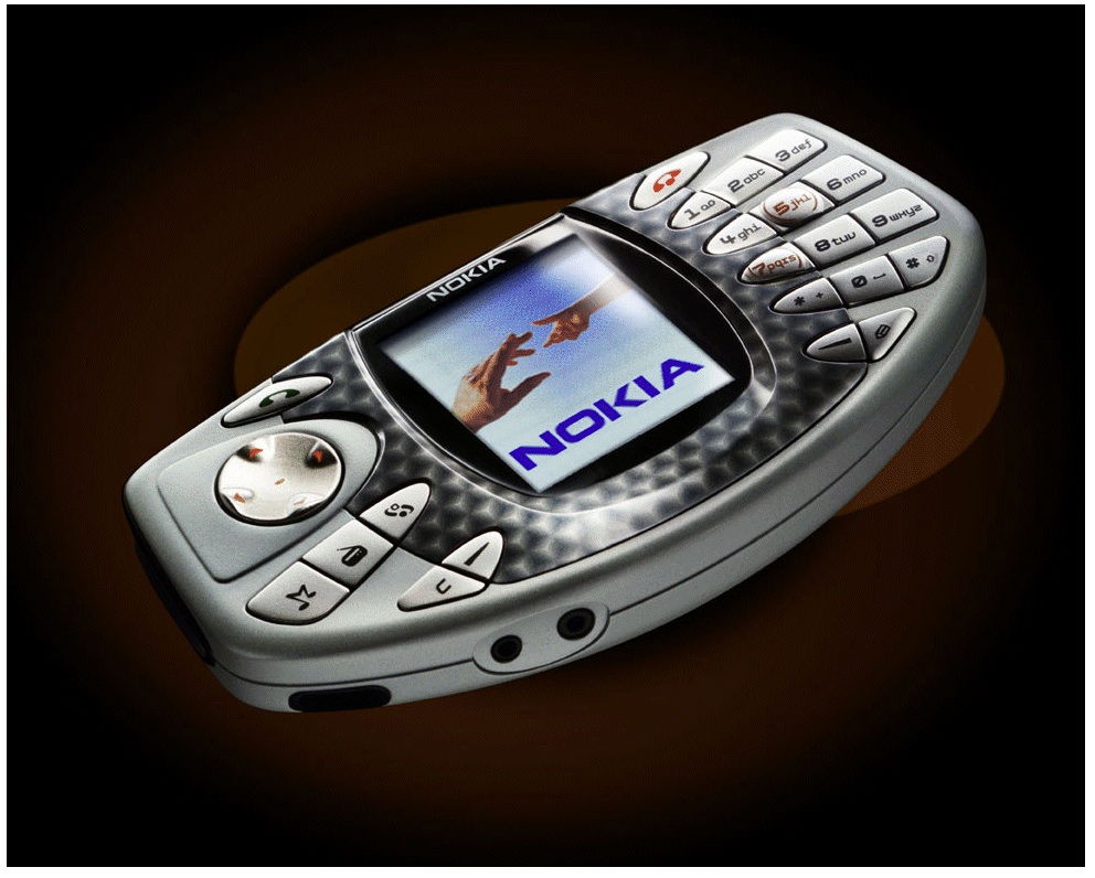
Ask 10 die hard Nokians which smartphone was weirdest and I bet at least four of them would say the original N-Gage, Nokia's attempt to create a whole new game console-phone hybrid market. It was a brave attempt in every way and there were some lovely touches as a piece of hardware, not least having a line IN jack, for recording stereo audio (I'm not sure why, mind you!) and being able to record from the built-in FM radio. It was all designed around a landscape form factor, very different from the traditional phone. But oddest of all, and unnecessarily so, was the positioning of the earpiece on the top face, meaning that you had to hold the N-Gage up to your ear with the front pace pointing forwards to onlookers. Who would then point and laugh... Weird, certainly, but I still have a soft spot in my heart for this device.
2. Nokia 3650
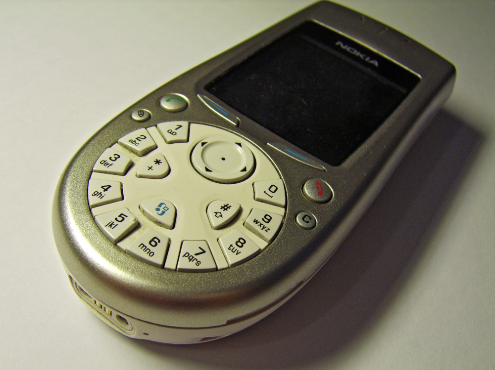
Of the 10 people mentioned above, the six who didn't go for the N-Gage probably went for this, the 3650. "Now, own up, Nokia designers. Which one of you came up with the idea of ditching the conventional keypad and spreading the numbers and letters around a circle? Come on, own up. You! Yes, you at the back!" [FX: bang] I'm not really sure what I can say that the photo above doesn't already say. The 3650, despite being the 7650's successor and with numerous improvements (Nokia's second ever Series 60 smartphone), including a memory card slot, was a usability disaster. As I think 999 out of 1000 passers by with zero technical knowledge could have told the design team at the time if they'd bothered to check....
1. Siemens SX-1
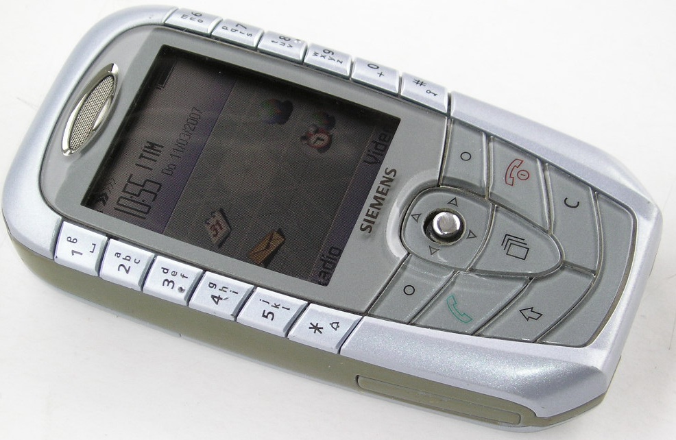
There's worse than the Nokia 3650 though - ho yes. Let's imagine the number/letter keys not even in the bottom third. Let's imagine them separated and stuck either side of the main display, where they're totally unusable by anyone who wasn't stuck with this arrangement since they popped out of their mother's womb. In fact, imagine no longer, because you can pick up the Siemens SX-1, a Symbian Series 60 phone, on eBay for a song if you happen to spot it anytime. Or maybe they're pricier because Siemens never sold many - can't think why. Can you?
______________________
It's (perhaps thankfully) noticeable that all of these designs are quite old. Could it be that weird and wacky designs never caught on because they looked odd and were hard to use? Who knew?(!)
Has the modern craze for touch slabs robbed us of the quirkiness of such designs as these? Or saved us? Comments welcome!
No hay comentarios:
Publicar un comentario