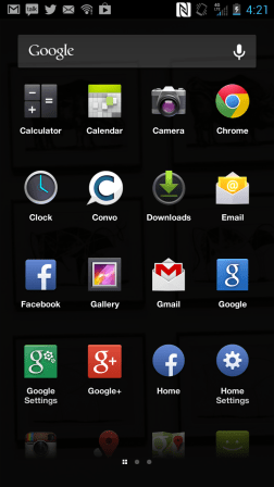
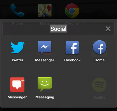
When Facebook Home launched, its launcher was awful. No dock, no folders, no widgets — basically none of the personalization Androiders know and love. Even if they wanted their friends to come first, few were willing to sacrifice their customized home screen. But with last month's new favorites dock and today's added ability to drag apps into folders, Home's biggest cracks are getting patched.
The problem is that Home replaces your home screen and launcher, rather than seeking to augment it. Most obviously, it buries your apps two taps deep. First you have to open its full-screen news feed on the lock screen called Cover Feed, and then use a gesture to bring up the launcher. The only customization allowed of the launcher was which apps sat on your primary home screen. That's still a bit messy, and the rest of your apps would be listed out in a redundant and tough-to-navigate secondary screen you had to scroll down. If you frequently wanted to access a variety of apps beyond Facebook, it was quite a hassle. There was no Dock or folders to help organize your apps, and no widgets to give you the info trapped inside them at a glance.
 As I wrote, some of the team who built and tested Home on Android were iPhone users, since Apple's phones are very popular among employees of the social network. That meant they didn't necessarily realize how important widgets were to people, and may have discounted the annoyance of reorganizing their home screen from scratch since they expected some friction when switching platforms. But for long-time Android users, Home overwriting their personalized home screen and leaving them with no way to reconstruct it was a deal breaker.
Home launched in April and by a month later, Facebook had read enough 1-star reviews to know this wasn't acceptable. Slow downloads and almost non-existent sales of the HTC First that comes pre-loaded with Home showed that a terrible launcher was weighing down more popular features like Cover Feed and Chat Heads.
In May, it announced it was working on Dock, a persistently visible tray of your favorite apps that sits on the bottom of your launcher, just like on iOS. A month later it launched so you could at least always find your email, phone or text messages button.
With today's update, when you drag apps on top of each other, they create a folder you can name. Many iOS and Android users employ folders to keep their home screens manageable and tidy even if they've downloaded dozens of apps. You might put all your news reading, restaurant finding, or puzzle gaming apps in the categorized folders. That makes it a lot quicker to find a certain app than trying to recognize it amidst a sea of icons or using search to pull it up.

Facebook now says it's working on widget support — another sacrifice Home users wouldn't have to make. It's also trying to improve the NUX — the new user experience of Home. Right now it's quite confusing, especially for tech novices and Android virgins. With NUX, dock, folders, and widgets worked out, it might finally be a fair fight between Home and more traditional versions of Android. Facebook would sure like to see the usage rates go up considering how long it's worked on its "apperating system".
But there's one more obvious stumbling block Facebook has to deal with: transitioning people from Android to Home.
Right now, even if you have folders or a dock set up on your old version of Android, when you switch to Home, you lose them. Facebook hasn't figured out how (or if) it can import these personalization preferences. For Home to be a success, it can't heap a ton of extra work on people. No one wants to re-drag all their apps into folders again, then name them all, then choose what goes in their dock, and then reconfigure all their widgets.
Home's appeal is already limited to serious social networkers. To stand a chance, it needs to be purely additive, not a trade-off. Once it's no longer hampered by objective technical shortcomings, people will be able to make a unbiased decision about whether they want to organize their world around people or apps.
[Image Credit: Janiel]
No hay comentarios:
Publicar un comentario