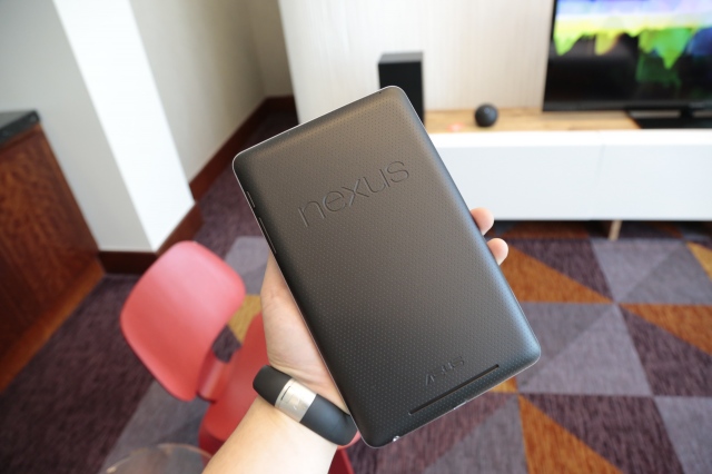
Little by little, Google is slowly piecing together a more cohesive and complete mobile OS. Having the right hardware to drive Android doesn't hurt either. While the Nexus 7 isn't quite what I expected Google to roll out last week at I/O given the Motorola Mobility acquisition, it's arguably the first real Android tablet to date.
With a $200 starting price, Android users and those looking for a smaller tablet now have a legitimate alternative to the Kindle Fire.
Smooth as butta
At its core the Asus-built tablet would be nothing if not for Jelly Bean (Android v4.1) and vice versa. Project Butter has made a surprising impact smoothing out the overall feel and experience with faster app switching (multitasking), frame rates and animations. Touch responsiveness has also seen an overhaul from past iterations of Android that tracks more accurately. Roboto, the system font for Android, has also been tweaked in Jelly Bean with better readability across the OS. Notifications are now actionable delivering even more content without having to actually launch a particular app. It can, however, cause sensory overload when notifications are expanded with a simple two-finger gesture.
Jelly Bean is also the first iteration of the OS that focuses on properly onboarding new users with semi-transparent overlays chock-full of helpful tips and tricks. Voice dictation can be taken offline, which is a plus considering the Nexus 7 appears to only be shipping in Wi-Fi trim. But it's not quite the Assistant some had expected. It falls somewhere in between simple voice dictation and Siri for basic search queries. Most, if not all, Google apps come preloaded like the updated Google Maps and the new default Chrome web browser, which is noticeably faster than the ho-hum default browser on pre-Jelly-Bean devices. (Oddly enough, though, the Galaxy Nexus loaded with Jelly Bean given out at I/O still carries the old browser and Chrome has to be downloaded.)
The magazine experience on the Nexus 7 is just as wretched as it is on the Kindle Fire. Design is a huge part of what makes magazines great and that is all but lost on the Nexus 7 because of the 16:10 display, which forces you to flip over into text-only mode. The back-lit IPS display (1280×800 w/ 216 ppi) just isn't dense enough to read copy in its more natural magazine form.
On the moving picture side of media, most of the popular shows you'd expect are now available for download but not everything is available as a whole. Only the latest season of uber popular shows like "Breaking Bad" are available, whereas the whole series to date is available on the Kindle Fire via Amazon. Otherwise shows and movies will stream automagically but you'll have to manually force the download if you want to store it locally. Not a deal breaker but just an observation. Pricing is also competitive with similar offerings from Apple and Amazon.
Games play remarkably well on the N7 due in part to Butter and the quad-core Nvidia Tegra 3 processor. Another win over the Kindle Fire.
But this isn't the final version of Jelly Bean, so things could change. For instance, the home screen is locked into portrait mode but flips between orientations in apps. Google Now is still a bit skittish. The prevailing issue, however, is the lack of tablet-specific apps for Android.
Will developers finally jump on board and optimize for tablets given the price point?
Something's gotta give
Not a bad start for Google and Android but the hardware may be a deal breaker for some. But if sales of the Kindle Fire are any indication, its shortcomings might not matter to the general consumer. For early adopters or those looking for something less iterative, you may need to look elsewhere.
The Nexus 7 lacks expandable memory and only comes in 8GB ($199) and 16GB ($249) trim, which explains why video content is streamed by default. There's also no way to output any content to a larger screen, so you're stuck with whatever content you download to the 7-inch display. Luckily the screen is vibrant and offers pretty decent viewing angles but it definitely reflects a lot of light. Compared to the Kindle Fire, the 1280 x 800 screen on the N7 is much, much better. The display is listed as having Corning Glass. Whether that means it's sporting Gorilla Glass or GG2 is anyone's guess.
You'll also want to mostly plug in headphones on the Nexus 7 as the speakers are placed on the lower portion of the backside and not along the edge.
At 0.74 pounds (compared to the Kindle Fire's 0.9 pounds), the Nexus 7 is easy to hold and use for extended periods of time.
Files can be transferred to other Android devices via NFC, if you're into that sort of thing.
Depending on usage and other variables like screen brightness, I managed to eek out just over seven hours. Based on other reviews, battery usage appears to range anywhere from six to nine hours.
The best part of the Asus hardware might be the fact that there is no back camera. Alternatively, you can't do much with the front-facing camera other than hangout in Google Plus since there is no dedicated camera app.
Buy or Pass?
Look, if you're looking for a 7-inch tablet or any tablet of the Android variety, you'd be hard pressed to find anything better than the Nexus 7. It runs vanilla Android (future proof, perhaps) that's actually optimized for the hardware and is relatively cheap. It's faster, nicer and smoother than the Kindle Fire but keep in mind the lack of tablet-specific apps and how Google is touting that it's made for Google Play.
Nexus 7 [Google]

No hay comentarios:
Publicar un comentario