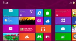
The official Windows 8 launch is less than two weeks away and judging by much of the commentary ahead of the consumer launch, you'd think that Windows 8 on the desktop is a total, unmitigated disaster. It isn't. It does take some getting used to, but the vast majority of desktop users will do just fine with Windows 8.
Those who think Microsoft went off the deep end with Windows 8 tend to focus on how much of a hybrid between a desktop and tablet/touch operating system it is. They ask how users will ever live without the traditional Start menu? How will they figure out how to switch between Metro apps? How will they ever find their way back to the familiar desktop once they open the new Start menu? How could Microsoft ever release an operating system that places such a massive cognitive burden on so many users?
Metro: Out Of Sight, Out Of Mind
Sure, Windows 8 introduces new concepts, including the Metro-style Start menu. But for the most part, you can happily use Windows 8 just like you do Windows 7 and just think of it like a service pack.
The old, familiar desktop is always there and waiting for you. Indeed, you can completely ignore the Metro/Windows 8-style user interface 99 percent of the time. You may have to face it when you launch Windows 8, but you can just launch any desktop app from there with one click and you're out of the Metro UI and back on the desktop.
Microsoft co-founder Paul Allen called Windows 8 "elegant" and "puzzling" at the same time. I think that sums up the first experience pretty well. It's not a hard puzzle, though, and Microsoft does a good job at explaining how everything works the first time you start it up.
Yes, Windows 8 can feel like weird hybrid of a desktop and tablet/touch operating system. Unlike the latest versions of OS X, where you can safely ignore the iOS-like Launchpad, you can't fully keep Metro out of your sight. But during those brief moments when you do have to deal with Metro, it's actually not that bad. It sure takes some getting used to and looks a bit out of place on the desktop. I doubt it will ever feel completely natural, but it's not the showstopper some would like you to think.
Microsoft sees Windows 8 as the stepping stone towards a future where touch-enabled laptops and desktops are standard. To bridge the gap, the company decided to fuse the touch interface and the traditional desktop interface into one OS. Looking back, the Microsoft probably would've done well to give desktop users an option to just get back the old Start menu and not force users to learn to use hot corners and essentially turn the desktop into app. At the end of the day, however, it's not as big a deal as it seems at first (and you can already install a number of utilities to get the old-school Start menu back, too). It is, however, a huge gamble on Microsoft's part and some of the rumored $1.5 billion it plans to spend on Windows 8 marketing will surely go towards simply explaining people how to use it.
Windows 8 shows a Microsoft – and the whole industry, for that matter – in transition. It sure won't go down as Microsoft's best version of Windows, but I've been using it almost daily for the last few months and I wouldn't go back to Windows 7. Windows 8 starts up faster, runs smoother, is safer and far more stable (I have only seen the new blue screen once since I started using it in March). Just like the minor OS X upgrades, Microsoft also polished the desktop UI and made some workflows (especially those dealing with files) faster and more intuitive. You can never tune the Metro UI out completely, but it doesn't get in your way.
Don't get me wrong. This isn't a must-have upgrade. If you're happy with Windows 7, you don't need Windows 8 (and Microsoft's sales will surely suffer because of this). As I said a few weeks ago, Windows 8 will confuse you the first time you use it, but give it some time and chances are you won't want to go back to Windows 7.

No hay comentarios:
Publicar un comentario