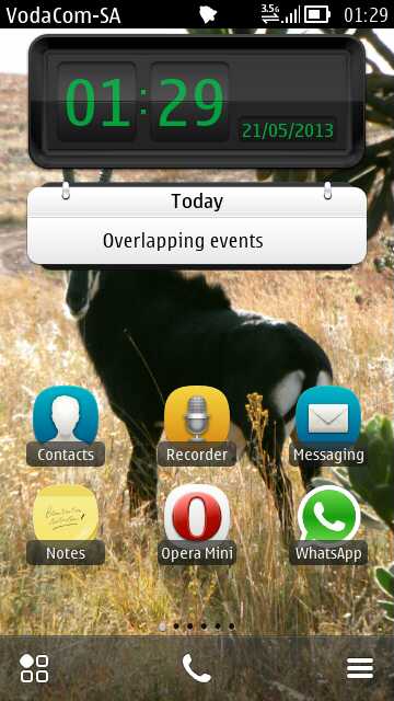
There's a lot to a set of homescreens, of course, with my original questions being:
- Do you max them out (six) or keep them simple (or even single)?
- Do you go for garish or plain?
- Mainly active content or mainly shortcuts?
- Do you try for any artistic look?
- What about wallpaper? Same for all homescreens, or geekily set to mimic panning? Or dramatically different for each, perhaps themed?
- Any widgets that you use which aren't well known and deserve wider dissemination?
Here then, for everyone's interest, are some of your submissions, along with any comments by the originator and, in places, with my own thoughts. Again, if your submission didn't make the cut, please don't be offended - I found every one interesting but there were a number that were quite similar, plus there really wasn't room for all of them!
In order of rising complexity, with the number of 'main' homescreens listed in parentheses after each name, here's my selection:
Gerald Fraser: (one)
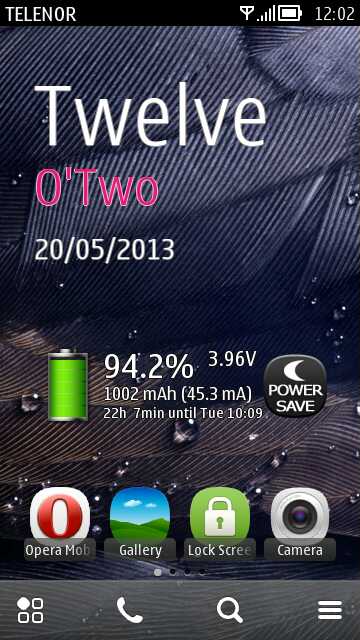
"Not exactly the brightest screen, but saving battery is key. Normally the Power Save button would be blue but it has to be off for me to send this 808 snap! This screen contains the most used items, text clock, QooBattery Widget (which shows current mA!), Battery Power Saver which keeps standby battery use to near zero, and of course Gallery, Opera Mobile, and the Camera (why I bought the phone in the first place!)"
Steve says: A nice focus on battery saving, plus a good reminder about Symbian's textual clock.
Chris Reed (one):
"Here's my single homescreen. The theme is ClearBlack II Lite. The GoToMenu app takes care of getting to things quickly also, so this is really all I need. Plus my data limit is a bit too low for elaborate online widgets, as much as I might like them. As you can see though, I don't care for a regular grid of icons. Belle makes it possible to not have one, so I don't!"
Steve says: The hexagonal grid would do my brain in, but I'm glad it works well for Chris! Note all the folder shortcuts too, courtesy of Thumbnail Folders.
Giacomo Zoppi (one):
"Only one homescreen. Just what I need easily and quickly"
Steve says: In case people are wondering, the calendar widget is BizCalendar and the extra buttons are from Lanternsoft.
Philip Nikoloff (two):
"I like to keep things simple. Listening to music is my main priority on my Nokia 701, so I think this layout suits me best. And for the overall look, errr... I am using Belle, the Greatest v2.51 custom firmware by Uriel Tapia."
Steve says: Interesting to have an arty/music-centric layout, though not sure my wife would appreciate me gazing at someone else's silhouette each day!
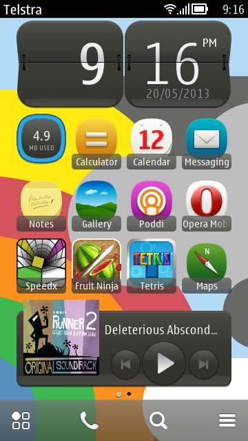
Brenda Fernandez (one):
"I think the homescreen on my N8 is pretty standard: I don't have many fancy widgets or anything unofficial. The background image is one of those bundled with Belle, and visible widgets are: 3G switch, Internet Radio with my favourite station, a couple of app shortcuts, the Email icon widget, AccuWeather, qooCalendar, Digital Clock mini and the profile switcher menu. The upper part of the screen resembles the S60v5 layout I was used to from my old Nokia 5230. I use a single homescreen, following your advice.
The buttons on the bottom are from the hugely popular Belle Extra Buttons and they consist of a menu and a battery meter (which I find very accurate, even more so than the official Nokia widget). Long pressing each button triggers the compose window for a new text message and detailed battery info, respectively. The screenshot above, right shows the menu open (called foldable panel A in the app itself). It's where most of my frequently used apps reside. Having this, I only rarely need to open the standard Symbian application menu.
(The theme currently in use is "Next Fuchsia - daeva112", but I switch it often for the others I have installed: Belly Jean, the stock Nokia Evolve, Meego Evolved, Tilesilicious M Lite, Womencipation, and Steelblack PINK DFLT (all, except Belly Jean, from the Nokia Store). Many of the themes feature prominent pink/fuchsia design elements, which match the colour of my beloved N8.)"
Steve says: Nicely explained, and the first of many respondents who swear by Belle Extra Buttons, it seems...
James Murray (two):
"I use a two homescreen setup to keep things simple. I really like the ability of Coming Next to show plenty of calendar information at a glance. I use the boring but power efficient REvolve Red theme - lots of black with occasional red highlights. I have Nokia Situations switch the theme to ClearBlack for 'work' and Nokia Evolve sits in third place.
Steve says: A nice Calendar-centric, optimised pair of homescreens. Though I'm starting to think these extra 'menu' utilities are amount to cheating... 8-)
Stephen Nealon (two):
"I try to keep the amount of home screens down to the bare minimum on my Nokia C7. I use Wi-Fi and the LED torch a lot, so it makes sense to keep them on homescreen one. I like to keep an eye on the battery life and RAM usage, so I also have Battery Info and Raminfo Free on homescreen one as well. On homescreen two, I keep my email and timer widgets. They're useful, but they're not used as frequently. I control Music through the drop down, so I got rid of that widget some time ago. "
Steve says: Nicely thought out and hey, I recognise that theme! (Belly Jean)
Rick den Ridder (two):
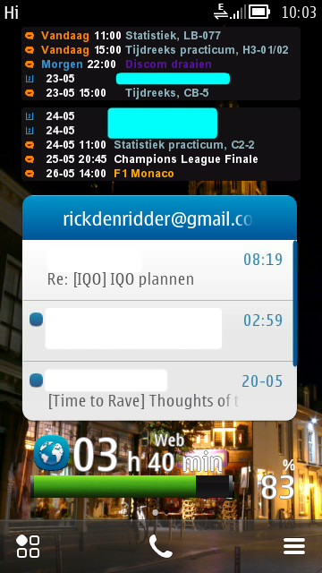
"Here are the two Symbian homescreens I use on my Nokia E7. One is for information: it has two BizCalendar widgets (with different colours for different activities), the standard E-mail widget and the Nokia Battery Monitor for a quick look at the remaining energy. The other one is full with shortcuts of applications I often use (Opera, Fix The Net, Gallery, etc.) or which I want to be able to use in a very short time (Shazam and Camera, as this is faster than using the shutter button). Moreover, it has the clock widget, as I use it daily to set my alarm and I can switch profile or toggle 3G (I only have 3G on while browsing the web) effortlessly.
As you can see, I maxed out the two homescreens. This way, I minimise the time needed to get information or open applications. I don't want to use a third one, because I like the idea of not having to think about whether I need to swipe to the left or to the right.
My wallpaper is quite dark, so it doesn't consume too much energy. Both homescreens use the same photo, as it's the most beautiful spot of The Netherlands: the Grote Kerk (Big Church) in Breda."
Steve says: I'm quite gratified that there Symbian users out there who think about optimising their homescreens as much as I do!
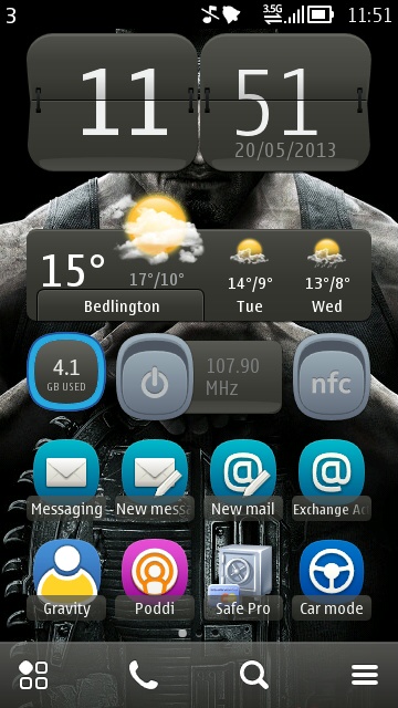
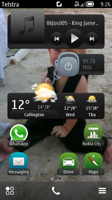
Darren Morin (two):
"I used to use 3 screens, now down to 2. On the third screen I would put the Google/phone search and a mail widget for my Gmail account, I realized with the "Mail, new arrival" widget I could get a visual indication that something has come in, rather than having a whole screen dedicated to it, so there's that.
On the first screen I like to have all of my info at a glance. Time, date, weather, calendar. Kind of like how my old PalmPilot use to work (minus the weather). This "main screen" has my other 3 most commonly used apps (on my phone, at least) Messaging, Gravity and "App Stop"; you're probably wondering why that's there. I'll get to that soon.
The toggle icons you see are Wi-fi, the mobile data toggle, and the most important one, the Bluetooth widget. Why is that there, you ask? Well I use what's known as a "Loopset", a Bluetooth-enabled device that I wear around my neck that is linked to both my hearing aids and the N8. When I have to make a call, I can quickly switch the Bluetooth on, put on the loopset, and dial the number. When the other party picks up, then I can speak. The loopset does a great job: folks tell me the call is clear, and I can hear them without any noise or interference. As I've found, the antennas in the phone (Wi-fi especially) do generate a rather annoying "click-click-click" sound that my hearing aids can pick up when I hold the phone to my ear. Sometimes open applications have habit of trying to "connect" so that's why I have the "App Stop" icon on the lower right. Kills everything dead except the current phone call.
I do realize I've got those toggle shortcuts in the pull-down panel from the top of the screen, but my logic is that having them where they are is quicker, i.e. one tap.
The second screen is for search, and a giant screen full of buttons. I use "Play via Radio" when I'm in my car a great deal, since my music is on an SD card (32 gig). Following that are map and map apps. The second row is for entertainment, I play "Angry Birds" usually while I'm waiting to pick up my wife from work. I've often had the "Play via Radio" on and listening to tunes while driving there, so it's still on while I'm waiting for her: the music player gets paused and it's funny to have the car windows wide open while the whole parking lot can hear me playing "Angry Birds"!
The last row is practical stuff: my notepad (shopping list, etc), clipbook so I can copy/paste bits of quotes or other things into tweets and facebook posts. Then finally the data counter so I can keep an eye on my data usage.
My theme is currently the stock Nokia Evolve theme with a dark, obscured grey background that I think matches well with the widgets' use of dark grey/white. I try to save battery power as much as I can. I cropped the image so it would fit on the phone screen.
I've been accused of being 'minimalist' to a fault, and I suppose that's true. My setup works for me, it's quick and clean."
Luke van Eede (two):
"I prefer to keep things simple and only have two homescreens. I think it is best to put everything I use the most on the first homescreen so I don't have to go into the menu all the time. I don't like to have too many widgets, but the music one is a must have. Emails and Webview linked to the Bureau of Meteorology's website on the second homescreen are very handy. I don't really like photos or a completely plain wallpaper. I like this one that came preloaded. Its colourful, but not too distracting."
Steve says: Great to see people using Nokia's Webview concept in real life!
CKS Richardson (three):
"I have three home screens, each with its own wallpaper, so that they wrap around and I never have to spend too long trying to find the app or shortcut that I want. One is dedicated to music, another contains my calendar and notes, and the final one is my main home screen that contains shortcuts and widgets for the things that I use most often. I try to keep the layouts balanced so that they look nice (to my eyes).
I recently tried Belle Extra Buttons and Weather Clock, and liked them very much. I'll probably drop down to two home screens when I finally get the time to organise my phone."
Steve says: Nice use of standard widgets, I'd already call this pretty well 'organised'!
Carl Schwarz (three):
"I've been using this setup on an N8 for around a year now only with minor changes. I use 3 homescreens because "the other" homescreen is only one swipe away, in either direction. Each homescreen has a purpose: Travel (driving); Work; Night time.
First a little bit about myself to show how it works. I have 3 small kids under 4 with a baby on the way, I work in an office, and for a few months now I've been developing apps in my spare time. I live ruraly and spend a fair bit of time in the car with the family. The first homescreen is essentially my 'drive' screen with
- Music + FM transmitter (I have an aux-in in my stereo but FM Transmitter is so much easier).
- Weather
- Drive and mapping icons.
- Messaging is here because usually I'm only messaging when going places
The second homescreen is 'work':
- Work email at the top, it used to have "web" and shortcuts to work websites there but I found that tapping the homescreen and hitting up the web there is better. I'm also trying to get "less work" on my homescreens to give me a better headspace when I'm not at work
- The middle of the homescreen has the app development assistant "Coda" plus "Animal Fun" for when I need to give the phone to the kids, and a new app I'm working on to teach the kids the alphabet, numbers and writing.
- The lower half of the homescreen is productivity apps. I create lots of content on the phone (audio, images, etc.) and I use these tools to upload media or to put stuff into OneNote notes. Joikuspot is also handy to have at hand at times. "Notes" is there for the times when OneNote is too slow to load and I want to jot a quick note.
The third homescreen is my 'home' homescreen
- News which I read last thing at night in bed
- MeeBible which I also read last thing at night in bed (following a daily readings chart - search Robert Robert daily readings chart to find the same one).
- Pregnancy widget because my wife is pregnant with number 4 and I like to know if she is going to be happy or cranky this week!
- Some audio recording tools because I record meetings. And "Mobile Microphone" because the kids find it so much fun when I hook it up to a bluetooth speaker.
- And Sportstracker for those rare occasions that I ride my pushbike into work.
I used to have a Facebook widget here but lately I only check the site once a day so the widget is not necessary. Homescreen 3 used to have a heap of kids apps on it like Sesame Street and Peppa Pig, etc. But the kids are a little older now and can find the apps and videos that they want all by themselves - even though the oldest is just 4! Who says that Symbian is complicated, the little kids run rings around this OS!"
Steve says: I love the personal/family touches here.
Andy Hagon (three):
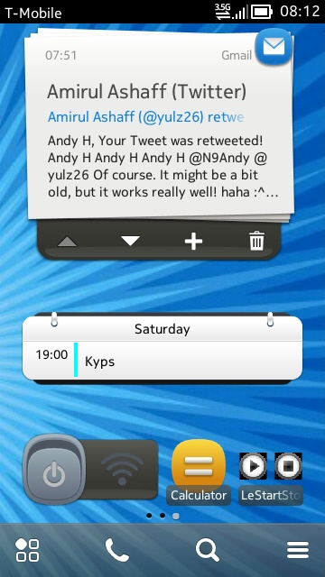
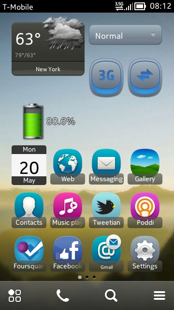
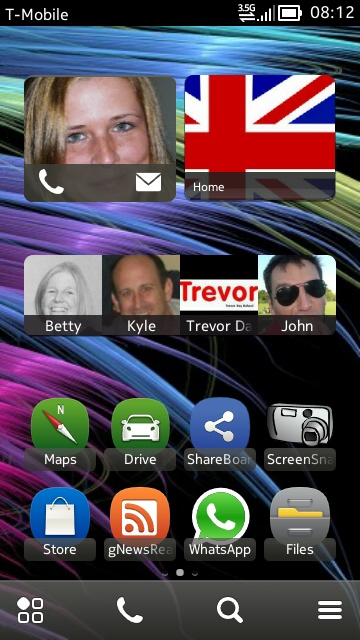
"The main one is the one with the weather and profile widgets, plus all the main apps I want instant access to. To the left of that is my email and calendar widget, with a couple more useful, well-used apps, and to the right of my main homescreen is another app 'drawer' plus my main contacts, Holly and Home. Note that Home doesn't need the new widget as I can only call the landline, while Holly can be texted as well as called!"
Steve says: Andy is the power user's power user, so fascinating to see the Symbian stuff he uses the most...
Marko Tomic (three):
Steve says: Nice use of standard widgets, including Nokia Social here (it's not all bad, you know), plus extensive use of the new Contact Communication widgets - a top set of three homescreens.
Kevin Cogels (three):
"Note the different wallpapers, which are different but with the same subject. My theme is Steel Sapphire by daeva112. Nice icons and also a little bit transparent. Also easy on the CPU and memory. The 'quickbrightness' icon is very easy to use when in powersaving mode and outside. It will override the Nokia settings, which is very handy. Just one tap on the icon is enough!
Everything I need in three screens, and for the odd program I even use the physical menu button on the 808!"
Steve says: Good to see an entire homescreen given over to email.
Viktor Sik (three):
"These are screenshots from my N8. I prefer it simple so I've installed only one custom widget (One Contact) to remote open my garage door(!) I use my phone mainly as calendar and organizer, so two calendar and email widgets are necessary. The icon in the middle of the top bar indicates the integrated VoIP client - that's the function I miss on Windows Phone 8 and that's why I stay with the older but still better Symbian. And one interesting thing is that my wallpapers is continuous from left to right (I also use the 'winter' theme)."
Steve says: Yep, got to love that wallpaper set, even if you only really appreciate it on a page like this!
Rob Vanderkam (three):
"One page for communications (and my most used app, Poddi), plus everything else goes on one or two other pages, as shown here: notes and high bandwidth apps, plus weather and misc apps that change. It may be important to note that Belle Extra Buttons has the "Menu" button on the menu bar that gives me access to every other app on one page, sortable."
Steve says: Nicely matched wallpaper and shortcut/widget positioning here, plus the use of some non-standard widgets to good effect.
Alberto Beltry (three):
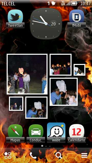
"I use only three homescreens and I like to combine the wallpaper, especially the one where my dog appears, where I've even arranged my widgets so he can always be in sight in both orientations, as shown!"
Steve says: Aww.... great to see the Nokia 808's Xenon flash being put to good use in that photo gallery, too...
Aishwarya Gaidhane (three):
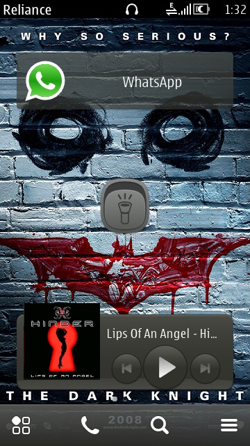
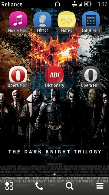
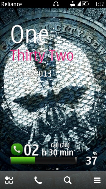
"I'm a Nokia 701 and Nokia 5800 user. The home screen of my 701 in the default nokia evolve theme consists of offline shortcuts as India has very expensive 3.5G and damn slow 2.5G. I am a very big fan of the Dark Knight trilogy and the shades of black on the 701's brightest display in the world are a treat. The main reason I bought my 5800 was because of the movie, the Dark Knight (a prototype was showcased during the Hong-Kong scenes as a sonar emitter.) And I bought the 701 just to know how much Nokia is going to develop Symbian even after abandoning it. But you'll be suprised to see that a Nokia 701 did appear in the final cut of the Dark Knight Rises too (it's a grey one with a black rubber cover on, used by Robin calling Gordon before and during the blasts). It kind of satisfied me to see Symbian in both movies."
Steve says: I'm sure there's a theme here, but... no, can't work it out....
'yulz' (four):
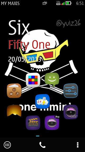
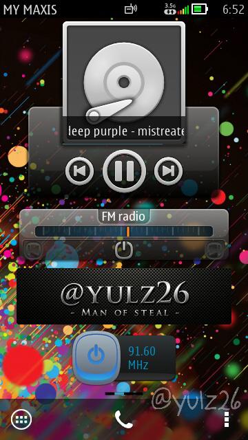
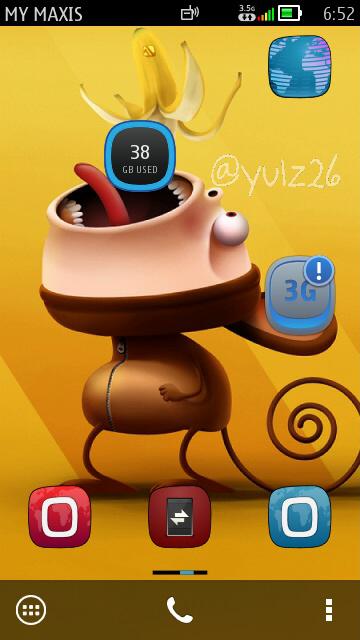
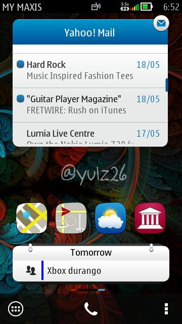
"Make your homescreens live, make it alive, simple, compact and useful. :)"
Steve says: Outrageous art/theming and shortcut positioning. Very cool.
Vlado Grv (four):
"On my first/main homescreen, the icons are optimized for right handed use, along the long side of the screen. It works very well for me. Otherwise, this is my "communication" screen... sat nav, messaging, Skype, social, e-mail, contacts, web... Second is just weather and my notes. Thirdly there's just an application launcher with a couple of bookmarks. Finally, there's my entertainment center!"
Steve says: Solid thinking and good wallpaper choices...
Mark Robinson (four):
"I use 4 homescreens on my 808, with each one having a theme of the content. The screens consist primarily of shortcuts and widgets with minimal active content, as I prefer to retrieve, say news, than have it forced.
- Screen 1: Communications; email and text and I actively use the reading and speaking functions. Note the lack of any social media as I do not participate.
- Screen 2: Media and Web; and a folder for quick access to some of the less frequently used items, such as Opera Mobile, Vimeo, Live Cams and other news sites.
- Screen 3: Weather and GPS; again with a folder for some other weather apps, apps for viewing the sky and Public Transport. A weather radar is a perfect use case for the Webview widget.
- Screen 4: Tools and Utilities; and a folder for each of those less frequently used, but still important.
I have had to add a fifth screen shot, because the use of Belle Extra Buttons has changed the way I use the phone. This now contains those frequently used system functions and apps, Setting, Files, Store, Gallery, Maps, etc., which of course you can access from any homescreen. "
Steve says: Everything is here, from Webview to Vlingo to every shortcut known to man. Respect.
Al Reynolds (five):
"Here's my five homescreen setup on my 808. I have the stuff I need to glance at on the middle screen: agenda and email notifications, plus the main personal organisation stuff. Either side reflects the main phone functions – email to the right and photos/music to the left. Beyond that are other things I need to use less regularly but for which I don't want to search through menus. I use Belle Extra Buttons' pop-up menu on the middle button for all the shortcuts I need, so they are accessible on all homescreens. I hardly ever use the standard Symbian application menu. The background is a photo I took of some ice on the roof of my car!"
Steve says: Nicely spaced, nicely thought out.
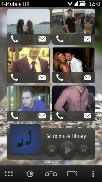
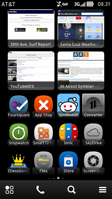
Trevor Lee (six):
"All of this is on my Nokia N8. I try and make my screens easy on the eye and practical. The wallpaper also forms an important part and will always be of photos that are important to me or photos that I love. I also don't change them very often, which does help when searching the screens. I also tend to prefer shortcuts rather than active screens as it suits my logical brain! Of course the layout in Landscape must be in the same order as portrait!
Screen One: My main screen and the most valuable. It is where, in my opinion, most of the important features of your day should sit. So, time / date / diary and the apps I use on a daily basis. Must be neat of course!
Screen Two: Emails – Work and Personal, nothing more need to be said.
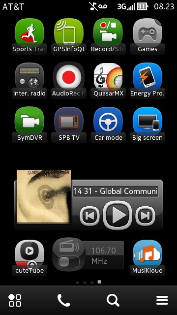
Screen Three: Weather and Motor. This is a very practical screen and very important. Car Mode is a fantastic app and, along with the FM Transmitter, this screen impresses those without Symbian! Come to think of it, so does Offline Maps, a true USB port and the HDMI output.
Screen Four: My practical screen. Cloud services and work related apps. Very functional.
Screen Five: The social screen. Photos, Gallery and the like.
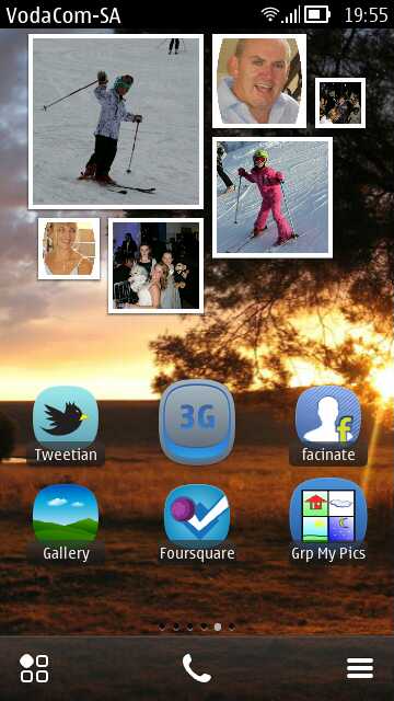
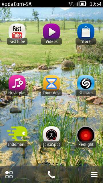
Screen Six: Most useful apps. It's amazing how few people know how to download from YouTube. JoikuSpot, Endomondo and Shazam are all very useful. Of course, when in a crowd and you need a flashlight, the conversation soon switches from "your torch isn't very good" to the "N8's Camera and Xenon Flash!"
Steve says: Utterly maxed out, shows what Symbian can do, and love the wallpapers.
Pavel (Paul) Smítka (six):
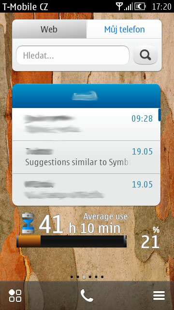
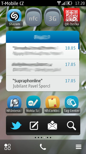
"I like original Nokia's Symbian. So first homescreen is default and on other homescreens there should be only useful things for me"
Steve says: Notable for not only maxing out all six homescreens, but doing so using (more or less) just what Nokia/Symbian provide. Seeing this set of homescreens would warm the cockles of the Accenture team's hearts...
No hay comentarios:
Publicar un comentario