Facebook Home's launcher was inspired by Lunchables. That's just one nugget of insight into Facebook's design process from a presentation it gave to Bay Area designers in May and that it's now released as a video. The 40-minute clip illustrates how Home evolved, iteration by iteration. Facebook's Julie Zhuo introduces it saying "the things that the articles never write about is the journey."
"We all just see the final product, we see the design in its completed state, and we don't really get to tell the story about all of the things that happen along the way, the ups and downs, the bad ideas we tried, the endless iteration and critique," product design director Zhuo explains. Designing Facebook Home, embedded below, tells that story.
While that end product hasn't gained the traction Facebook might have hoped for, it's slowly getting better. The relentless brainstorming and testing process exposed here are why Facebook keeps evolving, and why Home could eventually become a livable mobile "apperating system."
Mirroring The Real World
"This is how we should design our products" says Facebook designer Justin Stahl. "I think they should mirror this feeling of being alive. The way we do that at Facebook is by drawing parallels between the real world and the virtual world that we're building."
Stahl breaks down some of the key features of Facebook Home by outlining the meatspace experience they mimic:
 Cover Feed – "If you think in real life, news tends to find you. You don't really have to seek it out, and that's how we designed Cover Feed. I woke up one day…and had the brand new trailer for Iron Man 3 I was totally into [on my Cover Feed]. It was delivered to me. I didn't have to check a bunch of feeds and bounce between apps. It was as if someone had told me about it and it was available right when I turned on my phone."
Chat Heads – "It doesn't matter what I'm doing. If [my friend and co-worker] Francis comes to talk to me, I'm willing to talk to him. I'm not just going to tell him to leave and get back to him later that day. With Chat Heads I can quickly pop in and out of conversations. I can continue what I was doing. It's just like Francis dropping by my desk every day."
Stahl then takes a dig at the design of apps like Path, which use showy "fly-out" animations to reveal their navigation buttons. "There's a tendency to solve tough navigation design problems by doing little magic tricks like having menus fly in out from nowhere. What's really important for us is maintaining a sense of where you're at." That's a bit rich, considering Facebook has cribbed stickers and one-touch "ok" message replies from Path.
The Social Design Process
The most fascinating part of the video shows early prototypes of Cover Feed, gesture-based navigation, and the app launcher on Facebook Home.
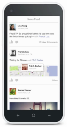
Originally, Facebook considered simply docking a more traditional version of the mobile news feed at the bottom of the Home lock screen. Facebook's Francis Luu explains that "we put news feed at the bottom so you could just scroll up. And the background was my cover photo." But that didn't show how the feed is the "lifeblood of Facebook." In fact, it conveyed the opposite.
In this design, Luu says "the majority of the screen is just this big photo that doesn't change much and something that makes the news feed a bad experience is when it feels stale. So we just decided, 'what if we fill up the entire screen with your friends' content?'" The video then shows a series of designs for the like and comment buttons, and how it settled on the option to double-tap to Like.
Facebook then tackled how to reveal your apps. Eventually it settled on swipe left for Messenger, right for your last app, and up to open the app grid. The designers originally considered offering more than three gestures to get you to your apps but realized it would confuse people. "What about 5, 6, 8? And you're like 'what the hell is going on?'" says Luu.
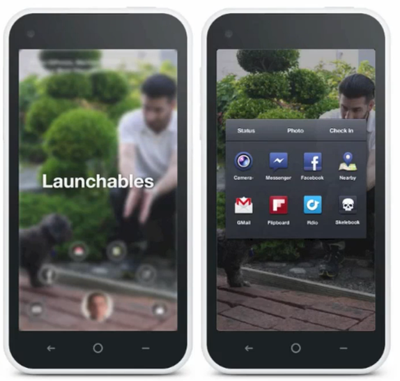
One solution Facebook tried was swiping to open an overlaid panel of a few favorite apps on top of Cover Feed. Luu says with a laugh that "Maybe instead of swiping up and getting three separate options you got a tray of apps as inspired by Lunchables [the pre-packed kids lunch]. We actually called this design direction Launchables, and we literally turned it into a tray of apps you could curate.
In the end, Facebook stuck with the apps gesture opening a full-screen launcher. Unfortunately at first it came with no widgets, folders or dock. But with time Facebook has begun adding those features, and now Launchables has emerged as Dock, a single row of favorite apps locked to the bottom of the launcher like on iOS.

The video concludes with Facebookers discussing the need to design mobile experiences right on a touchable mobile phone, not some image-editing software like Photoshop. Facebook designed Home using Quartz Composer so they could feel the physics of flinging Chat Heads around the screen. The company's insistence on careful design led it to have the employees who built Home oversee the productions of the commercials that promote it.
Facebook is famous for its "Move Fast And Break Things" iterative design. By letting its guard down and giving us a peek into its process, we gain better understanding of what works in Home and how it and the rest of Facebook are likely to progress.
No hay comentarios:
Publicar un comentario